
Zizhu Social Impact Partners
The Zizhu Social Impact Partners brand identity is a branding project for the corporate social responsibility alliance of the Zizhu National Hi-Tech Industrial Development Zone. Interviews with the executive team distilled three key messages, openness, collaboration and innovation, which shaped a logo, color and imagery system inspired by window panes.
Zizhu Social Impact Partners Brand Identity: The Branding Journey
Client
-
Zizhu Social Impact Partners
Industry
-
Philanthropy / Non-profit
Scope of work
-
Brand interviews and key messages
-
Logo and visual identity system
-
Color and brand imagery
-
Brand applications and guidelines
Brand background
To encourage companies in the Zizhu National Hi-Tech Zone to fulfill their social responsibilities and to foster a culture of public welfare in the park, the Zijiang Foundation funded the Zizhu Social Impact Partners alliance and served as its first chair.
The alliance is oriented toward solving social problems and helps companies find innovative opportunities. Building on its cohesion, it invites more companies to take part in practicing social responsibility.
Challenges
Since its founding in 2016, the alliance has grown from 18 members to 30. After years of steady work, its influence in the park has reached a meaningful scale, and it is exploring further possibilities.
Against this growing influence stood the lack of a systematic brand identity, which made it harder to communicate the alliance’s value externally. The biggest immediate task was extending the brand to reach more companies, engaging them, and exploring diverse forms of cooperation.
How could the alliance reach more companies and build a clear brand image? An in-depth branding collaboration began.
In-depth interviews with the alliance’s executive team distilled three key messages for brand communication.
The solution
The window pane became the source of inspiration. A window is a way of seeing. It looks out to a wide world and lets in light, so that inside and outside meet.
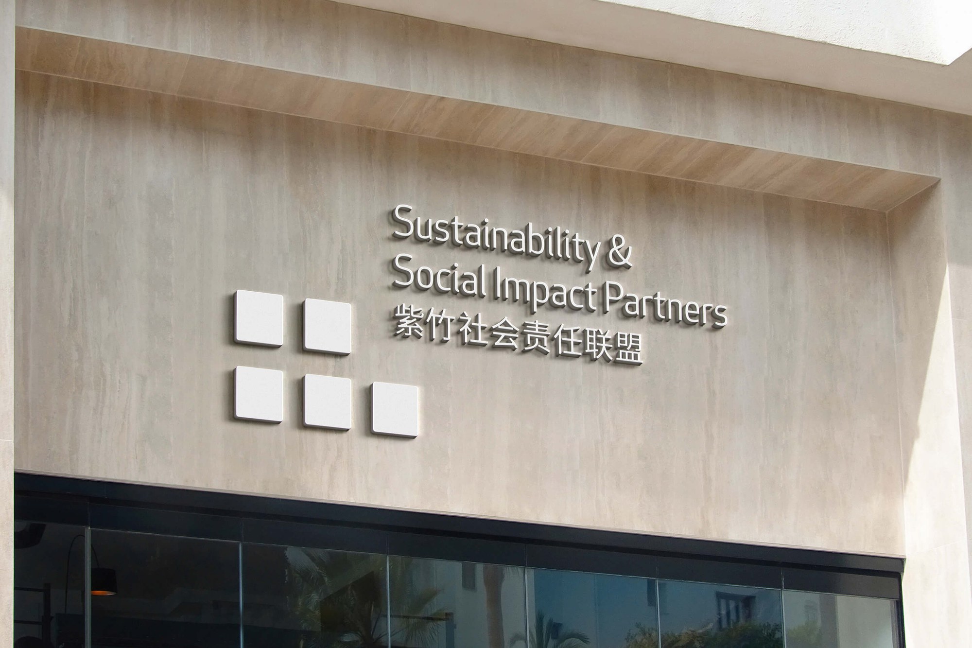
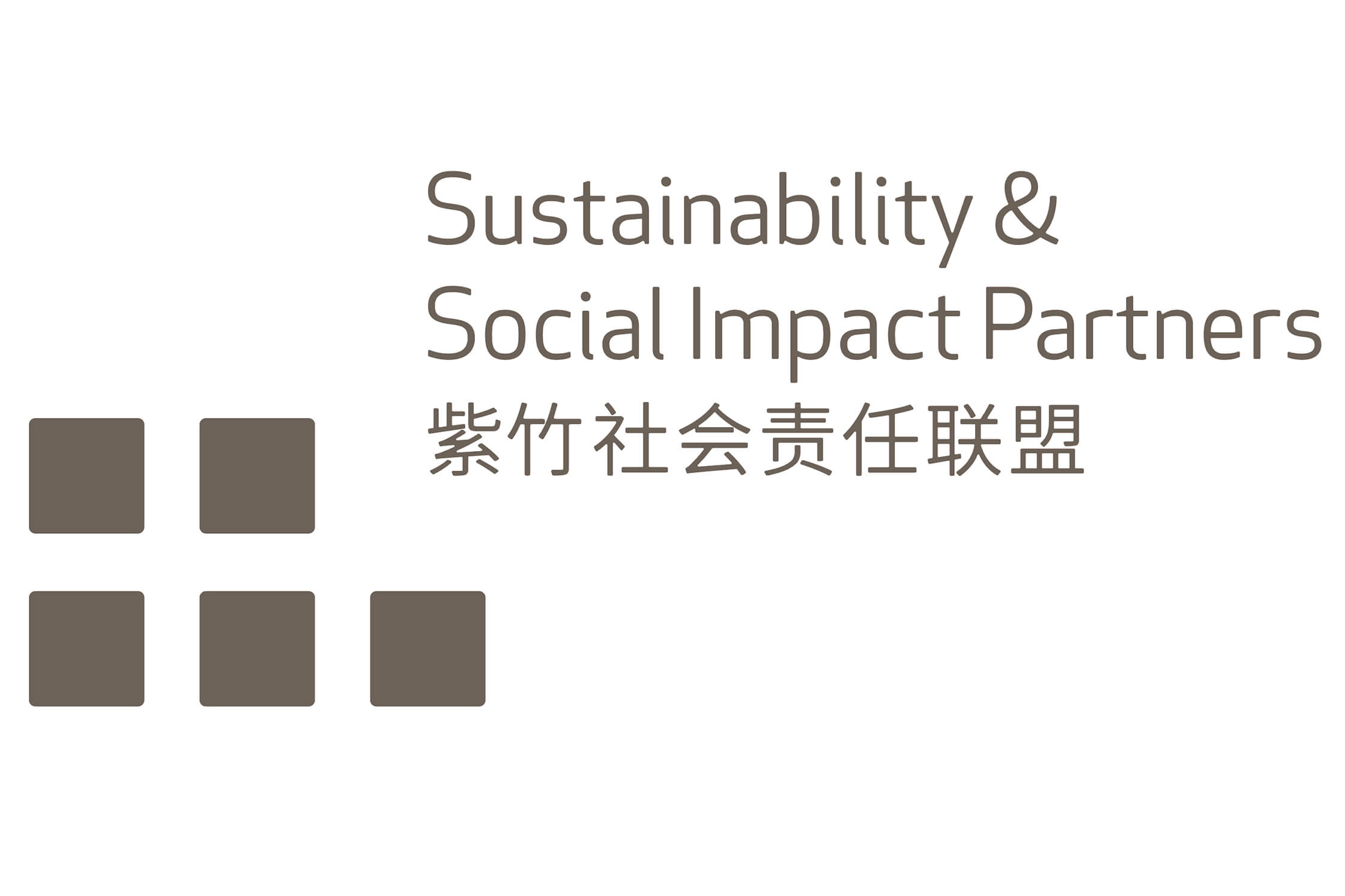
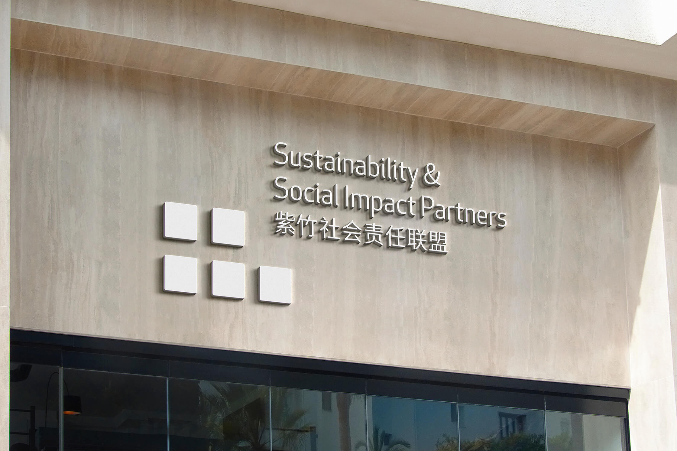
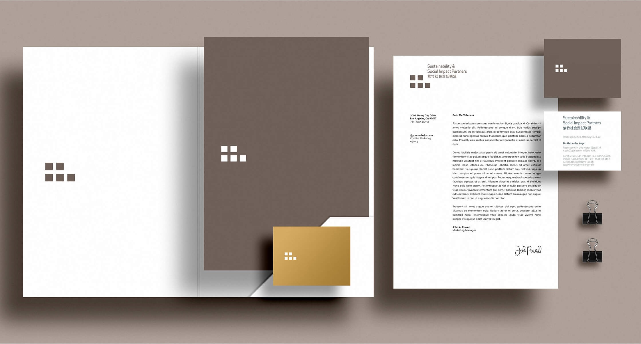
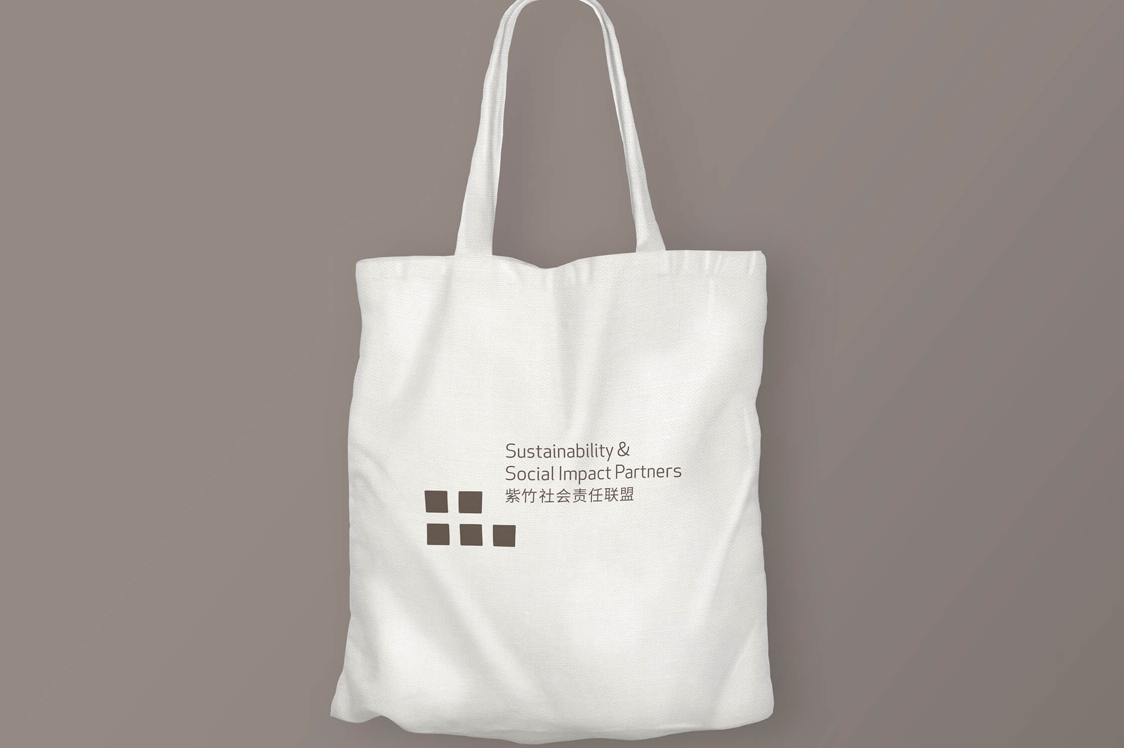
The Zizhu Social Impact Partners brand identity arranges squares in an orderly grid to evoke window panes. It also suggests members connected to one another, echoing the brand message of openness, collaboration and innovation.
Color system
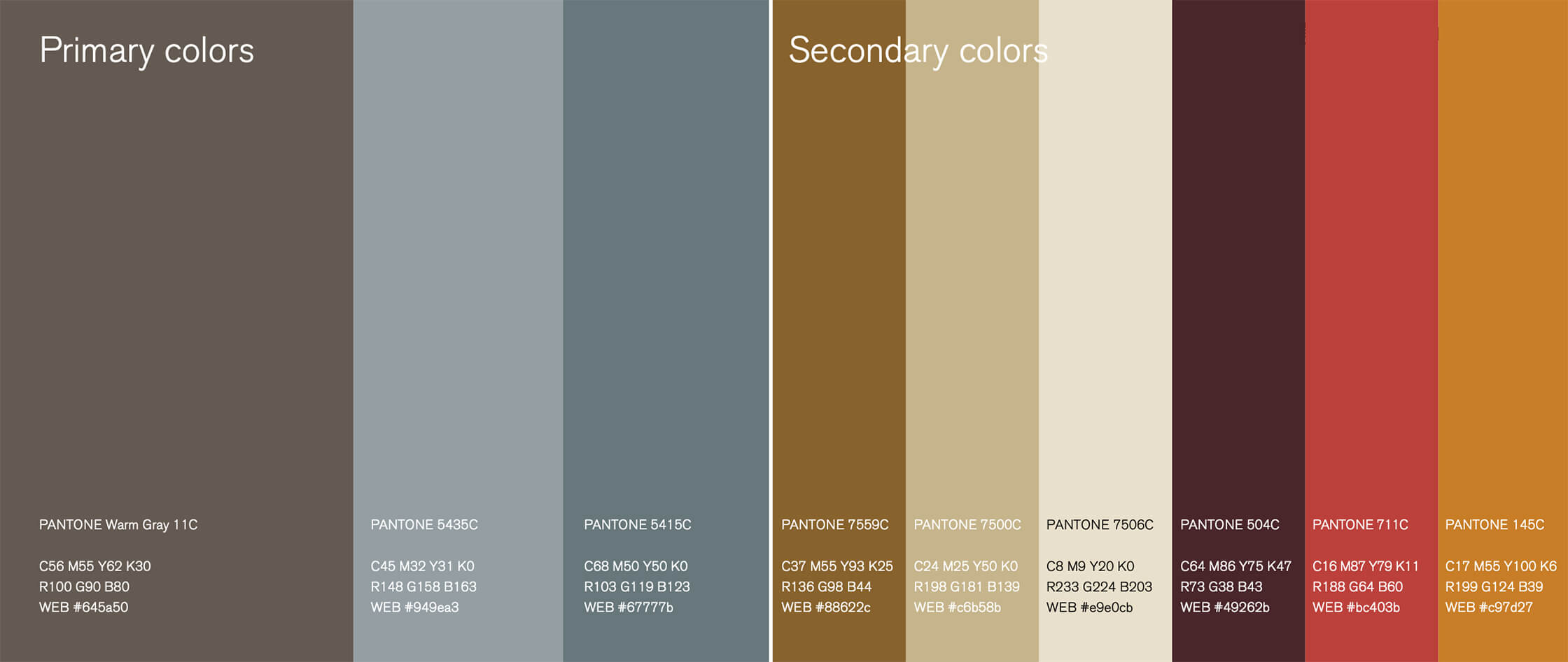
The color system takes calm cool brown and gray-blue as its primary colors, paired with brighter earth tones that add energy while keeping a consistent tone.
The primary colors carry over the cool brown and gray-blue of the alliance’s logo. The restrained, steady palette suits the long-term, trustworthy image of a public welfare organization and keeps the logo clearly recognizable across different media.
The secondary palette of ochre, sand, off-white, deep burgundy, brick red and amber draws on the colors of earth and nature. It supports information hierarchy, emphasis and extensions for different themes, giving the brand a richer range of expression within a unified whole.
Brand imagery
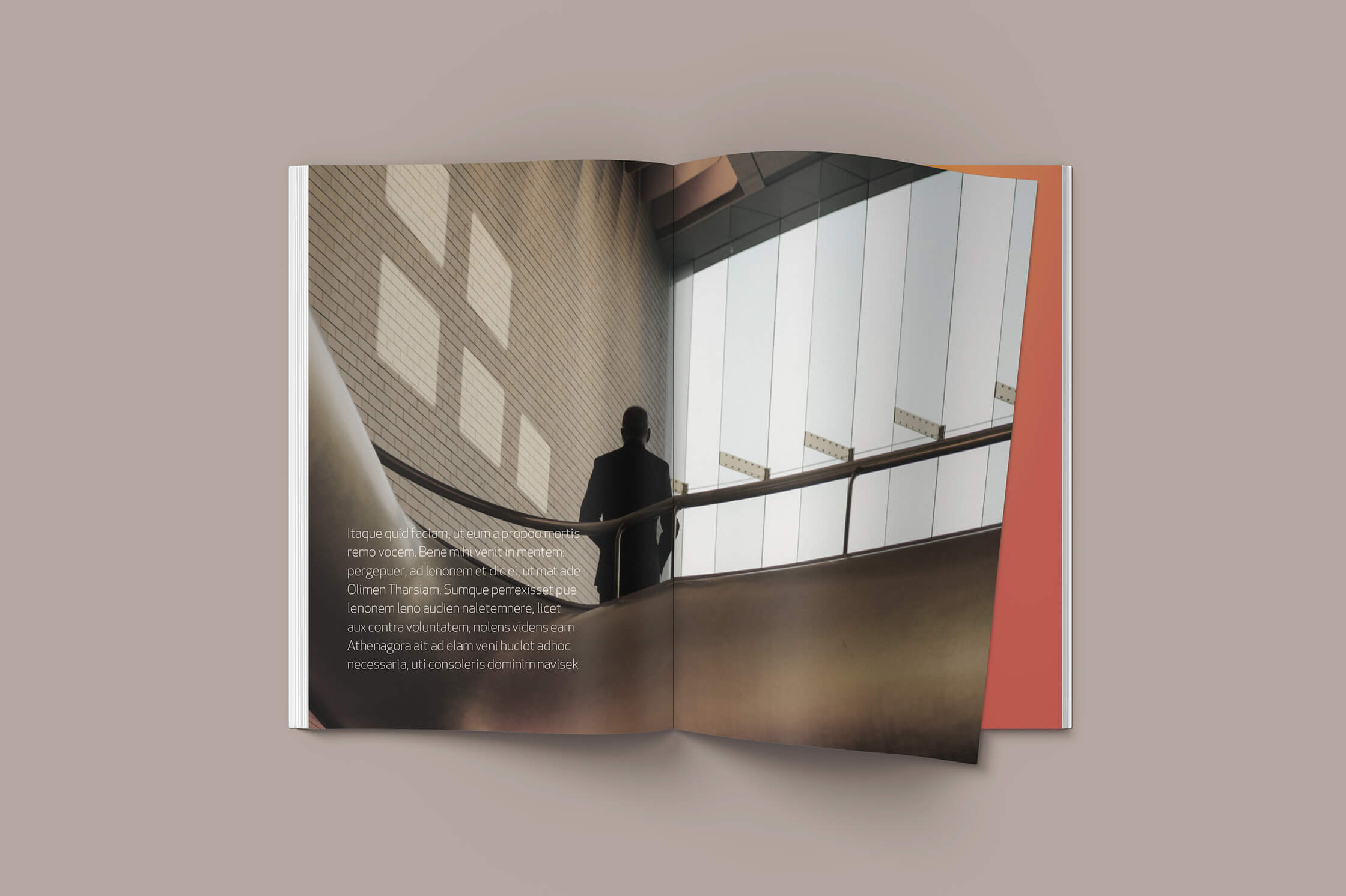
Brand imagery brings in the light and shadow of sunlight streaming through a window. It reinforces the brand elements, connects visually with the logo, and deepens brand recognition over time.


Brand applications
The biggest challenge for the application system is keeping the design consistent, which requires clear guidelines. By using the same design elements, applications create a visual connection with one another and convey consistent brand value.
In practice, the brand system covers stationery, brochures, web pages, and merchandise such as tote bags and T-shirts. The logo, color and imagery follow the same logic across media, so every piece that members and partner companies encounter conveys a consistent brand impression.
Unified layout, color and imagery guidelines also let the alliance team extend the same brand language directly when producing new event materials and communications, reducing repeated coordination and rework.



For a nonprofit organization like Zizhu Social Impact Partners, building a brand means building trust. Only by conveying brand value directly through a visual language can the alliance earn broad social recognition and draw more companies into social responsibility practice.
The Zizhu Social Impact Partners brand identity now presents a professional and innovative image, and is expected to support the alliance’s continued growth. To learn about the alliance’s founder, visit the Zijiang Foundation website.
Frequently asked questions
The Zizhu Social Impact Partners brand identity is a branding project for the corporate social responsibility alliance of the Zizhu National Hi-Tech Industrial Development Zone. It covers a logo, color and imagery system and application guidelines.
The Zizhu Social Impact Partners brand identity is built on three key messages, openness, collaboration and innovation, distilled from in-depth interviews with the alliance’s executive team.
In the Zizhu Social Impact Partners brand identity, the window is a way of seeing. It looks out to a wide world and lets in light, so that inside and outside meet. Squares arranged in an orderly grid evoke window panes and suggest members connected to one another.
It includes the logo, a color system of cool brown and gray-blue with ochre, sand, off-white, deep burgundy, brick red and amber as secondary colors, imagery of sunlight streaming through a window, and application guidelines for stationery, brochures, web pages and merchandise.
The Zizhu Social Impact Partners brand identity serves an alliance founded in 2016 that has grown from 18 members to 30. The Zijiang Foundation funded the alliance and served as its first chair.