Zijiang Foundation

The Zijiang Foundation brand identity refresh is a brand upgrade for the Shanghai Zijiang Foundation. As the foundation moved from a youth-focused start toward wider public engagement, its brand strategy was reviewed, the logo and visual system renewed, and both extended to applications and the official website, so that integrity, pragmatism, innovation and endurance show up at every touchpoint.

Zijiang Foundation Brand Identity: An Innovation Base for Public Welfare

Client
Industry
Scope of work
Foundation established
2015
Public welfare focus areas
4
2018 China Corporate Citizenship Brands
Top 20
Transform Awards Asia Silver
2024

Award

Transform Awards Asia 2024 · Silver. Best Visual Identity, Charity, NGO or NFP.

About the foundation

Since its founding in 2015, the Zijiang Foundation has positioned itself as a platform-based, grant-making non-public foundation that uses its platform to mobilize more resources. It focuses on four areas: talent development, philanthropic support, sustainable development and social welfare, with public-interest talent development and awareness building at the core of its work.

The foundation has launched programs such as the Social Responsibility Investment Fund and the Philanthropy Talent Development Fund. Through education development funds, it supports student development, faculty building, facility improvement and academic advancement in China.

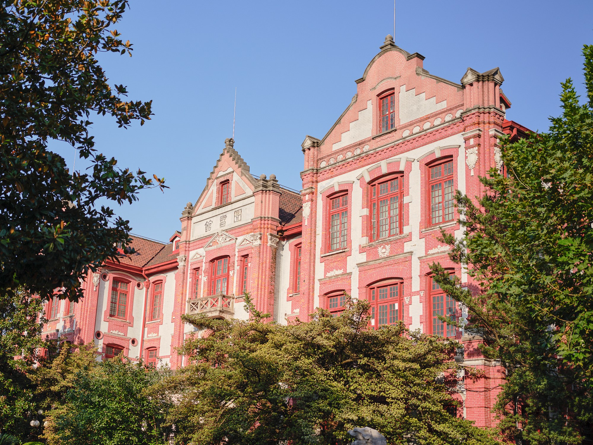
Campus project supported by the Zijiang Foundation
Zijiang Foundation education classroom
Zijiang Foundation partner project site

Brand challenge

In its early years, the foundation concentrated on building its program mechanisms and spoke mainly to younger audiences, with a modern, flexible and energetic brand image. Today it has more opportunities to communicate externally and is reaching a wider public, working closely with like-minded foundations, companies, universities and scholars.

An identity built only around youth no longer matched that stage. Adding a sense of maturity to the existing energy would better reflect the foundation’s growth. At the same time, the core values of integrity, pragmatism, innovation and endurance underpin the brand, and the new identity had to carry them into future communication.

Integrity, pragmatism, innovation, endurance

These four values are the foundation of the Zijiang brand and the benchmark for this refresh.

Updating the brand identity

In-depth conversations with the foundation led to a full review and reassessment of the brand strategy, with a clearer view of its core values and goals. Issues in how the brand system was being applied also came to light and were adjusted in a unified way, so the Zijiang Foundation brand identity communicates its positioning and value proposition consistently and clearly in every context.

Zijiang Foundation brand identity: logo update animation

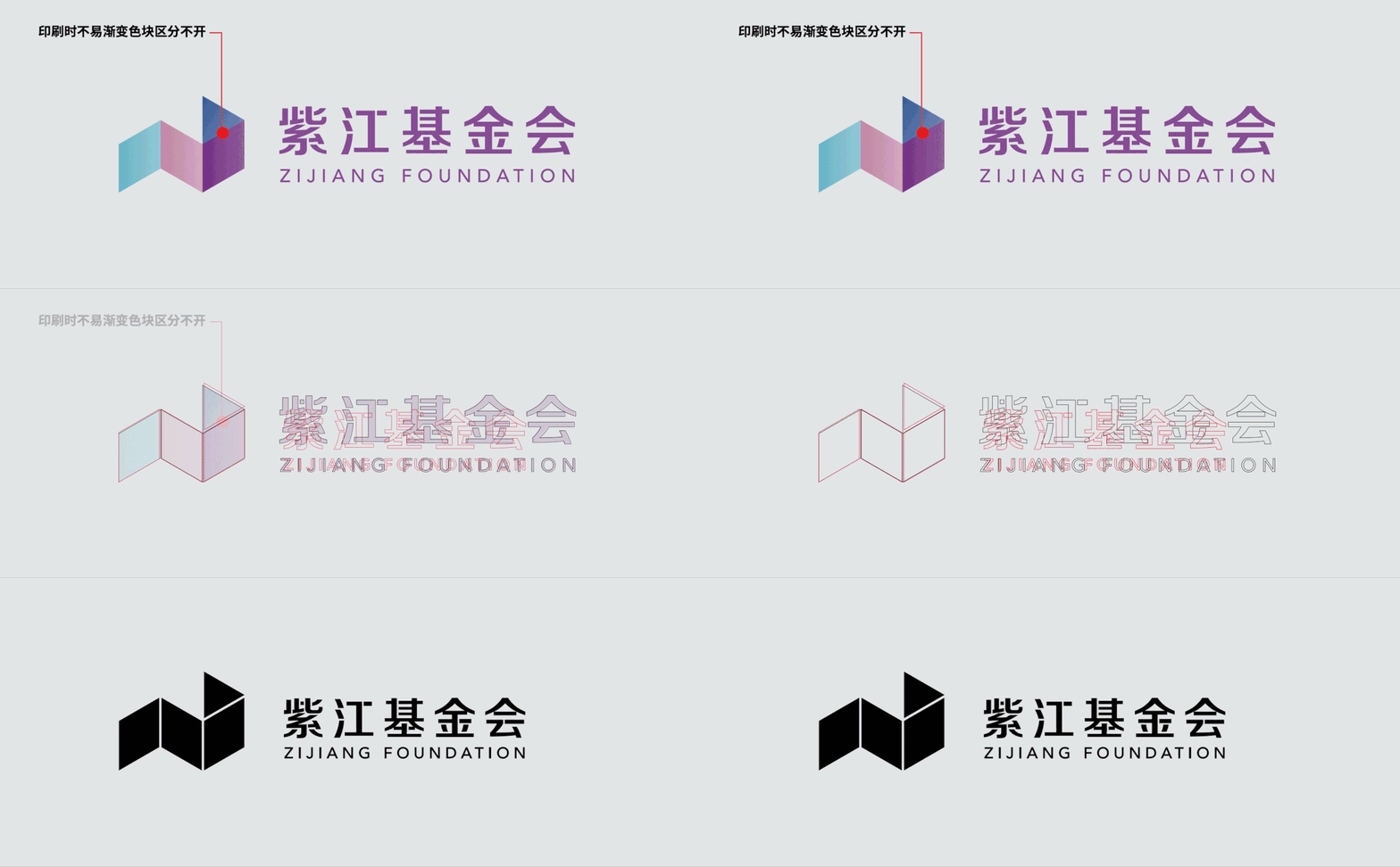
Logo: unified negative space

The original logo used interlocking negative space in its lettering to improve legibility. In the update, that negative space was applied to every character, standardized the spacing and rebalanced the proportion between type and symbol.

The original symbol relied on several gradients in similar hues, which blurred its edges in print and weakened recall. The same negative space now runs through the symbol, giving it a clearer outline and echoing the design language of the lettering.

Zijiang Foundation logo geometry and negative space

Graphics: from one form to a system

The symbol serves as a basic unit that repeats to form the signature pattern of the Zijiang Foundation brand identity.

Like a tangram, the form can be cropped freely into varied fragments. These fragments make up a set of supporting graphics used across key visuals.

Zijiang Foundation brand identity graphics and pattern

Color and imagery

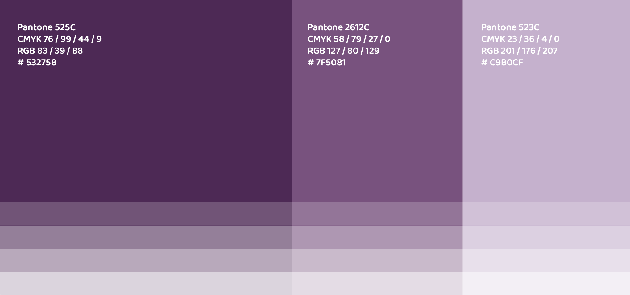
Youthful energy and professional responsibility define the Zijiang personality. The Zijiang Foundation brand identity includes a rich color system and image guidelines, so it adapts to different contexts and shifts emphasis for different audiences.

Two audiences, two emphases

The wider public
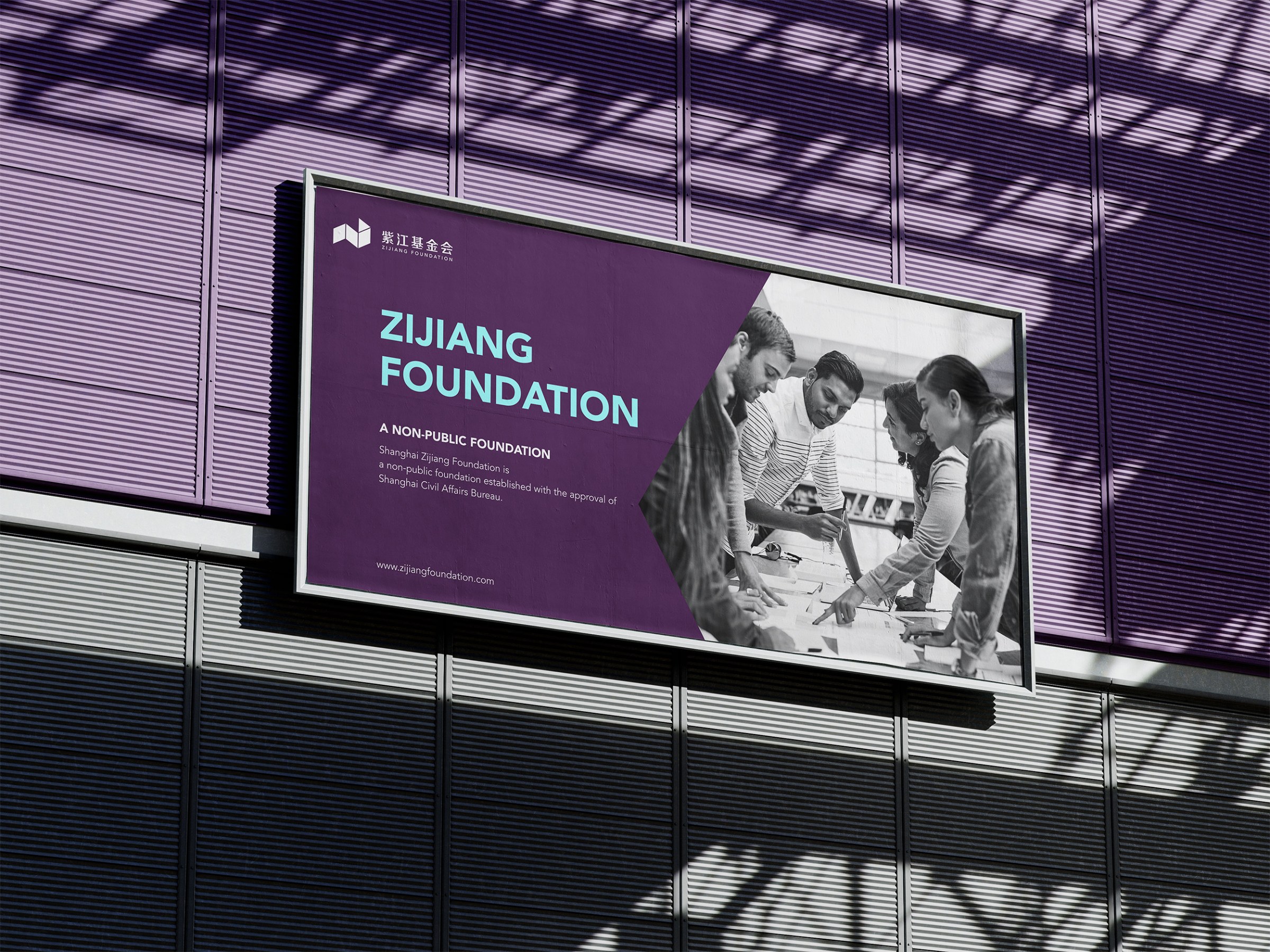
The emphasis is on integrity and pragmatism. Purple, the brand’s signature hue, leads, and imagery is treated in black and white at low contrast to soften distance and suit the foundation’s character.

Students
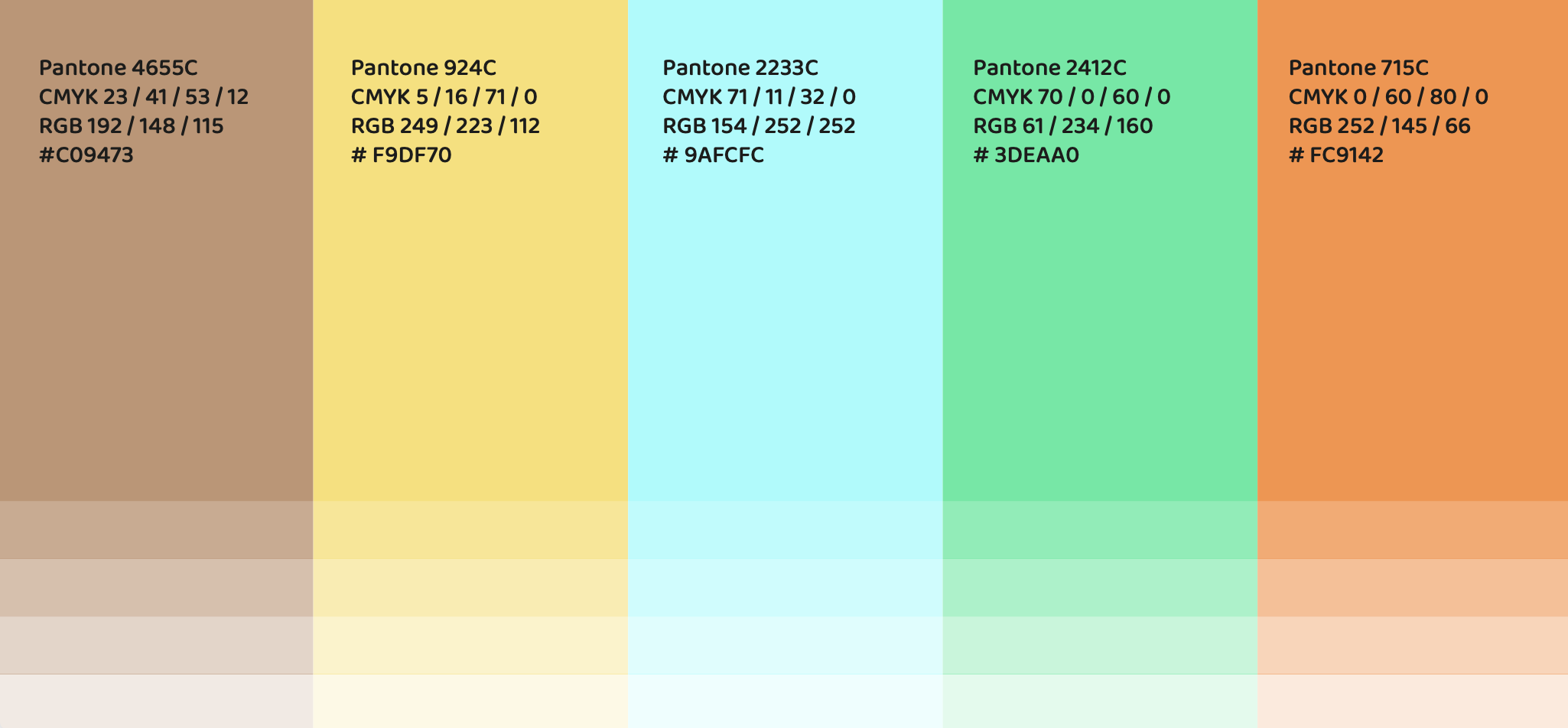
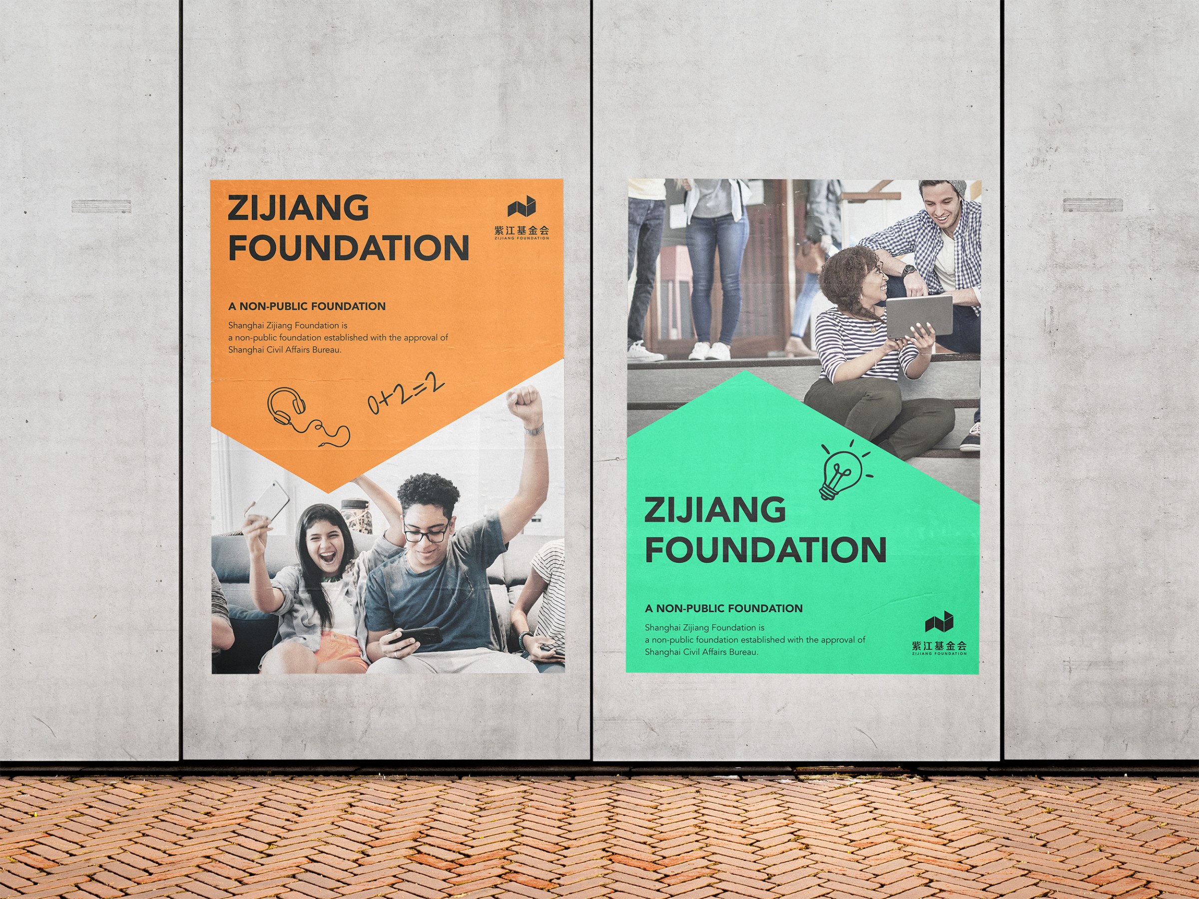
The emphasis is on innovation and endurance. Bright supporting colors pair with low-saturation imagery for a modern feel, and the many combinations reflect the adaptability of young people.

Zijiang Foundation color system for the wider public
Zijiang Foundation color system for students

Illustration: the warmth of hand drawing

Illustration was added to the visual elements. A hand-drawn style feels natural and gives imagination room to run. Its texture carries warmth and approachability that cold digital graphics lack, which helps build emotional connection and resonance.

Zijiang Foundation brand illustration icons

Brand applications

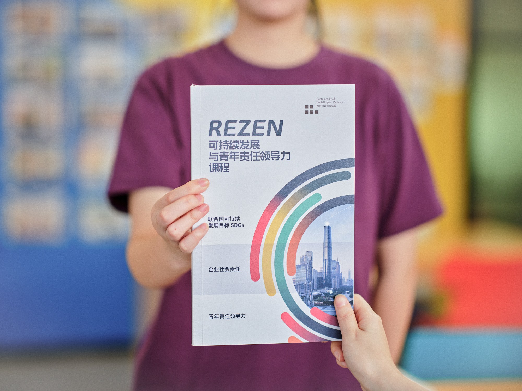
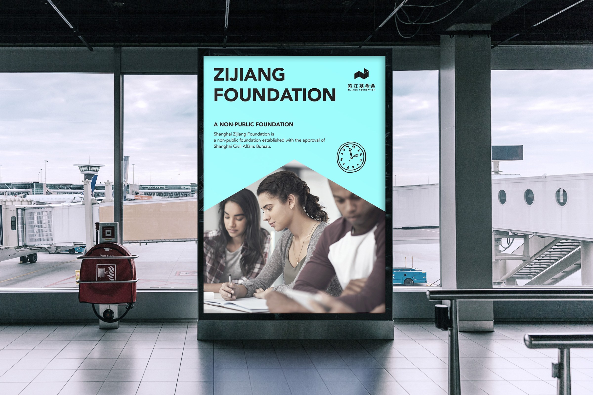
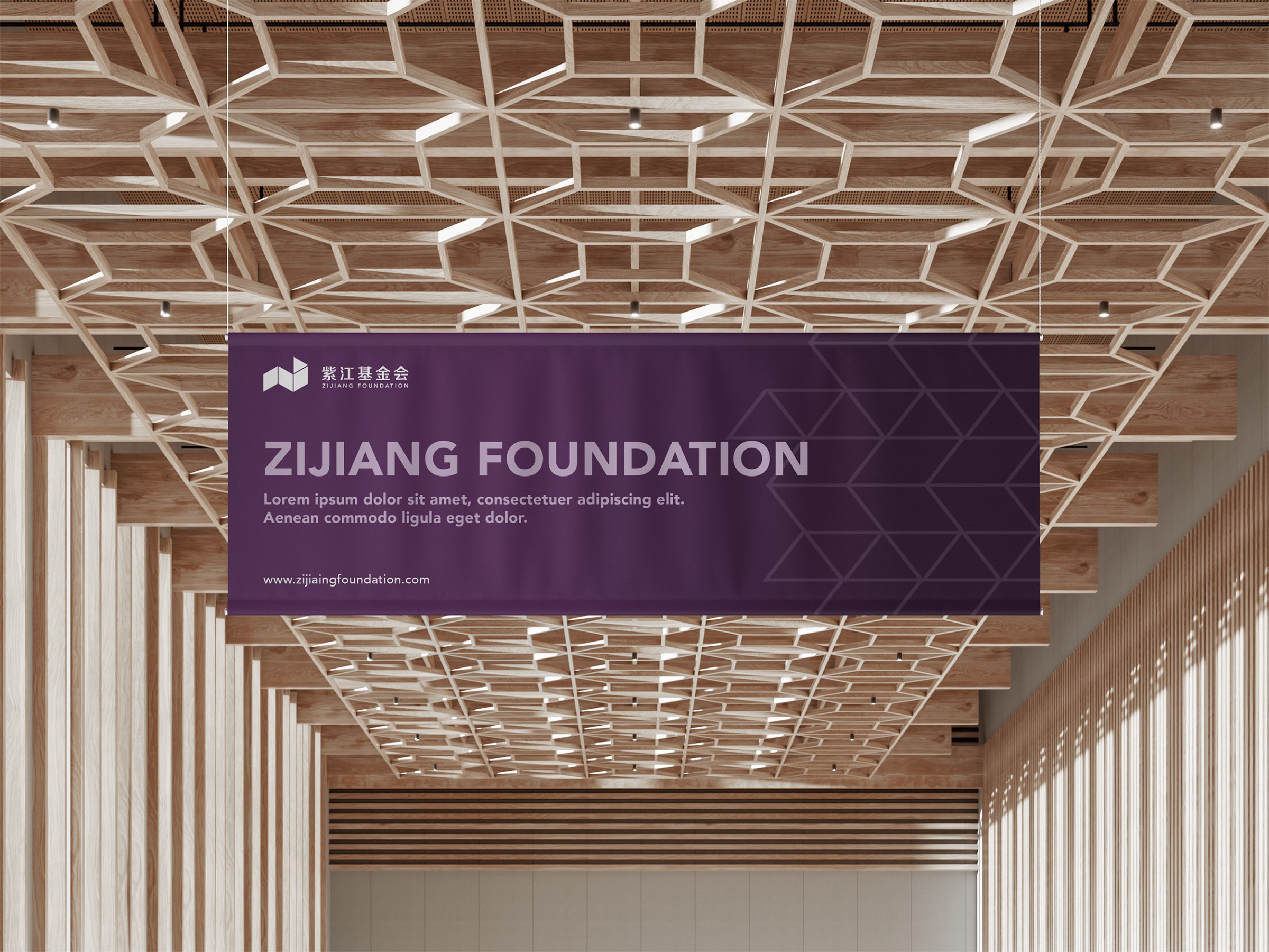
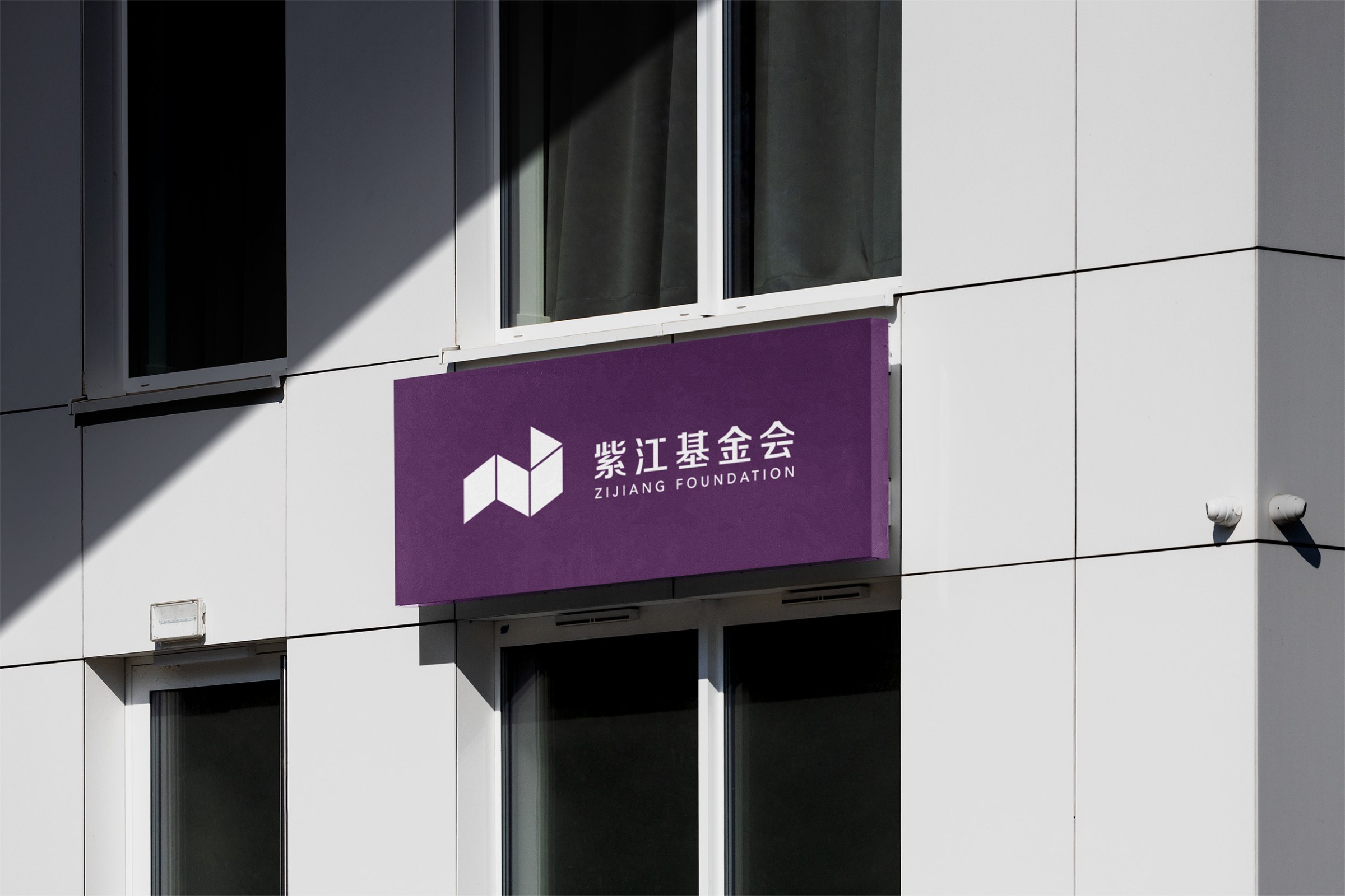
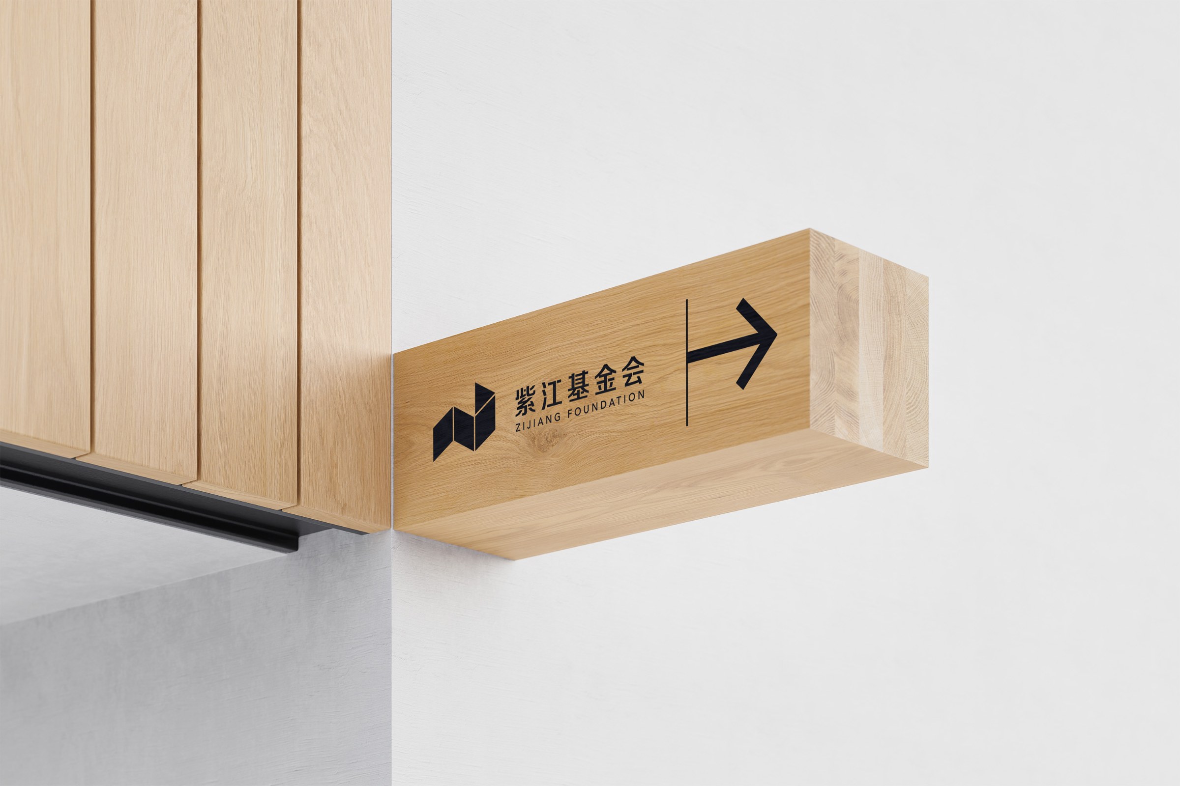
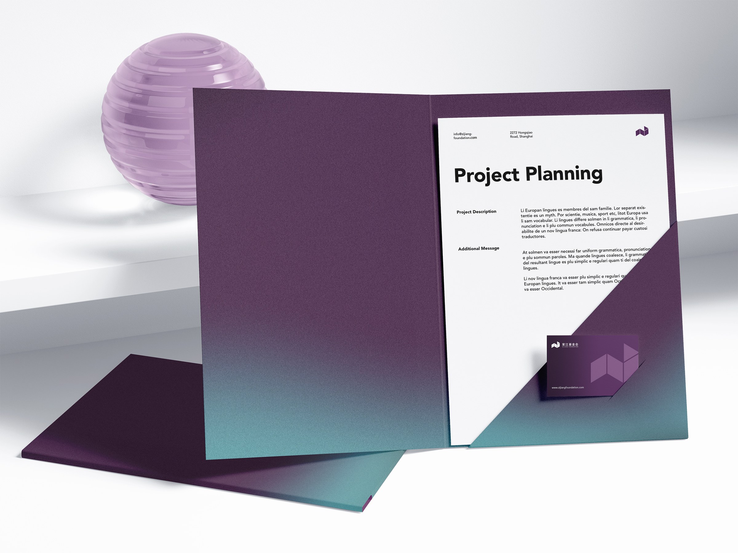
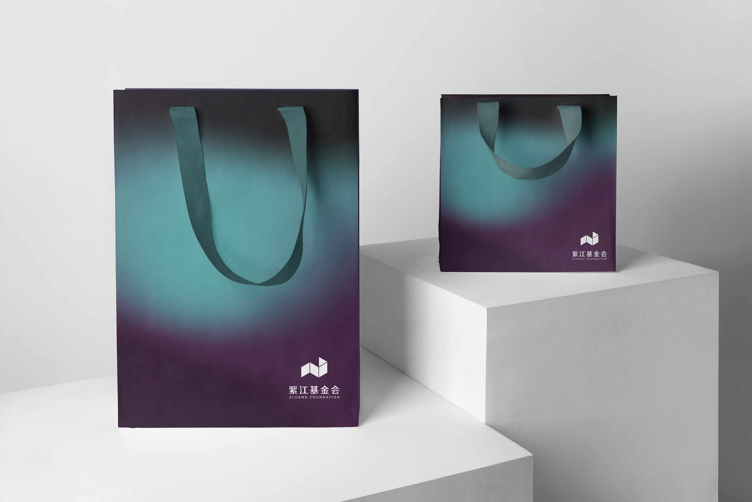
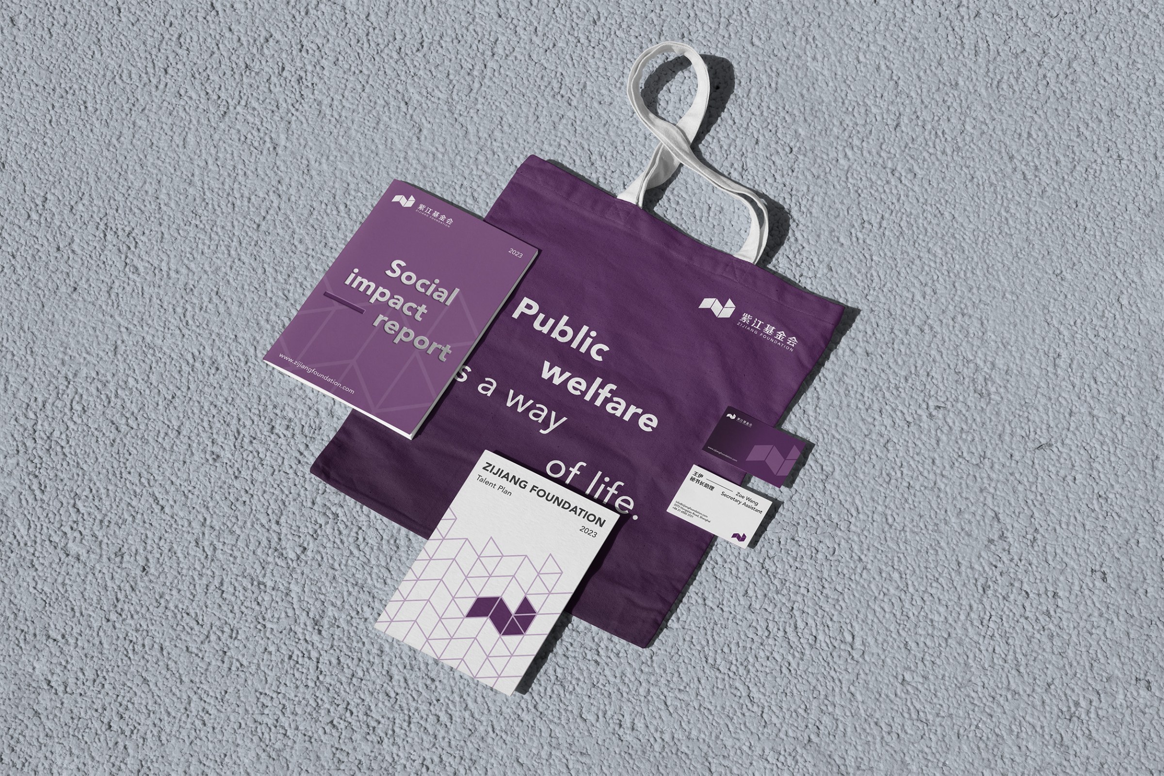
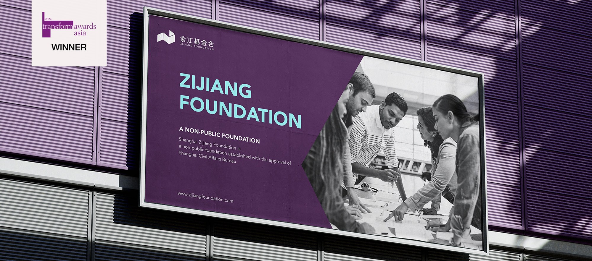
The Zijiang Foundation brand identity extends to outdoor billboards, posters, ceiling and signage applications, a wayfinding system and office stationery, along with the official website.

Zijiang Foundation brand identity on an outdoor billboard
Zijiang Foundation poster application
Zijiang Foundation key visual poster
Zijiang Foundation ceiling application
Zijiang Foundation signage application
Zijiang Foundation wayfinding system
Zijiang Foundation folder
Zijiang Foundation tote bag
Zijiang Foundation office stationery

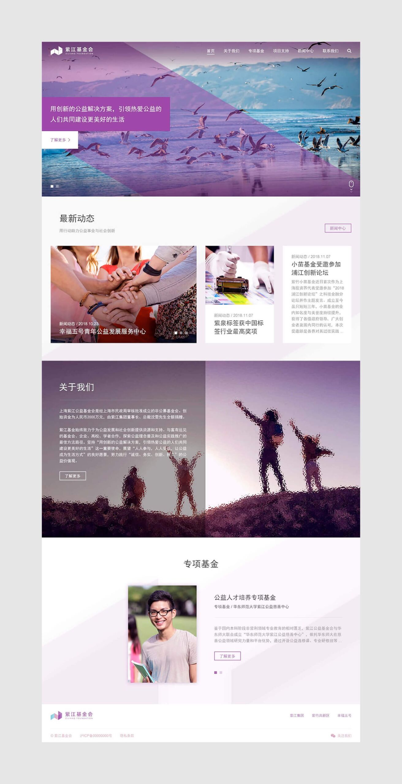
Official website

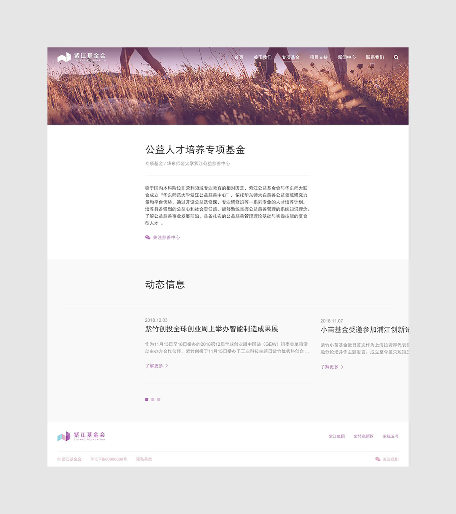
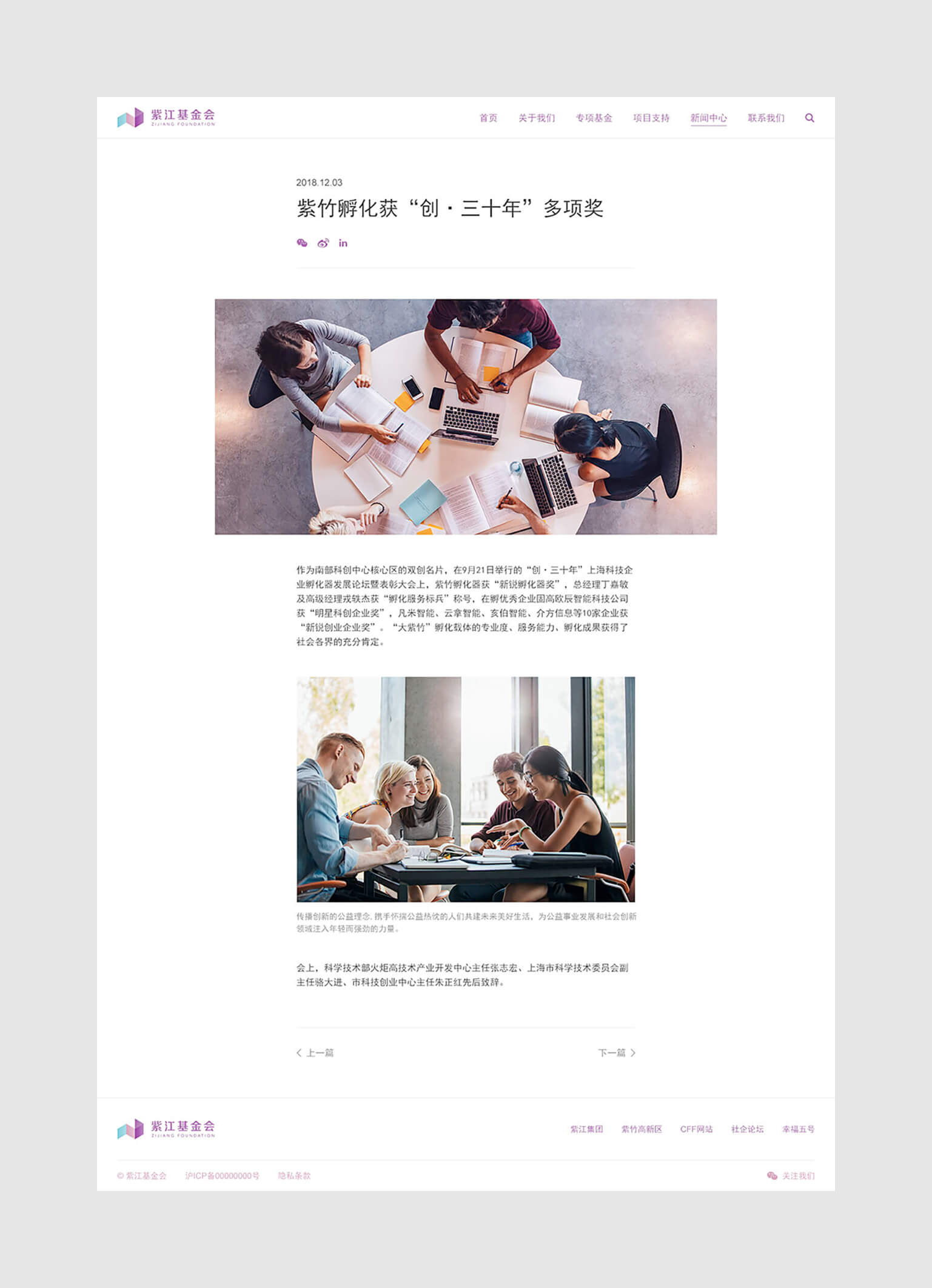
The website extends the Zijiang Foundation brand identity online, presenting the foundation’s programs, philosophy and news in the new visual language. Visit the Zijiang Foundation website to learn more.

Zijiang Foundation website homepage banner
Zijiang Foundation website page one
Zijiang Foundation website page two
Zijiang Foundation website page three
An ongoing partnership

The Zijiang Foundation brand identity continues to grow with the Shanghai Zijiang Foundation’s work in philanthropy and social innovation. For another non-profit brand project, see Wisheye Charity brand design.

Frequently asked questions

The Zijiang Foundation brand identity project was a brand upgrade for the Shanghai Zijiang Foundation. The brand strategy was reviewed, the logo and visual system renewed, and the result extended to applications and the official website.

The earlier identity was youthful and flexible, which suited the foundation's early stage. As the foundation began communicating with a wider public and working with more foundations, companies, universities and scholars, the identity needed more depth, while integrity, pragmatism, innovation and endurance stayed at its core.
The interlocking negative space in the original lettering was applied to every character, with standardized spacing and a rebalanced proportion between type and symbol. The same negative space now runs through the symbol, replacing gradients in similar hues whose edges blurred in print.

For the wider public, purple leads and imagery is black and white with lower contrast, which emphasizes integrity and pragmatism. For students, brighter supporting colors and low-saturation imagery emphasize innovation and endurance.

Silver at Transform Awards Asia 2024, in the Best Visual Identity, Charity, NGO or NFP category.