WINSUN Group

The WINSUN Group brand design project is a full-scope engagement that began with brand strategy and group architecture and built a forward-looking corporate brand system for a food industry group. By clarifying the brand architecture and creating an orbit-inspired visual system, the project brings diverse businesses into one scalable identity that supports the group’s growth and international expansion. The project is a German Design Award 2027 Winner.

Coexisting in Diversity, Moving Forward

Client
Industry
Services
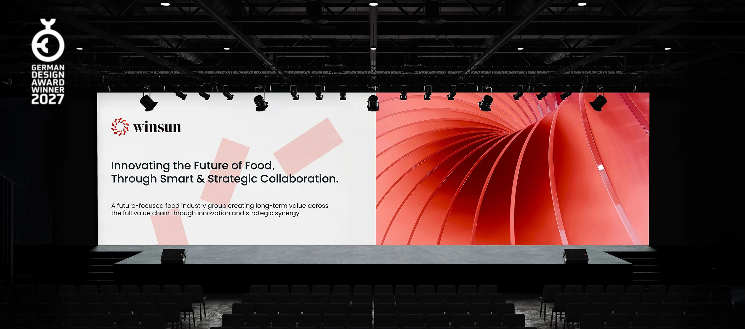
WINSUN Group brand design banner | 万顺集团品牌设计主视觉

WINSUN Group Brand Design at a Glance

  • WINSUN Group is an industry group in food manufacturing and food technology, formerly known as W Group.

  • taasdesign provided group brand architecture strategy, group brand positioning and strategy, and group brand design for WINSUN Group.

  • The project established a two-tier brand architecture. WINSUN Group is the top-level corporate brand and SHUNDA Group is the business-level B2B brand.

  • The WINSUN visual system is inspired by orbits and rotation. The logo uses two spiral structures extending upward, and supporting graphics are built from orbits and arcs.

  • Supported by the new brand system, the group continues to deepen its domestic market and has entered overseas markets, where it already works with a range of local companies.

  • The project is a German Design Award 2027 Winner.

A Group Evolving with Its Business

WINSUN Group was formerly known as W Group. Over many years the group widened its footprint and built a diversified system across food-related fields, with business units, subsidiaries, factories and multiple brands operating in parallel, forming a complete and complex business network. W Group had long served as the top-level organizing function and supported the growth of each business. As business units, subsidiaries and segments multiplied, the group evolved from a single structure into a layered system with closer coordination. It needed a clearer, more unifying corporate-level expression to hold the expanding organization together and to give the outside world one consistent, stable point of recognition.

The top-level group needed to grow from its earlier coordinating role into a corporate entity that represents overall strategy and long-term direction. Each business segment also needed a clear place within the same framework, with defined hierarchy and coordination logic. The brand therefore began to take on organizational integration and structural expression, going beyond the presentation of existing businesses.

WINSUN logo on a corporate office building facade

Architecture Strategy, Redefining the Group Hierarchy

The project focused on structural evolution at the corporate level. W Group evolved into WINSUN Group, a corporate brand system built to carry the group’s future. The new name is only the visible layer. Behind it is a systematic upgrade of how the group expresses its corporate hierarchy and overall brand structure, giving strategic direction a clearer home and the group a single outward voice.

New Brand Architecture

Top-Level Brand

WINSUN Group, as the top-level corporate brand, carries the group’s overall identity and strategic expression and serves as the main point of entry for outside recognition.

Business-Level Brand

SHUNDA Group, as the business-level B2B brand, keeps connecting with markets and customers and carries forward the industry experience and operating capability built in the existing business.

This architecture moves the group’s expression away from scattered business presentations toward a system with clear hierarchy and consistent logic. The brand links organizational structure with external perception, so a diversified group can communicate in a clearer and more consistent way.

WINSUN logo on a dark jacket

Brand Strategy, Clarifying Role and Narrative

Once the architecture was clear, the next question was more fundamental. Who is this enterprise? Building on the architectural shift, the brand strategy defined the following.

  • The division of roles between the corporate level and the business level

  • The group’s overall expression logic and narrative approach

  • A forward-looking direction and the basis for trust

The brand now serves as a shared reference inside the organization and a unified vehicle for outward expression, with a role that extends beyond communication. WINSUN has a clear corporate identity, so stakeholders can see who the group is, what it does and where it is heading.

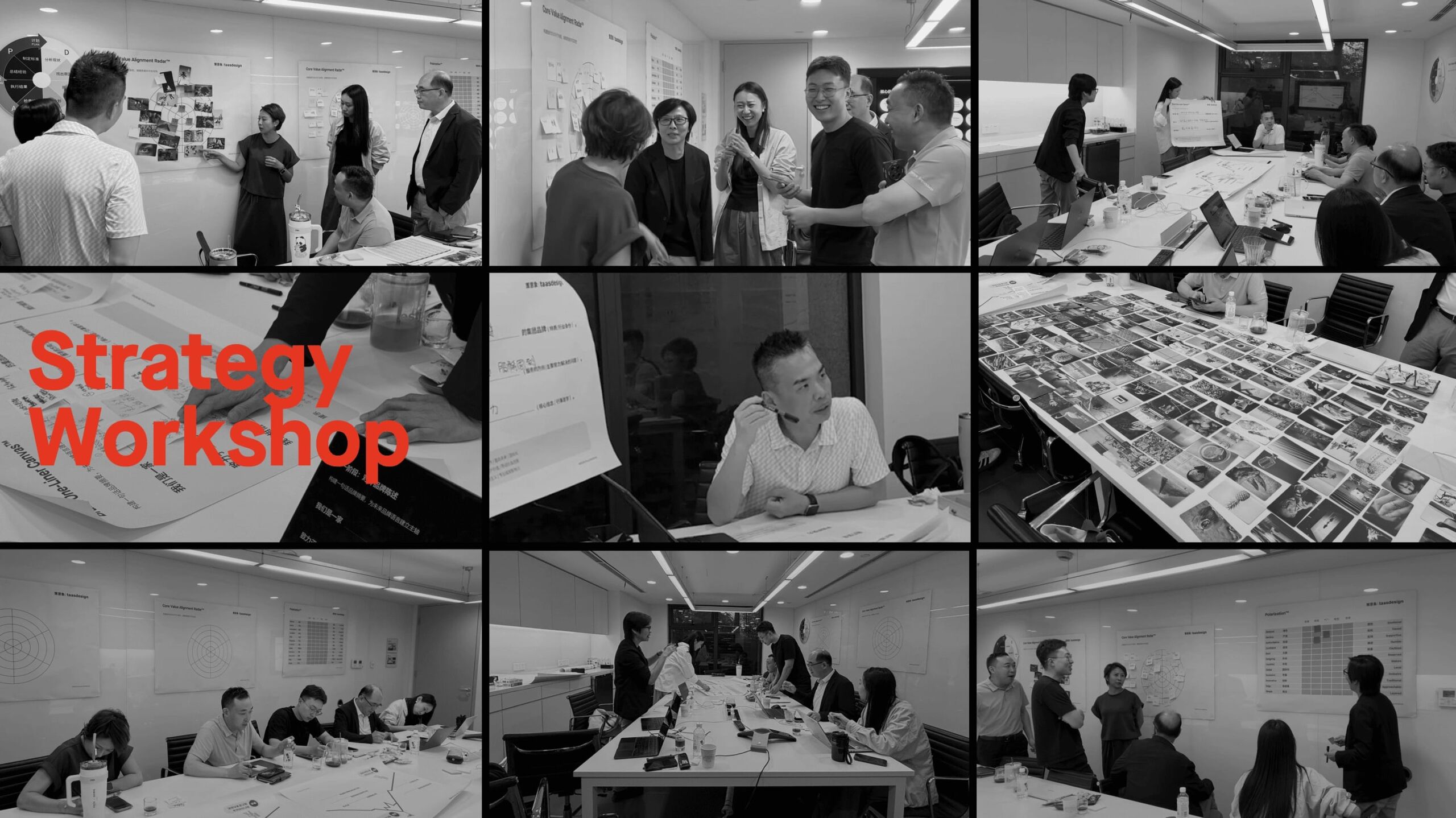
WINSUN Group brand strategy workshop
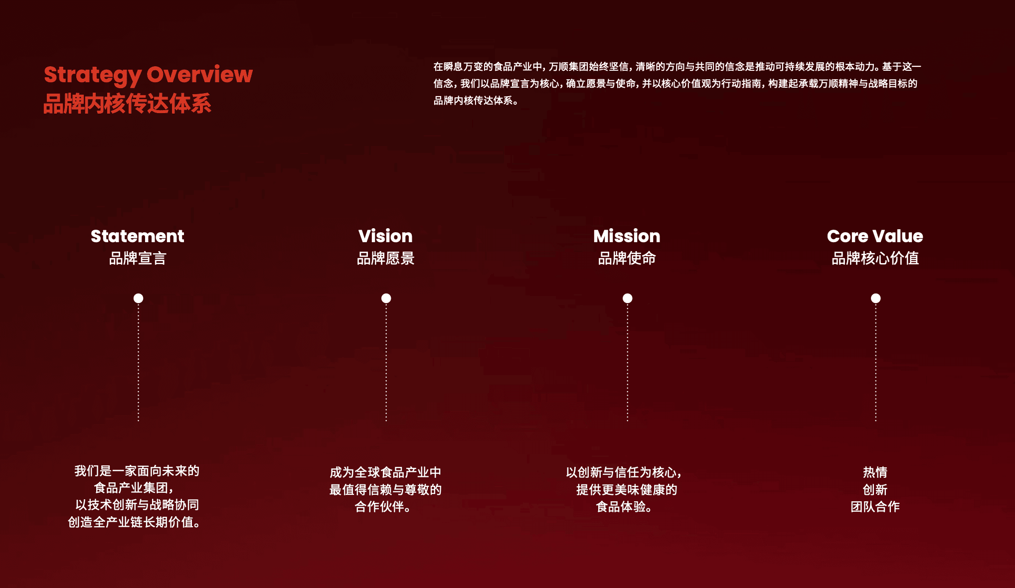
WINSUN Group brand strategy overview

Visual System
Orbit logic that shows how the organization works

The WINSUN visual system starts from how the organization operates. Its core concept comes from a simple observation. A group is made of many business units that keep running and stay connected to one another, and it is never a single entity.

We turned this relationship into a visual language, a system structure in constant motion. The logo draws on orbits and rotation. Business units are treated as structures operating within one system, each independent yet coordinated around a shared center.

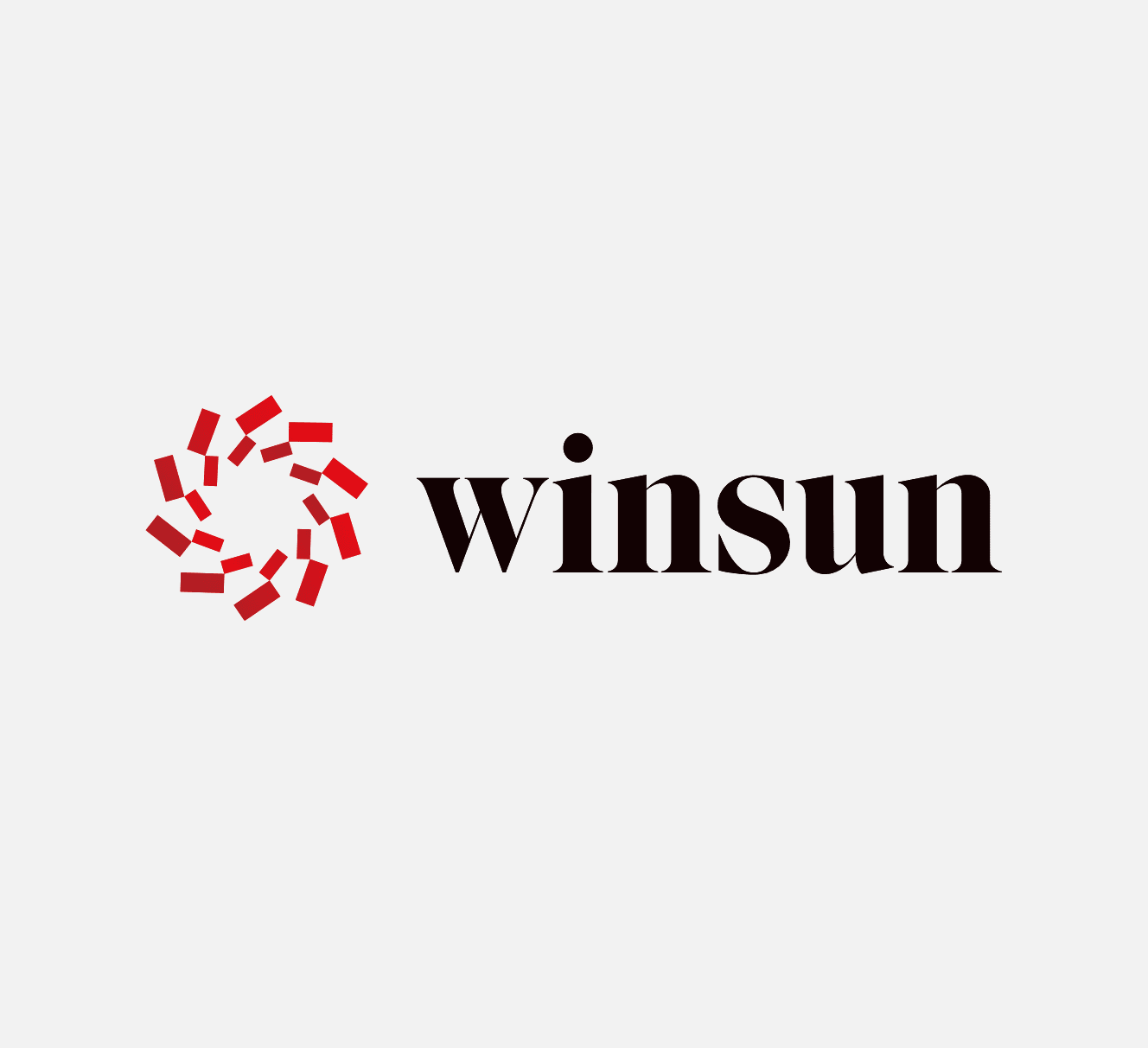
WINSUN Group logo
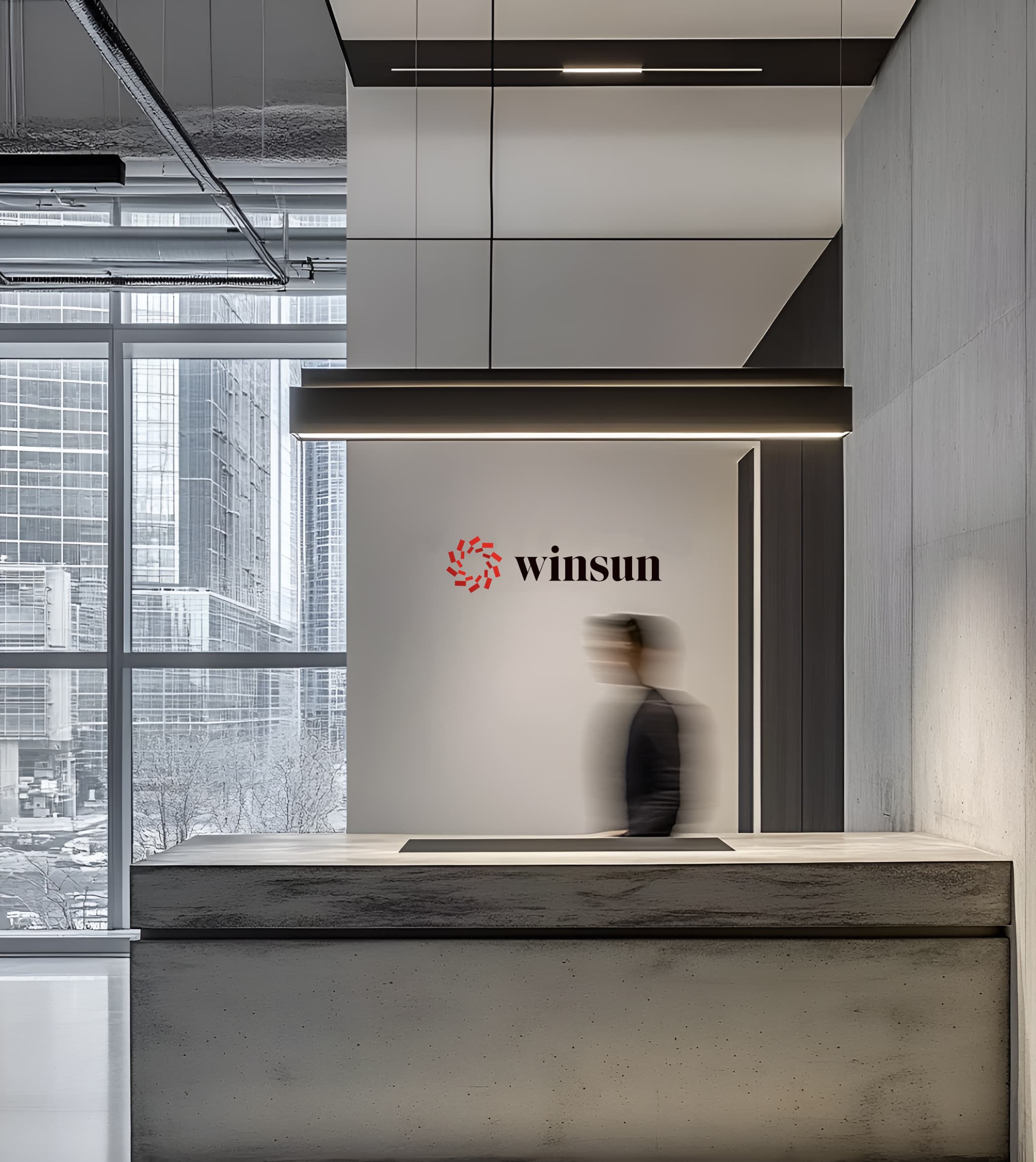
WINSUN logo on the reception wall of a corporate lobby

Two spiral structures extending upward signal an organization moving forward and imply a direction of long-term growth. The same logic runs through the entire visual system. Supporting graphics are built from orbits and arcs, and variations in scale, angle and rhythm produce an expression that is unified without repeating itself.

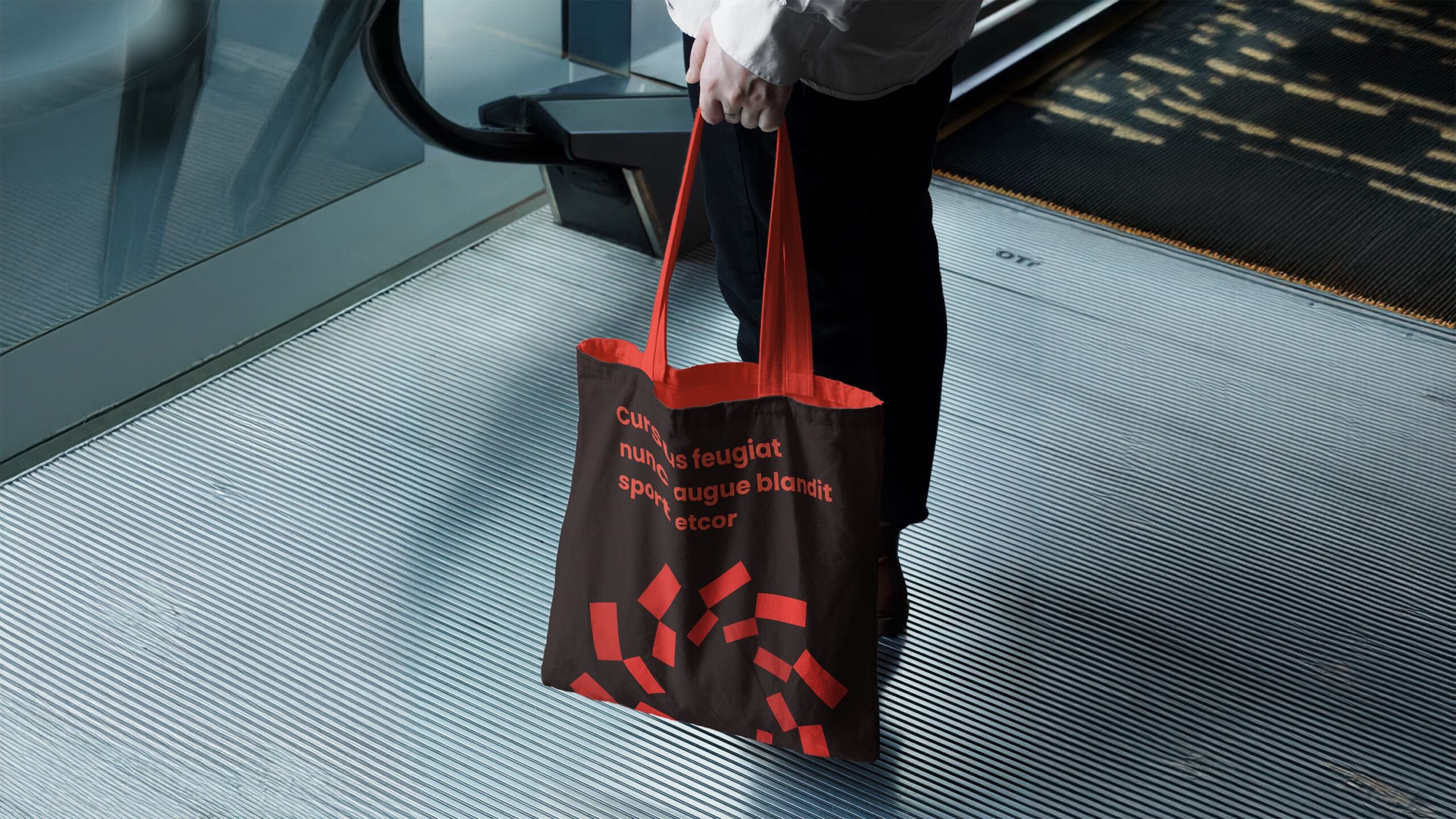
WINSUN tote bag with orbit pattern
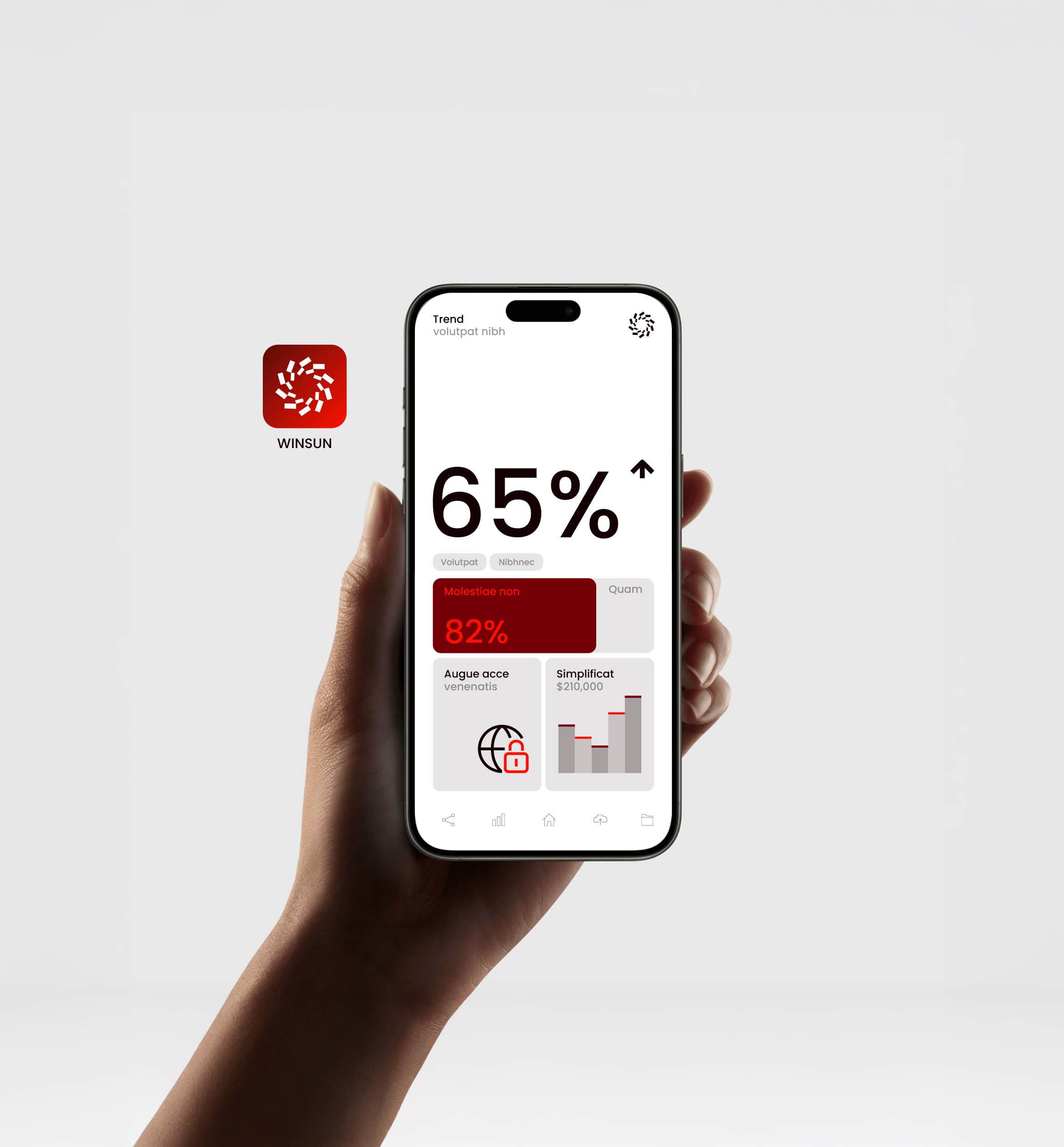
WINSUN app icon and data interface on a smartphone

The system looks varied, yet one set of rules sits behind it. It works as a rule structure that can keep expanding, and it is not a fixed layout. New businesses or brands can join naturally without breaking the overall identity logic. What the system finally shows is an organization in operation.

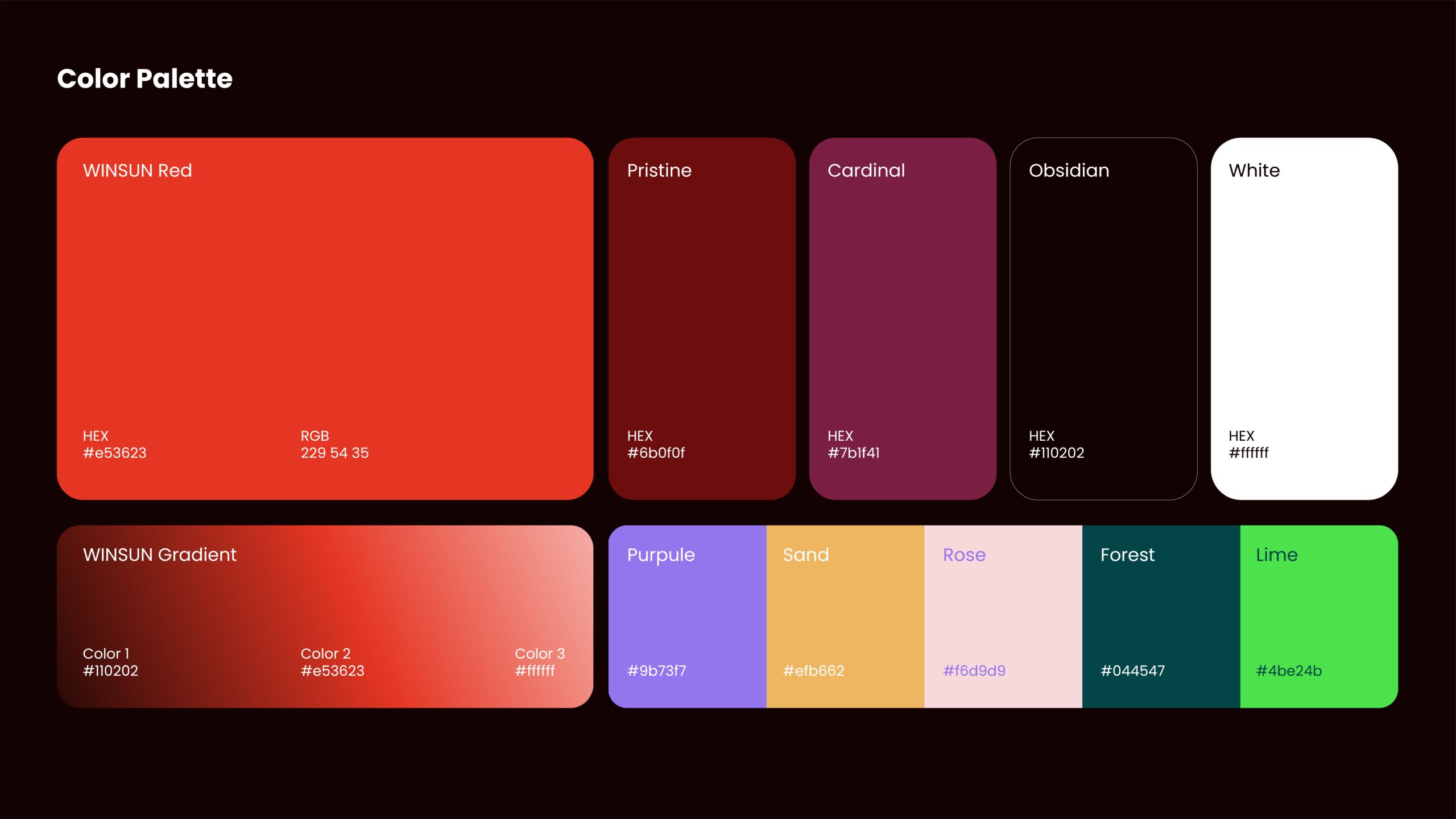
WINSUN color system
WINSUN corporate presentation slide
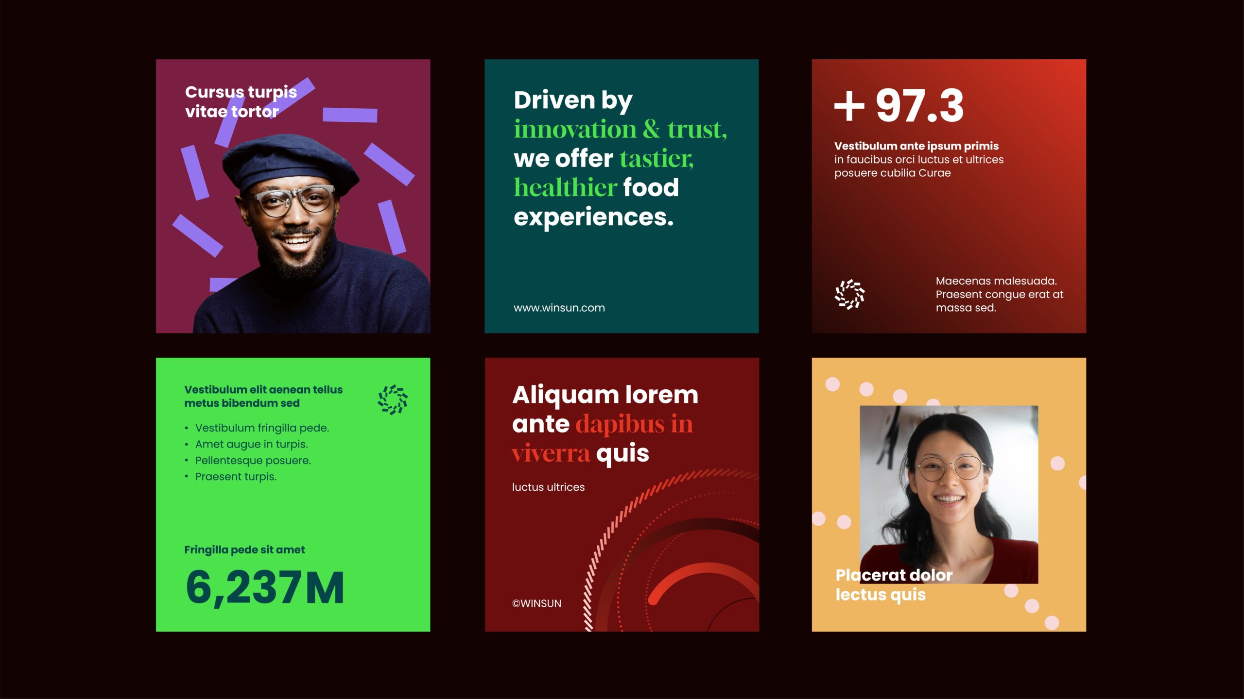
WINSUN brand communication layout
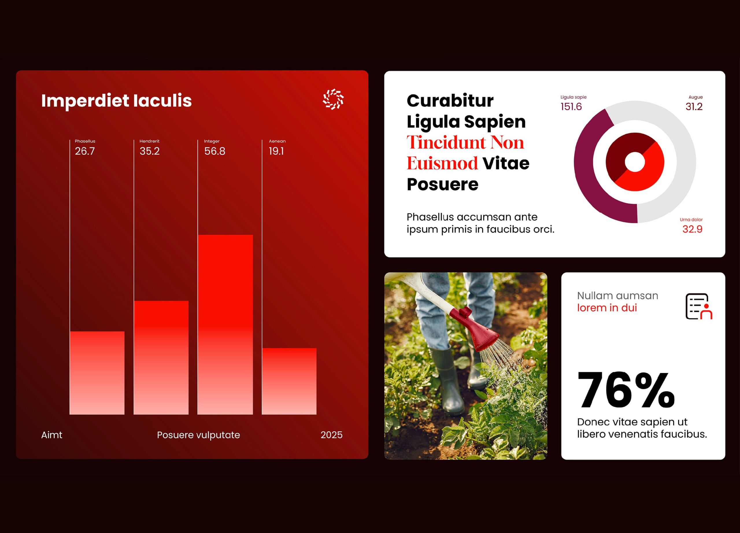
WINSUN data visualization and infographic layout
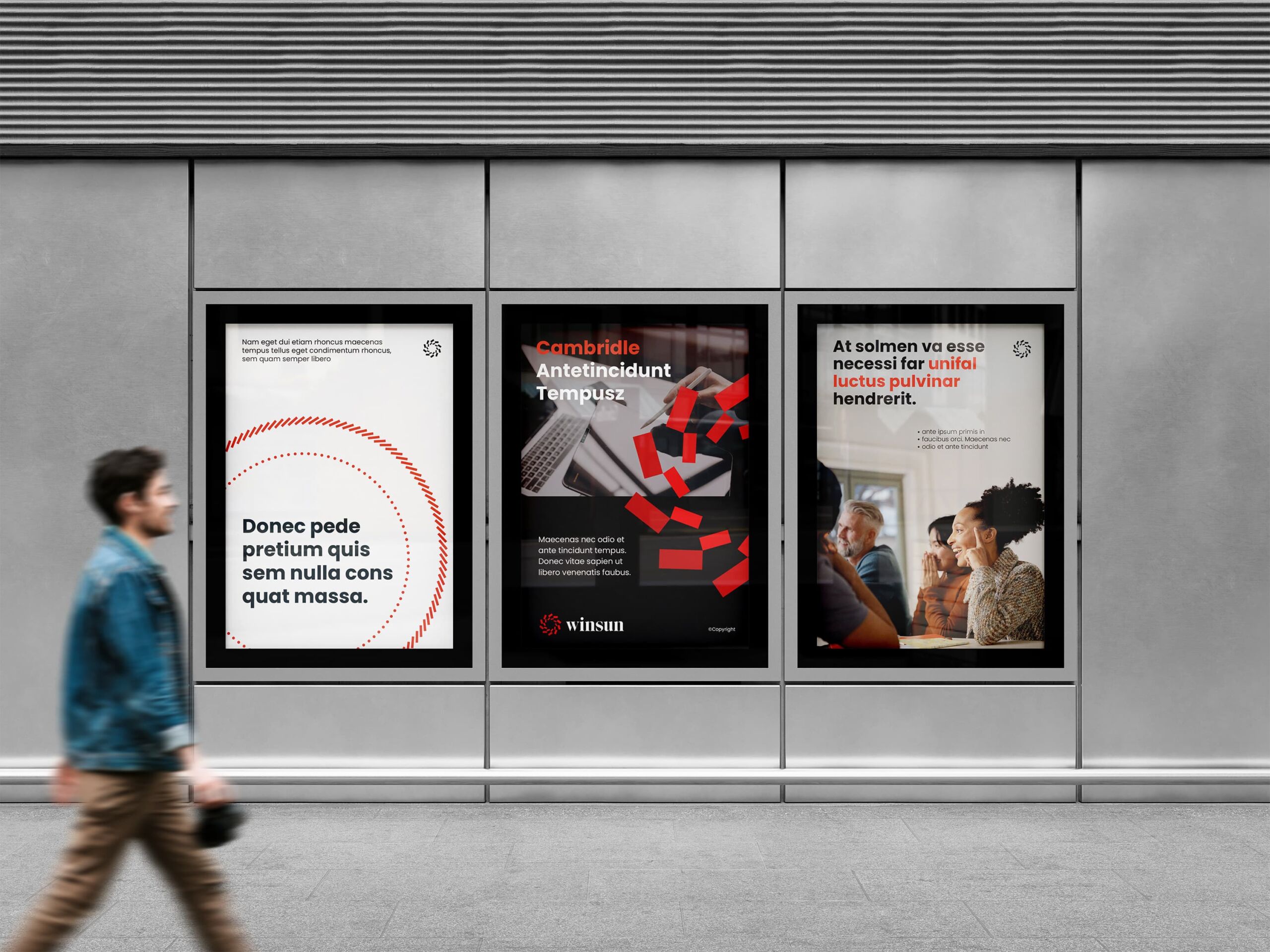
WINSUN poster series display
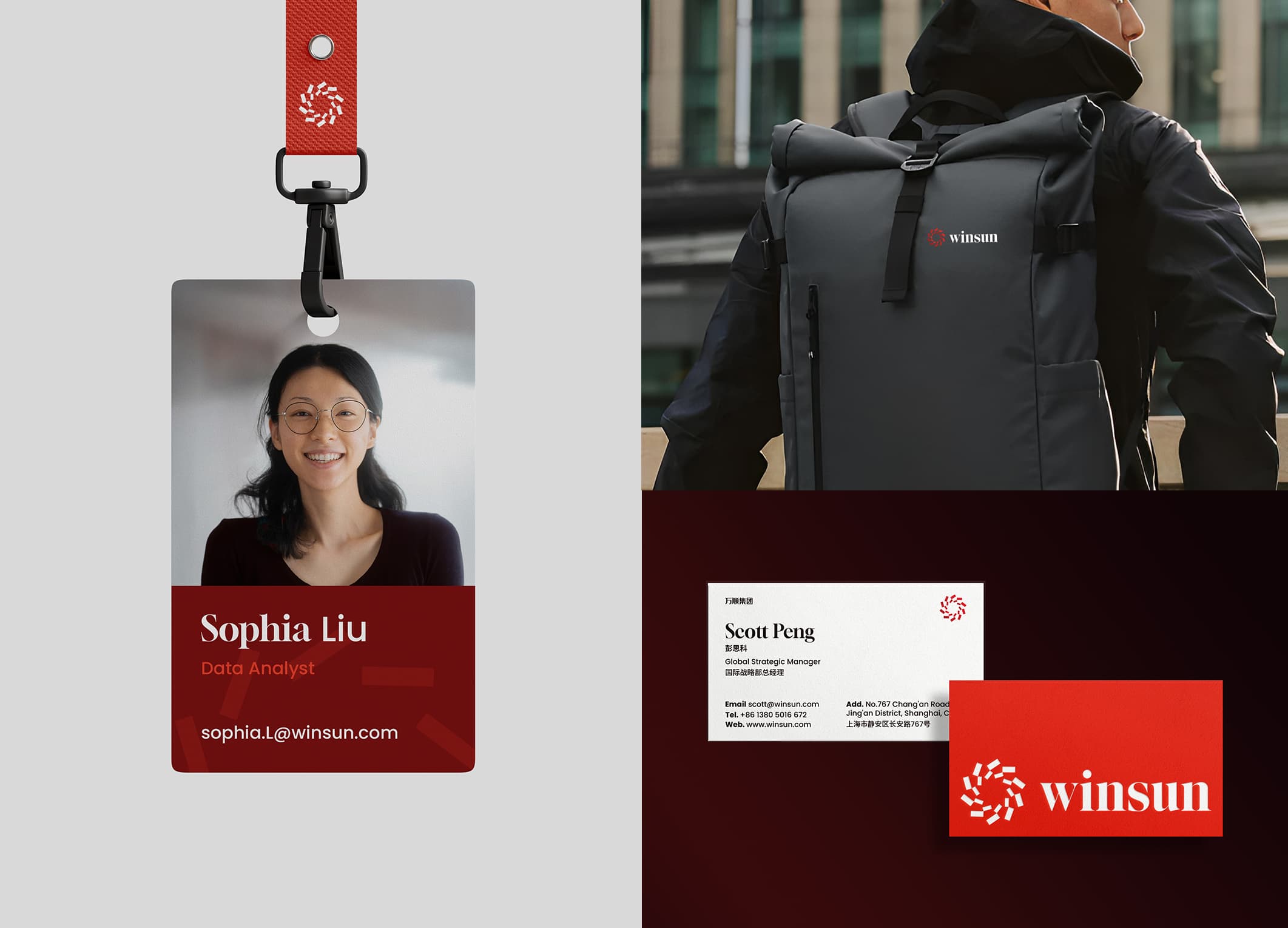
WINSUN employee badge, business card and backpack

A Group Brand Still Growing

With the brand architecture and visual system rebuilt, WINSUN entered a new stage with a clearer, more unified and more scalable corporate identity. Supported by the new brand system, the group continues to deepen its presence in the domestic market, strengthening its industry capability in food-related fields and the coordination efficiency across its businesses, while accelerating its overseas expansion. The group already works with a range of companies abroad, and its brand expression now speaks to markets with a global outlook.

From W Group to WINSUN, the brand update brought a parallel upgrade in organizational structure and expression. A long-developing enterprise system is now presented, for the first time, in a way that is clear, understandable and scalable. WINSUN will keep growing steadily on its existing businesses, maintain its industry depth, and widen its international partnerships, working toward becoming a food-sector group with lasting competitiveness and long-term influence.