HPW GROUP
Reimagining Classic Value
Client
-
HPW Group
Industry
-
Logistics
Our work
-
Brand Strategy
Rebranding
Carrying a Legacy Forward into a New Era of Diversified Global Growth
HPW Group was established in 1975 as a diversified enterprise spanning frozen foods, entertainment and real estate. Through decades of market cultivation and continuous development, the HPW brand has become a leading name in the frozen food industry. Its signature fish balls and processed food products have also become an essential companion to hot pot and family dining tables.
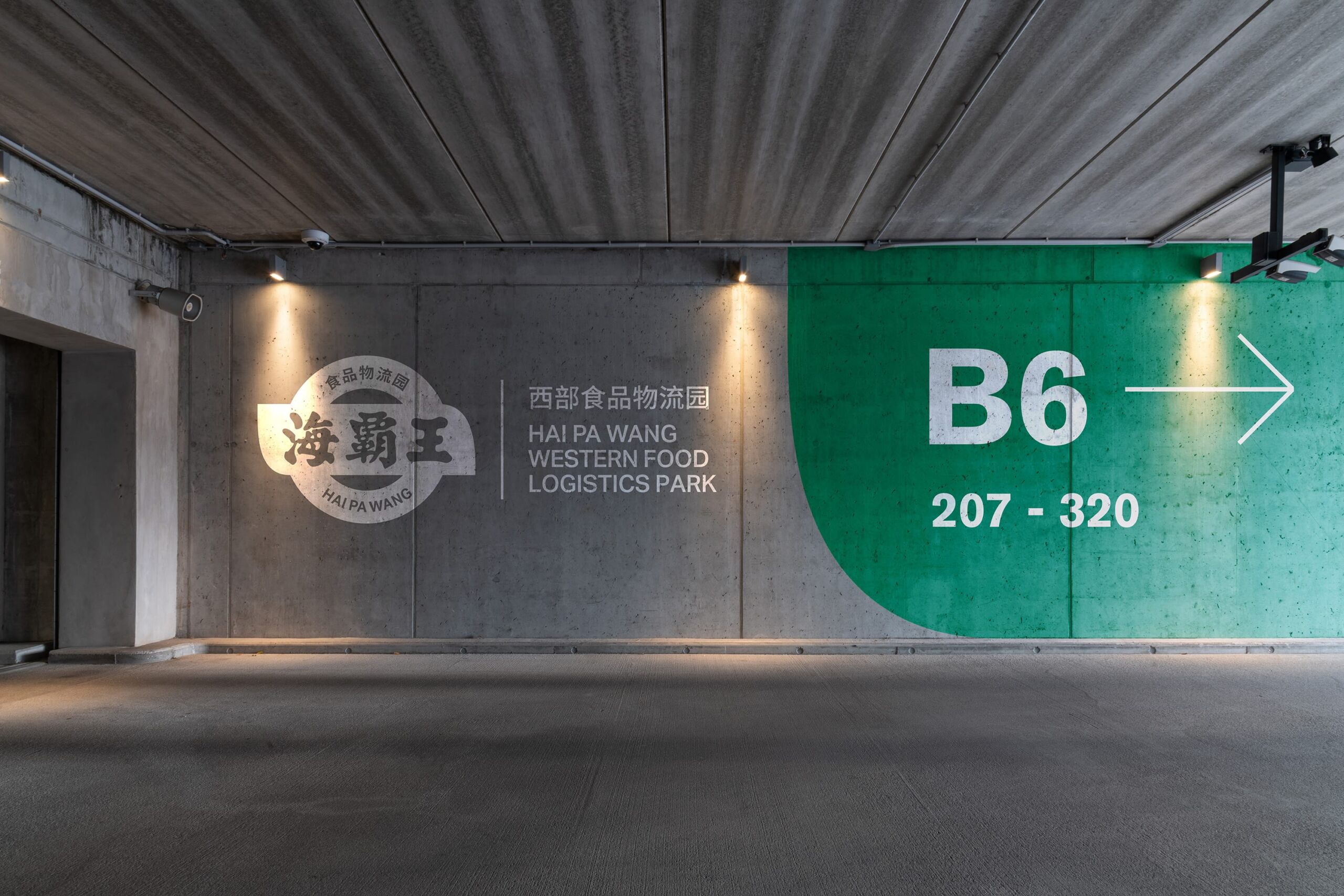
HPW has consistently invested significant effort in expanding its market presence. Its Western China Food Logistics Park in Chengdu, Sichuan, has become the largest food logistics park in Southwest China. Looking ahead, HPW Group plans to expand into additional commercial sectors, including food and beverage and hospitality, further extending its business footprint. To support this next stage of development, HPW required a renewed brand identity—one that could better reflect its ambitions as a diversified, international and contemporary group, while preserving the brand assets built over decades and enhancing its overall brand value.
Brand Diagnosis
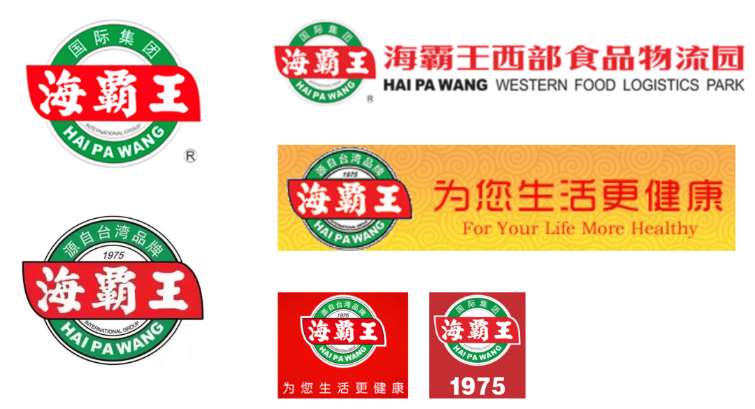
The HPW brand identity has been presented in a variety of ways across different applications. In particular, the relationship between the corporate logo, subsidiaries and brand taglines has yet to be defined within a consistent and unified system. A clearer structure for logo usage and brand hierarchy would help establish a more cohesive and well-governed brand identity system.
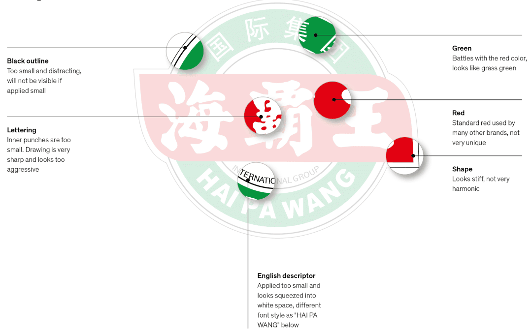
Through an in-depth review of the existing logo, we identified opportunities for refinement in areas including typography, colour balance and overall form. By revisiting and optimising these details, the logo could be renewed with a more contemporary expression.
Brand Identity
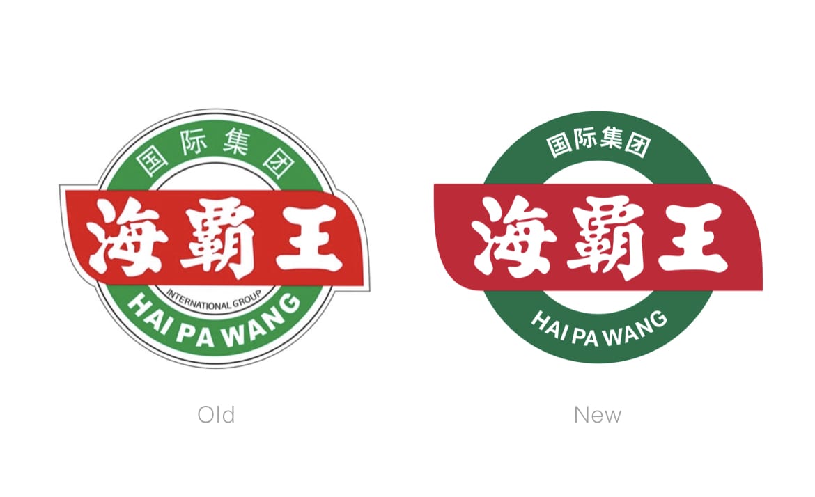
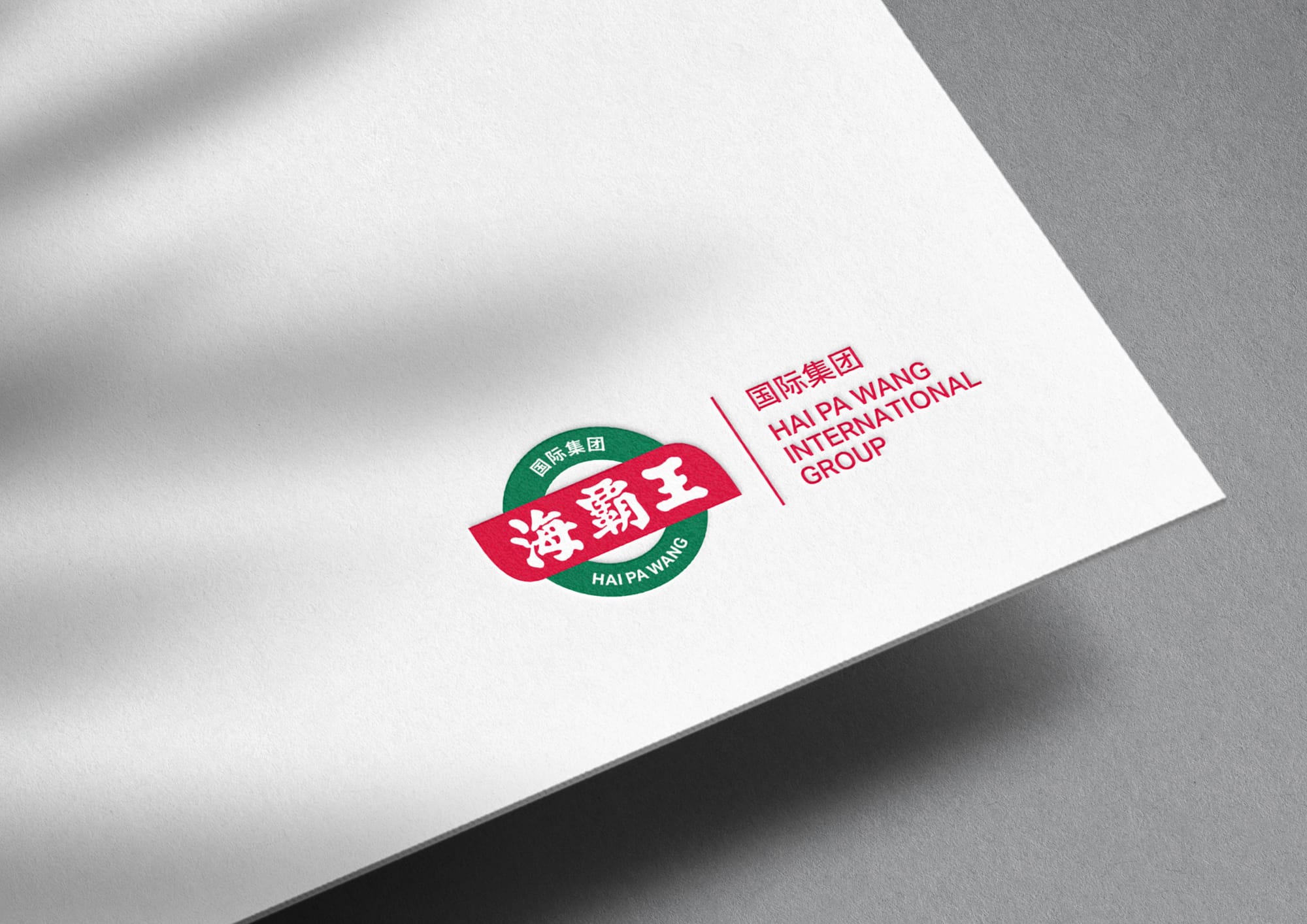
Building on the brand assets HPW has accumulated over the years, the existing logo was reimagined with a more contemporary approach. While retaining its core recognisable characteristics, the graphic structure was simplified and visual proportions were refined, resulting in an identity that feels cleaner, sharper and more aligned with an international and modern brand presence.
The colour system was also redefined, with the iconic red and green retained as key elements of the brand’s visual heritage. Through more refined colour relationships and applications, the renewed palette strengthens brand recognition while elevating the overall sense of quality and professionalism, creating a more flexible visual foundation for HPW’s future diversification and international growth.
Brand Applications
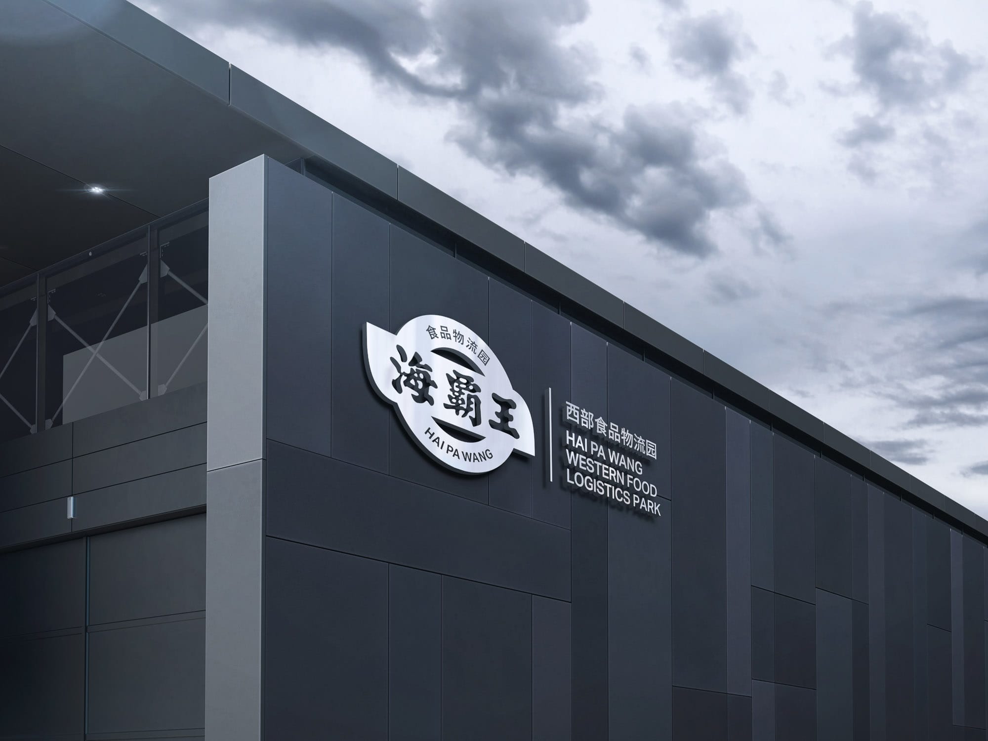
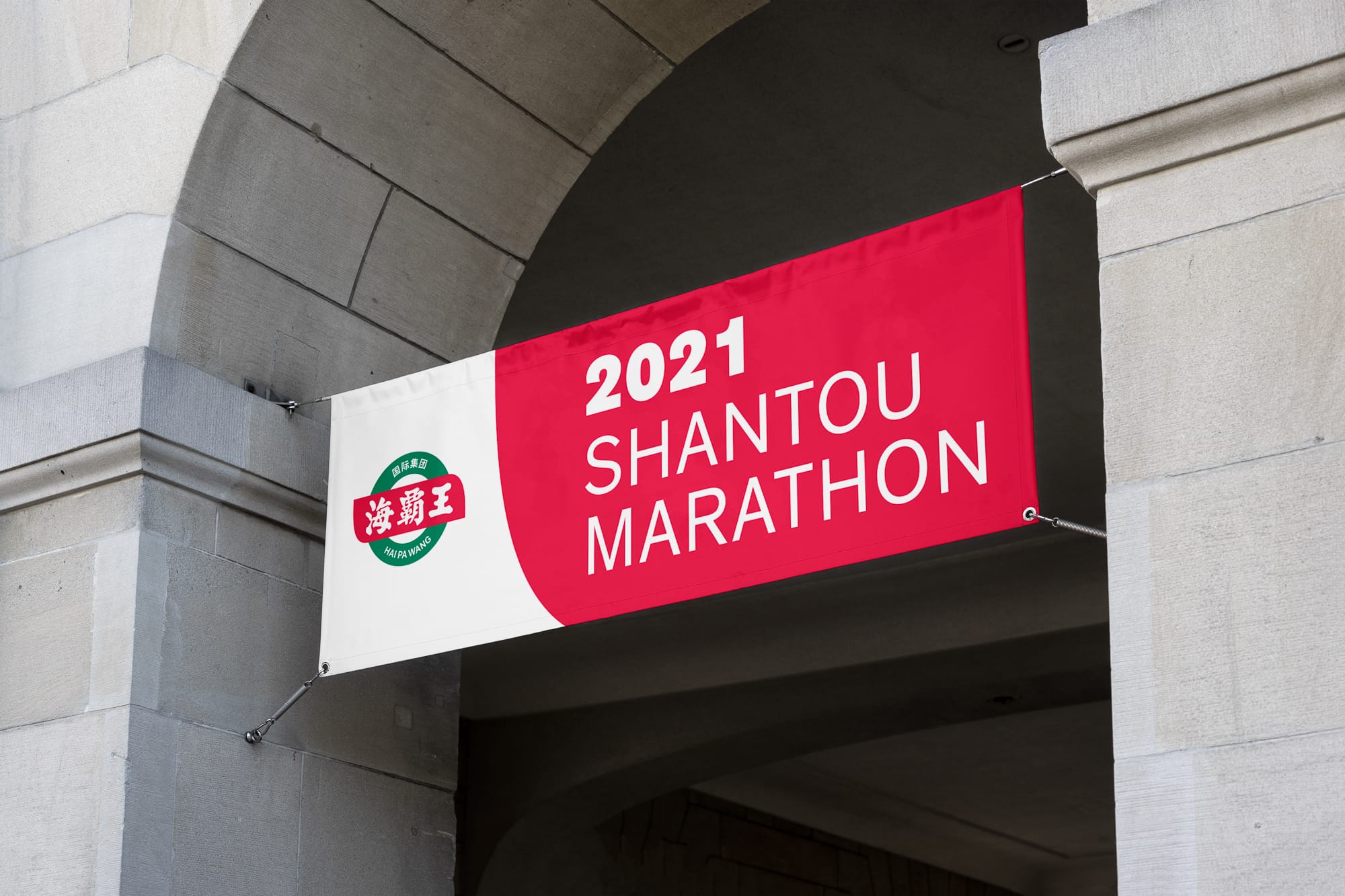
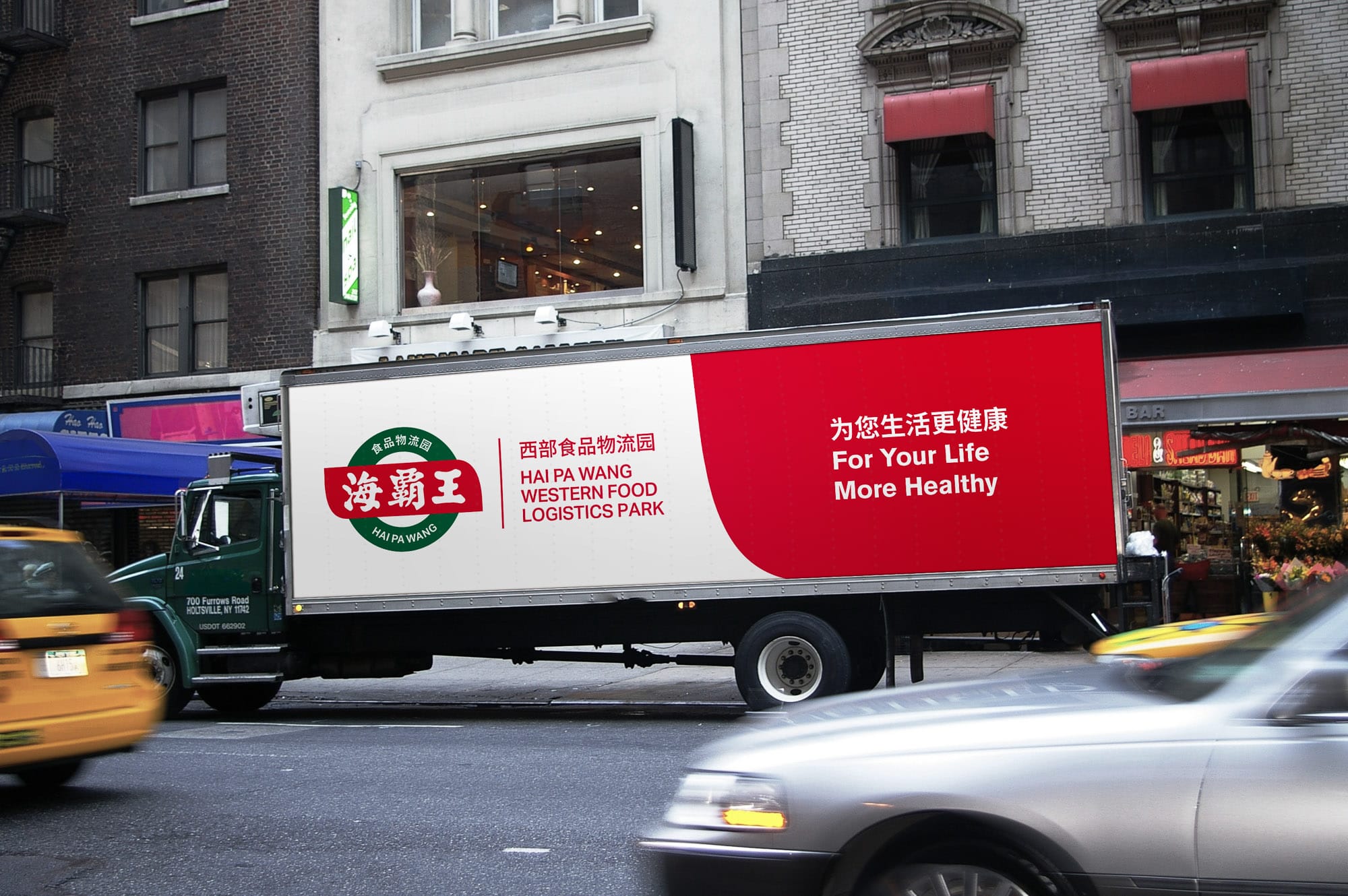
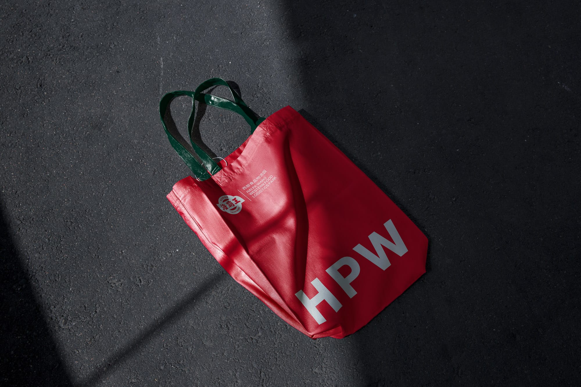
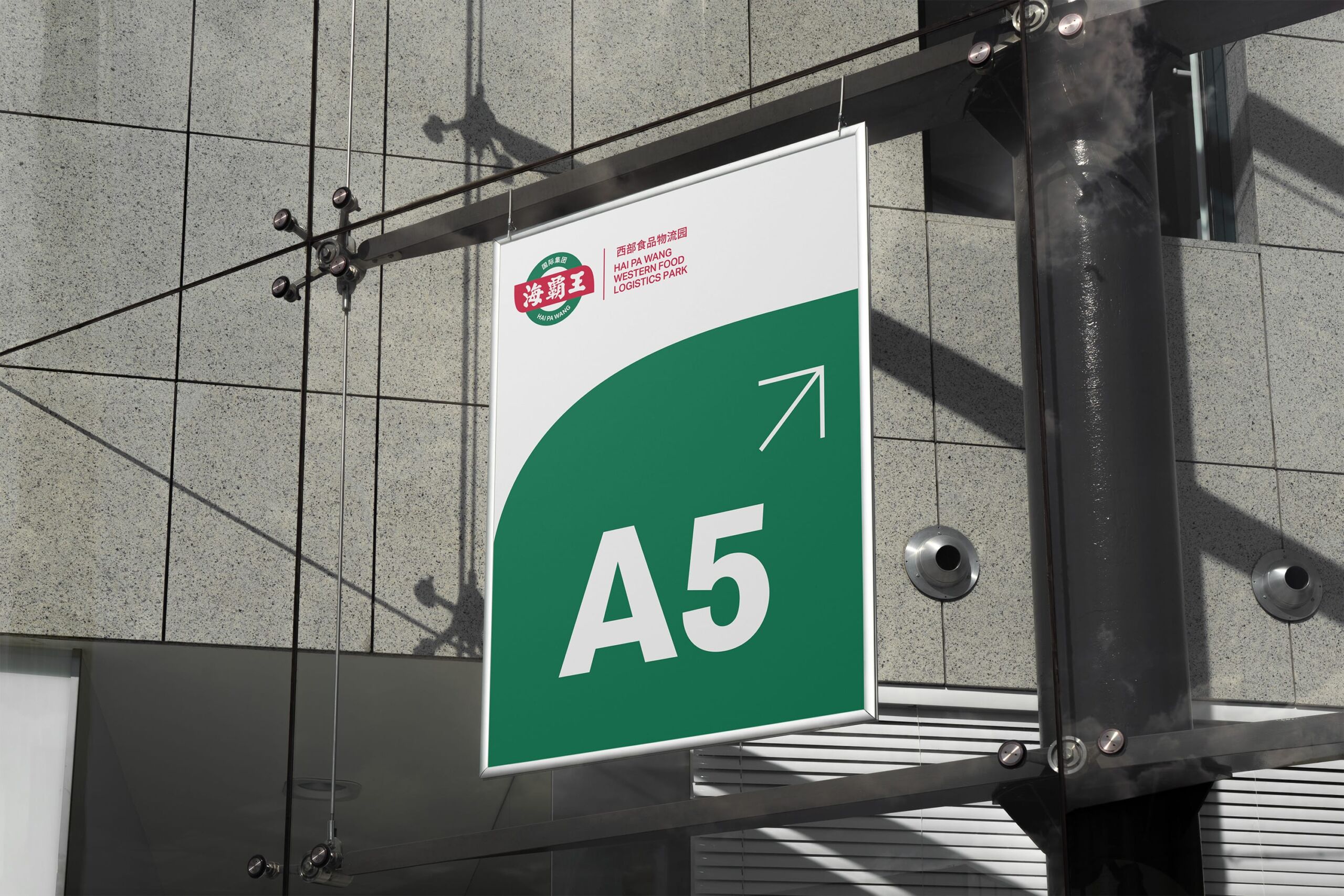
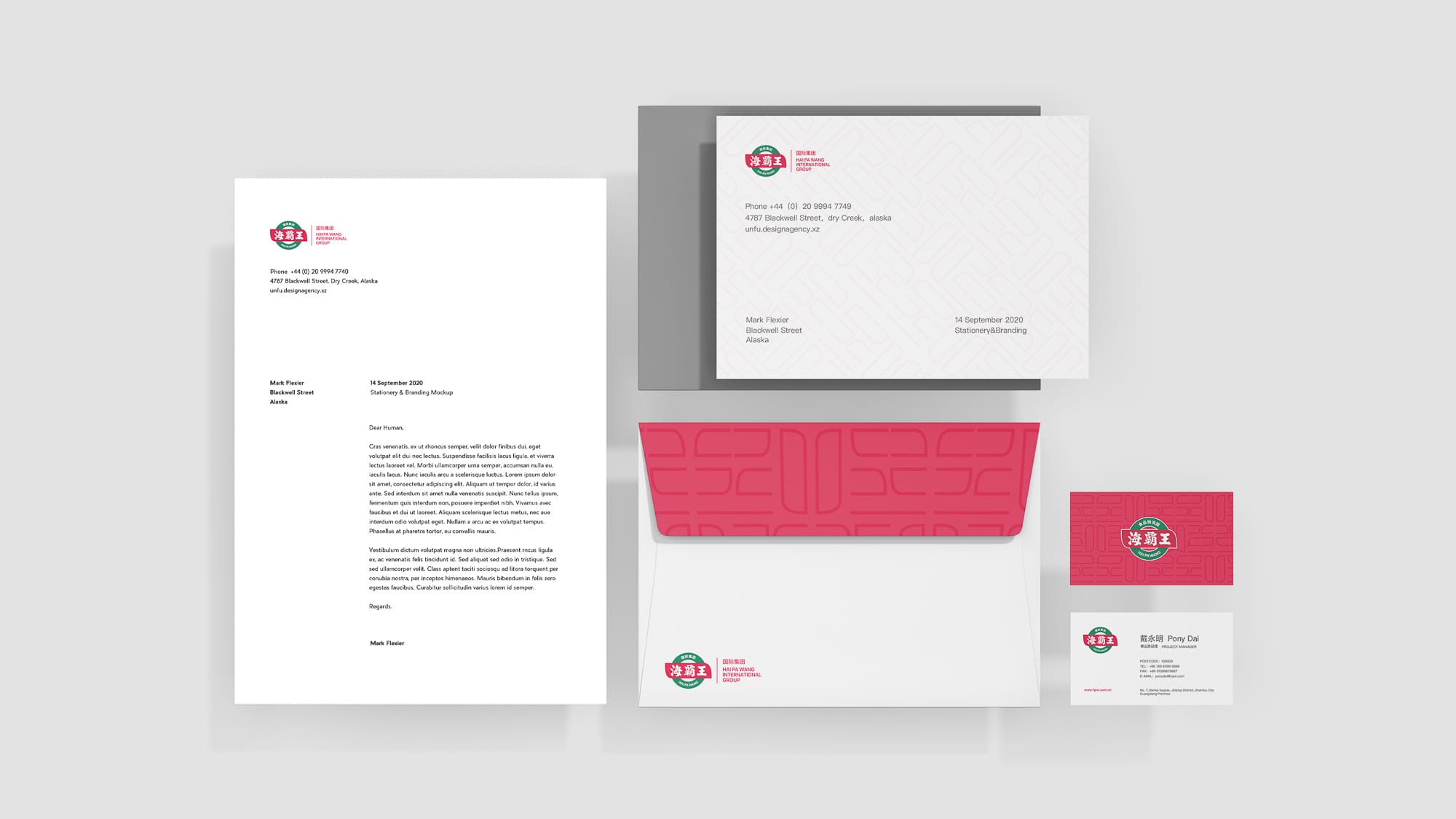
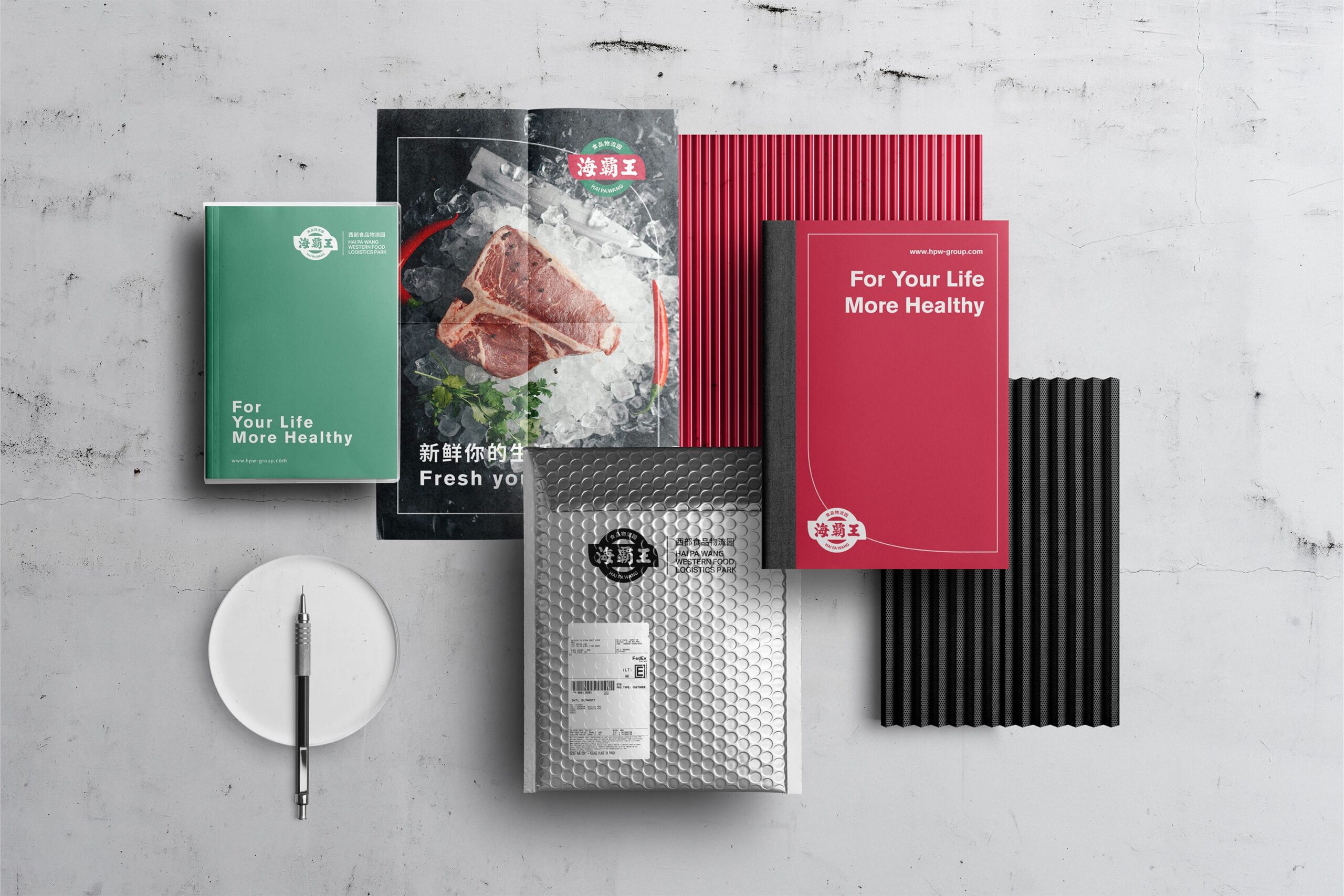
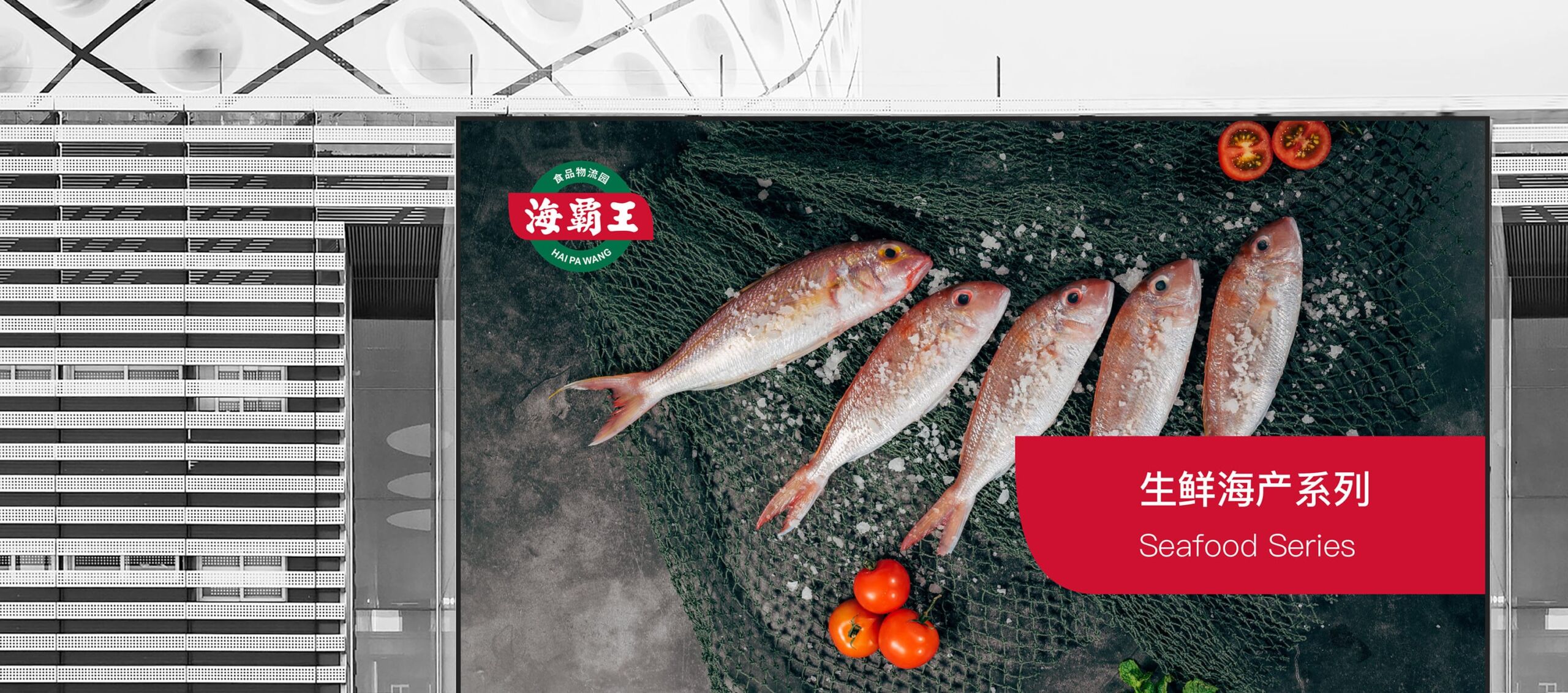
A unified visual extension system was developed around the new HPW logo. Core graphic elements from the logo were deconstructed, recomposed and redesigned to create a distinctive set of proprietary supporting graphics.
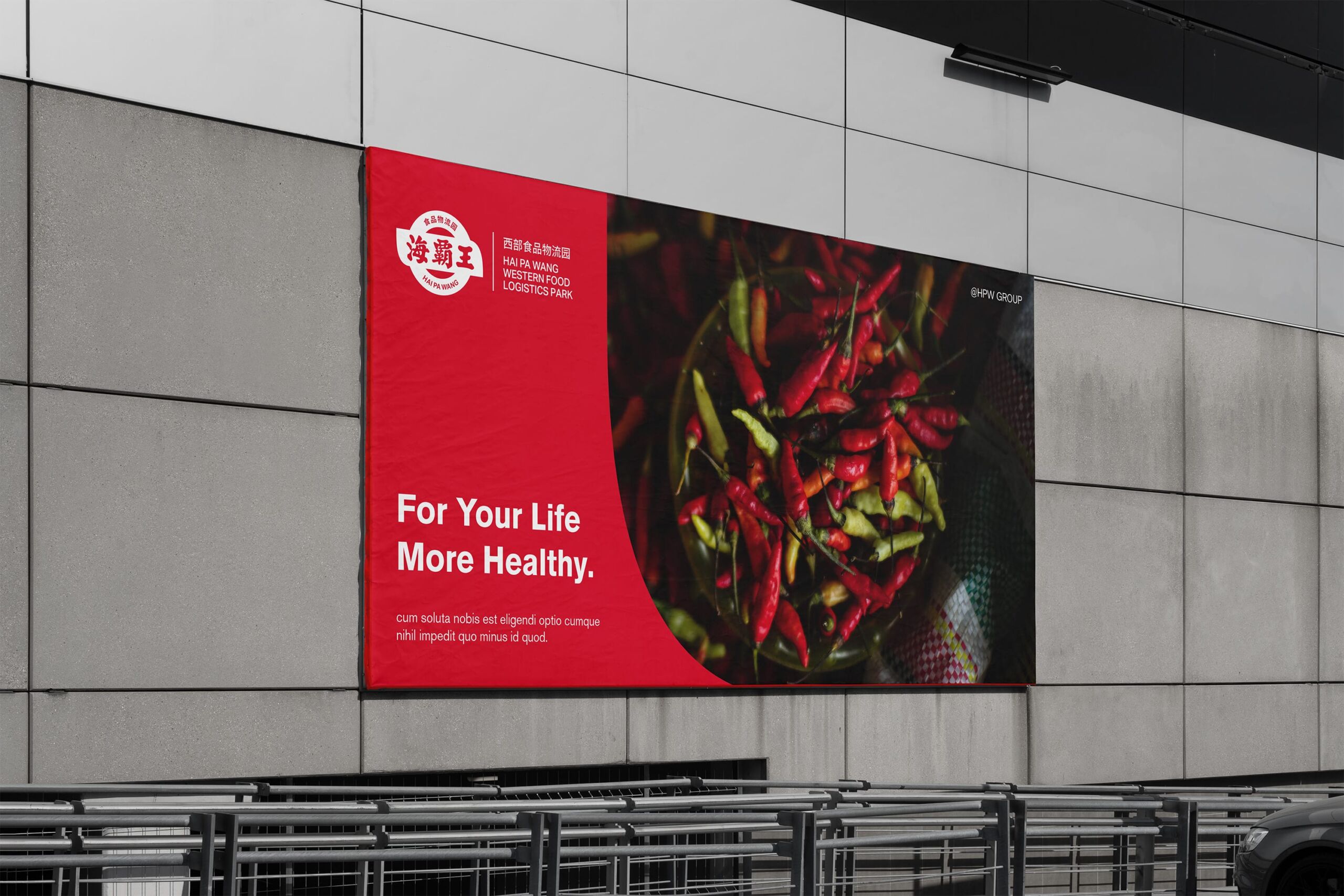
Through flexible combinations of scale, proportion and composition, these graphic elements can be adapted across packaging, spatial environments, communication materials and other brand touchpoints. This approach maintains a consistent visual identity while allowing greater variety and flexibility across different applications.
From a single logo to a complete visual language, the new system further establishes a unified, distinctive and recognisable brand presence for HPW Group. It enables the brand to deliver a consistent visual experience across diverse commercial contexts while creating flexible and scalable brand assets to support the Group’s continued expansion into the future.