Fantora 馥朵芮
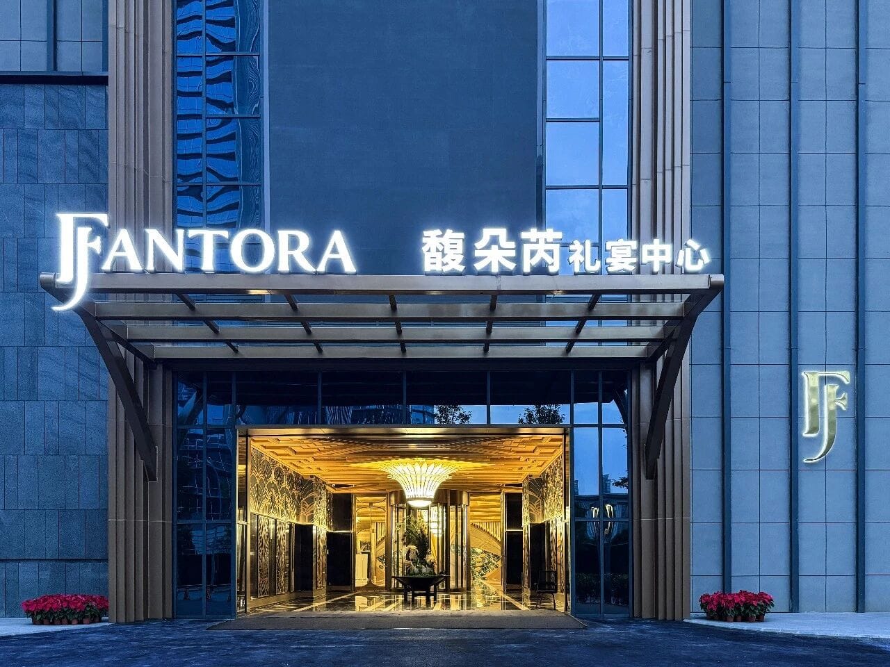
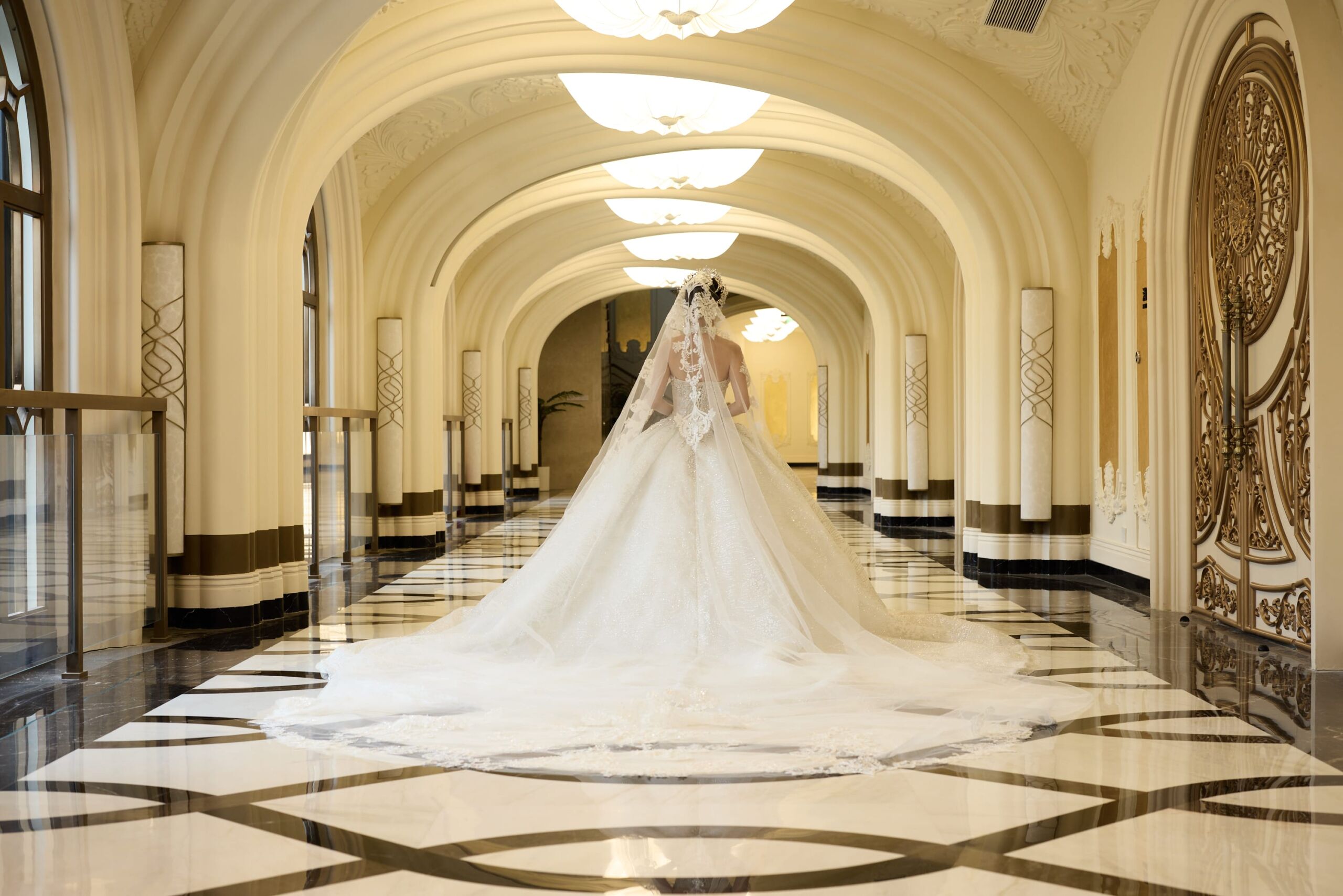
As wedding and business banquet experiences continue to evolve, Taasdesign created Fantora, a new hotel banquet sub-brand for Delizzo Hotels, bringing romantic imagination and a premium brand experience into every space and service.
A Dreamlike Space for Emotion and Art
Client
-
Fantora Banquet
Industry
-
Hotel & Banquet Services
Our work
-
Brand Strategy
Branding
Brand Image
Brand Film
Hotel Banquet Sub-Brand Fantora: One-Stop Wedding Services
As traditional hotel banquet halls increasingly struggle to meet consumers’ evolving expectations for experience, Delizzo Hotels sought to redefine the emotional value and experiential potential of banquet spaces through a new sub-brand. Fantora was born from this vision. More than a functional venue for weddings and business events, it is a one-stop creative experience space that brings together romantic imagination and artistic expression—expanding the boundaries of the hotel experience while adding greater emotional warmth and aesthetic energy to the overall brand ecosystem.
Through end-to-end, one-stop wedding and event services, Fantora integrates planning, styling, and execution into a seamless experience. This helps reduce management and coordination costs while ensuring that every wedding or business event is delivered efficiently, with a distinct sense of personality and ceremony—enhancing the overall customer experience and strengthening brand competitiveness.
A Name That Opens the Imagination of Space and Emotion
Taasdesign approached the brand through the ideas of spatial emotion and experiential imagination, creating the English name Fantora, inspired by two poetic concepts: Fantasy, evoking dreams and imagination, and Aurora, suggesting luminous movement and shifting light. Together, they embody the dreamlike atmosphere of ceremonial spaces and the artistic interplay of light.
The Chinese name 馥朵芮 was developed to complement the English name in sound, character, and imagery. Elegant and distinctive, it naturally evokes the image of blooming flowers. This floral association aligns seamlessly with wedding décor, making flowers a core visual element of the brand. From name to space, and from visual identity to experience, every touchpoint carries a unified sense of romance and ceremony.
This integrated Chinese-English naming system establishes Fantora 馥朵芮 with a premium brand character that balances emotional warmth, elegance, and imagination.
Evolving Within Consistency
Keeping the Brand Refined and Fresh
To ensure Fantora remains part of the Delizzo Hotels brand ecosystem while maintaining a clear and distinctive personality as a banquet space, Taasdesign developed an extensible and adaptable visual language within a unified brand guideline system.
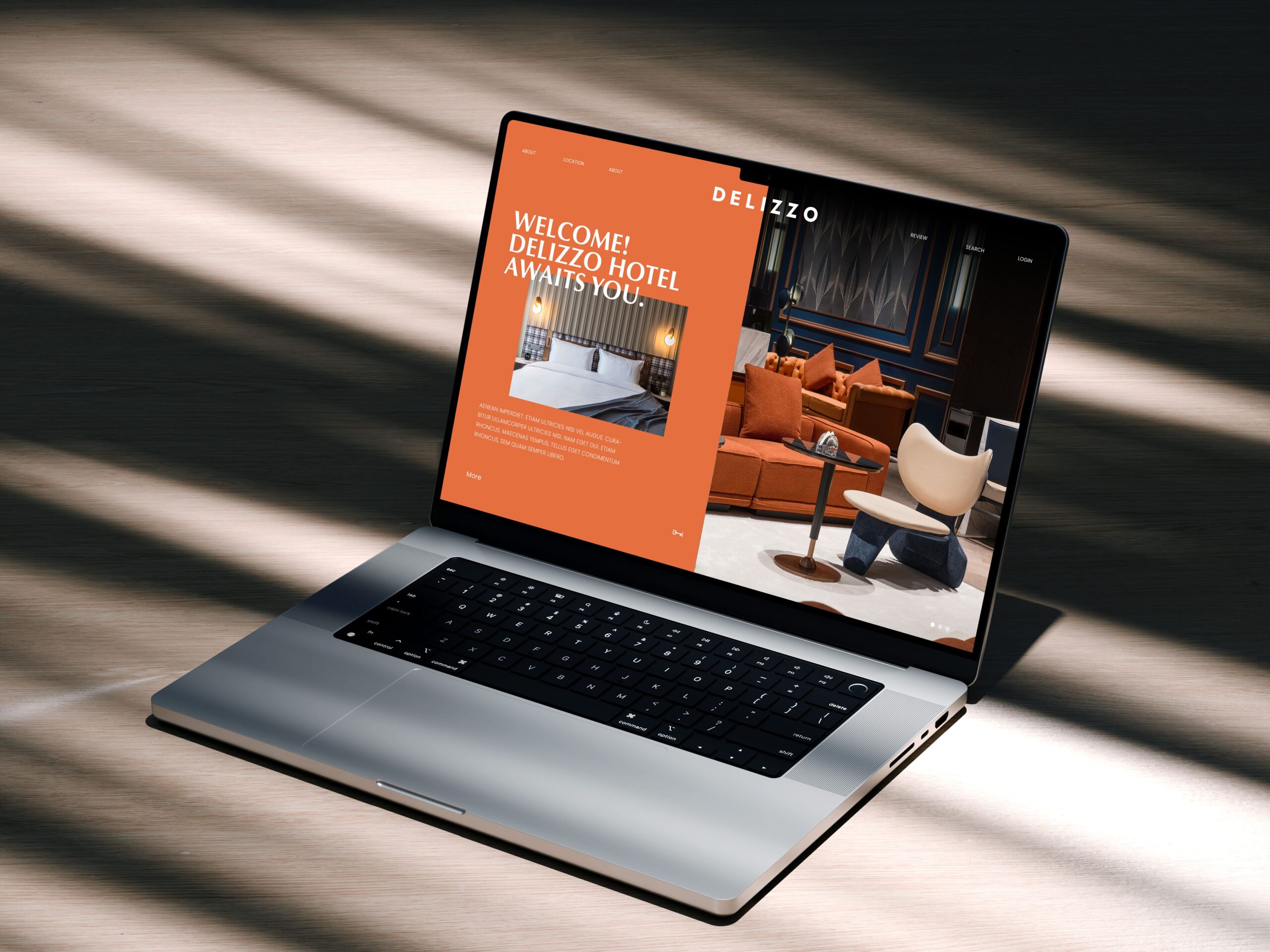
<Click to view the full Delizzo Hotels case>
Building on the parent brand’s core visual DNA, Fantora introduces materials, graphic language, and emotional nuances tailored to the banquet experience. This allows the brand to maintain a sense of professionalism and sophistication while creating a more romantic and artistic spatial atmosphere.
a. Logo|Core Brand Symbol
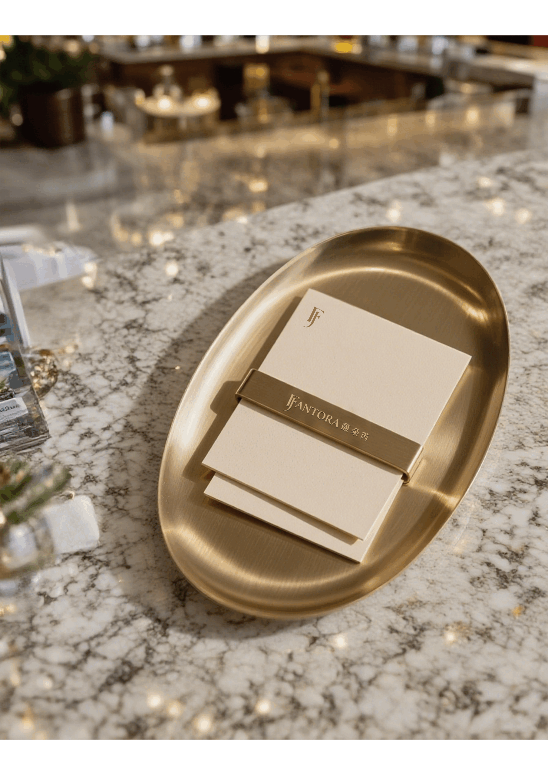
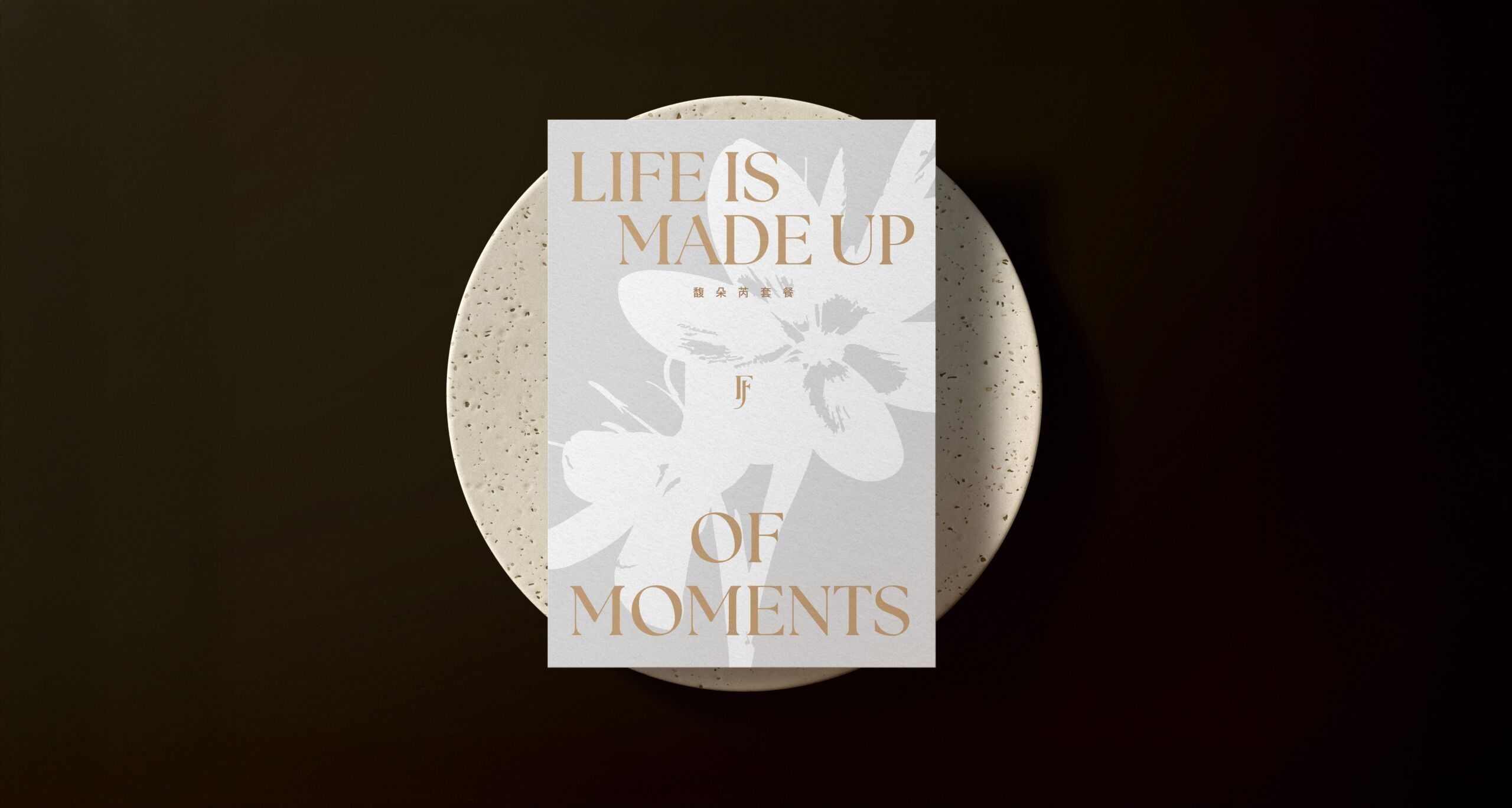
At the core of the brand identity, Taasdesign developed a Logotype-led wordmark system for Fantora 馥朵芮, using a refined and elegant typographic style to convey a sense of premium quality and sophistication.
This fusion of dual imagery gives the brand identity strong recognition while naturally connecting the spatial theme with the emotions of weddings and banquets, making it a key visual symbol of Fantora 馥朵芮’s emotional expression.
b. Graphic System | A Growable Graphic Language
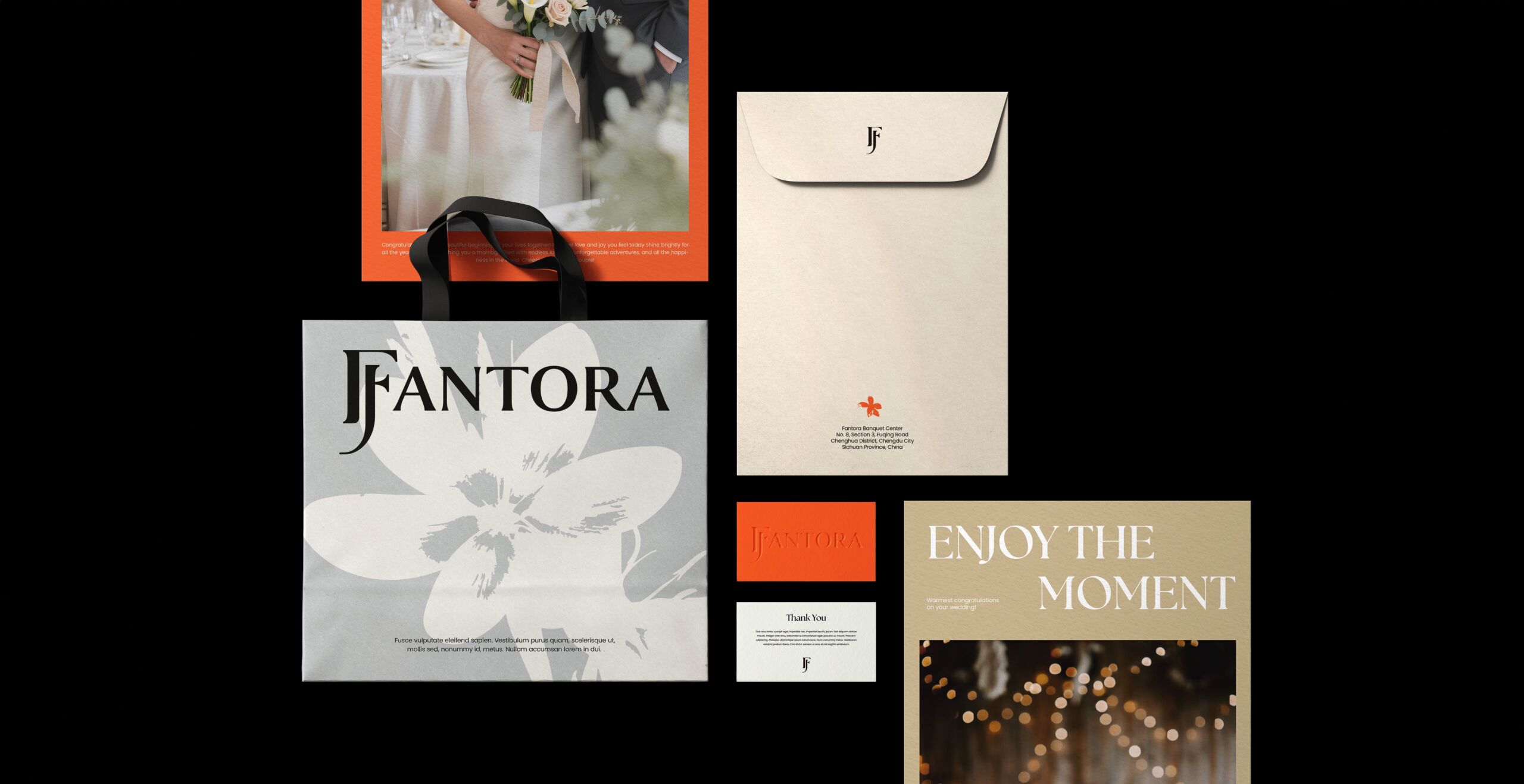
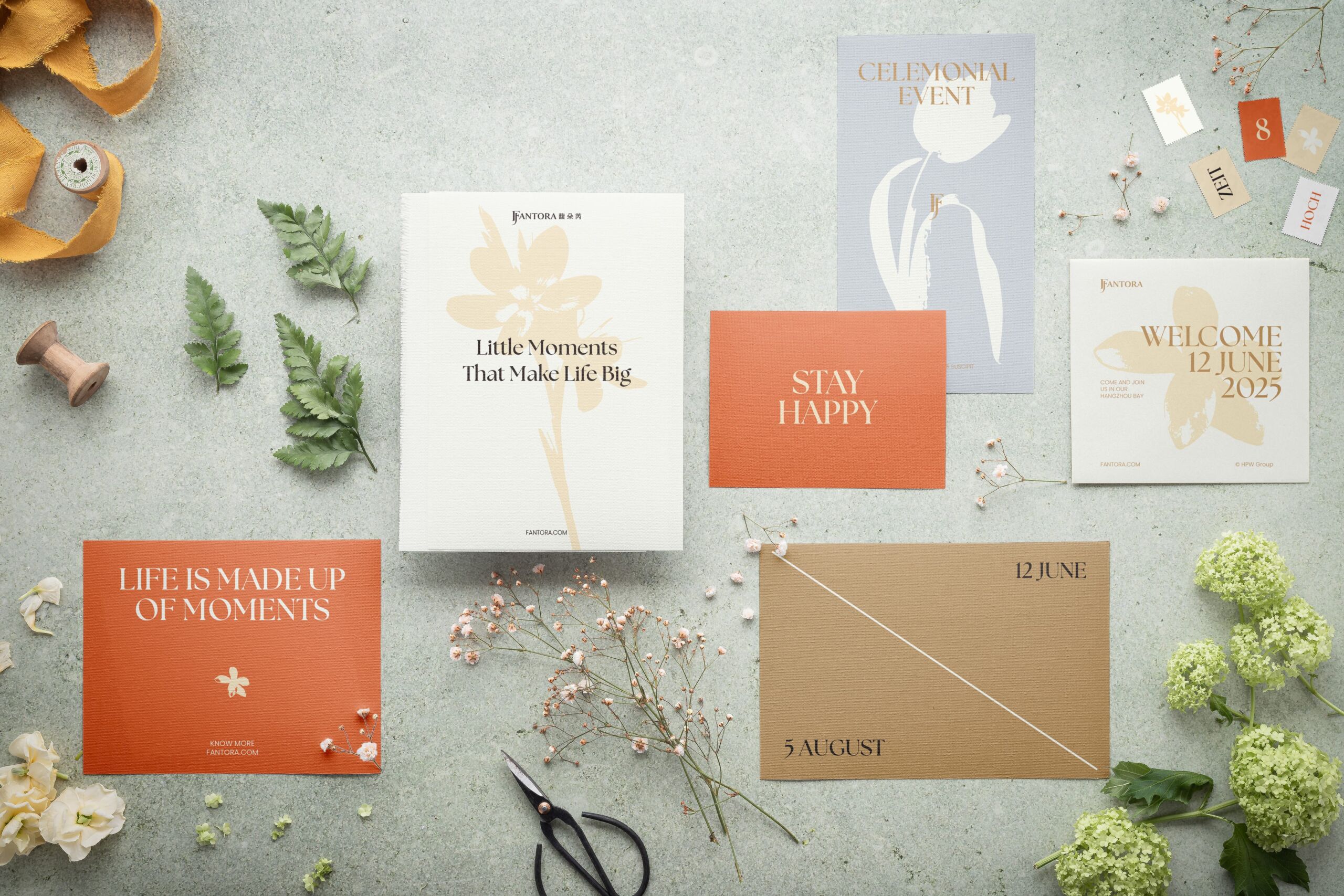
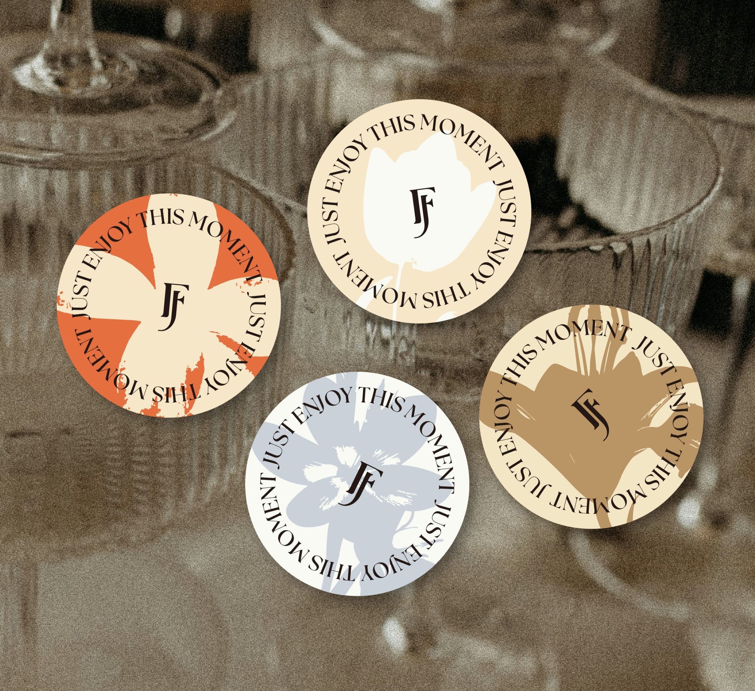
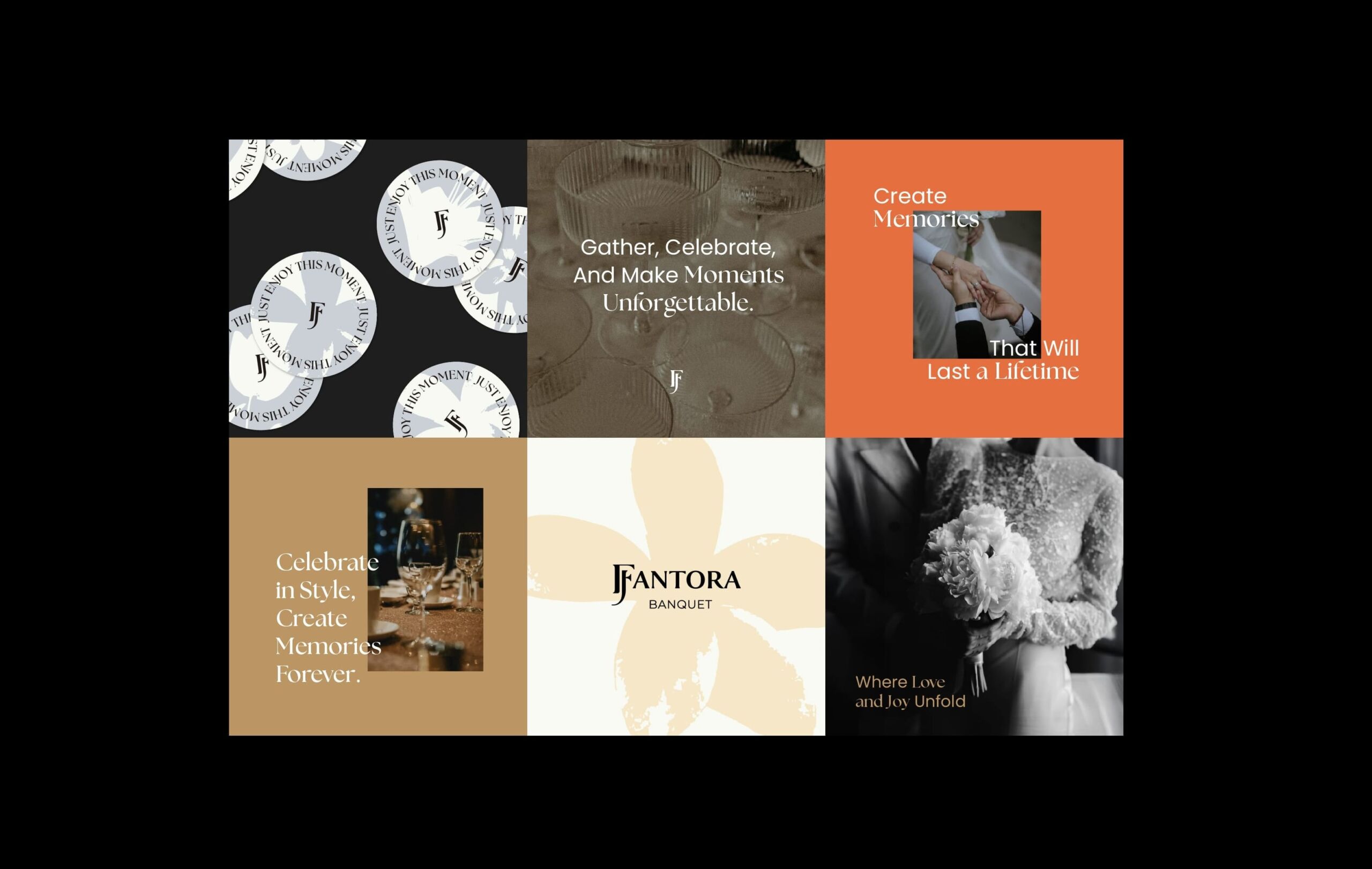
For brand applications and extensions, Taasdesign developed a supporting graphic system centered on floral silhouettes for Fantora 馥朵芮. Symbolizing the blossoming of life and the gathering of beautiful moments, the floral forms create a natural connection with the romantic imagery embedded in the brand name.
Highly flexible and adaptable, the graphic system can be freely cropped, combined, and continuously evolved across different media and contexts. It can be applied across larger areas to create an immersive artistic atmosphere, or used as subtle decorative details across brand touchpoints to enhance refinement and visual depth.
While maintaining a cohesive visual language, the system gives Fantora 馥朵芮 an ever-evolving visual expression and artistic vitality.
Spatial Signage | Detail Within a Unified System
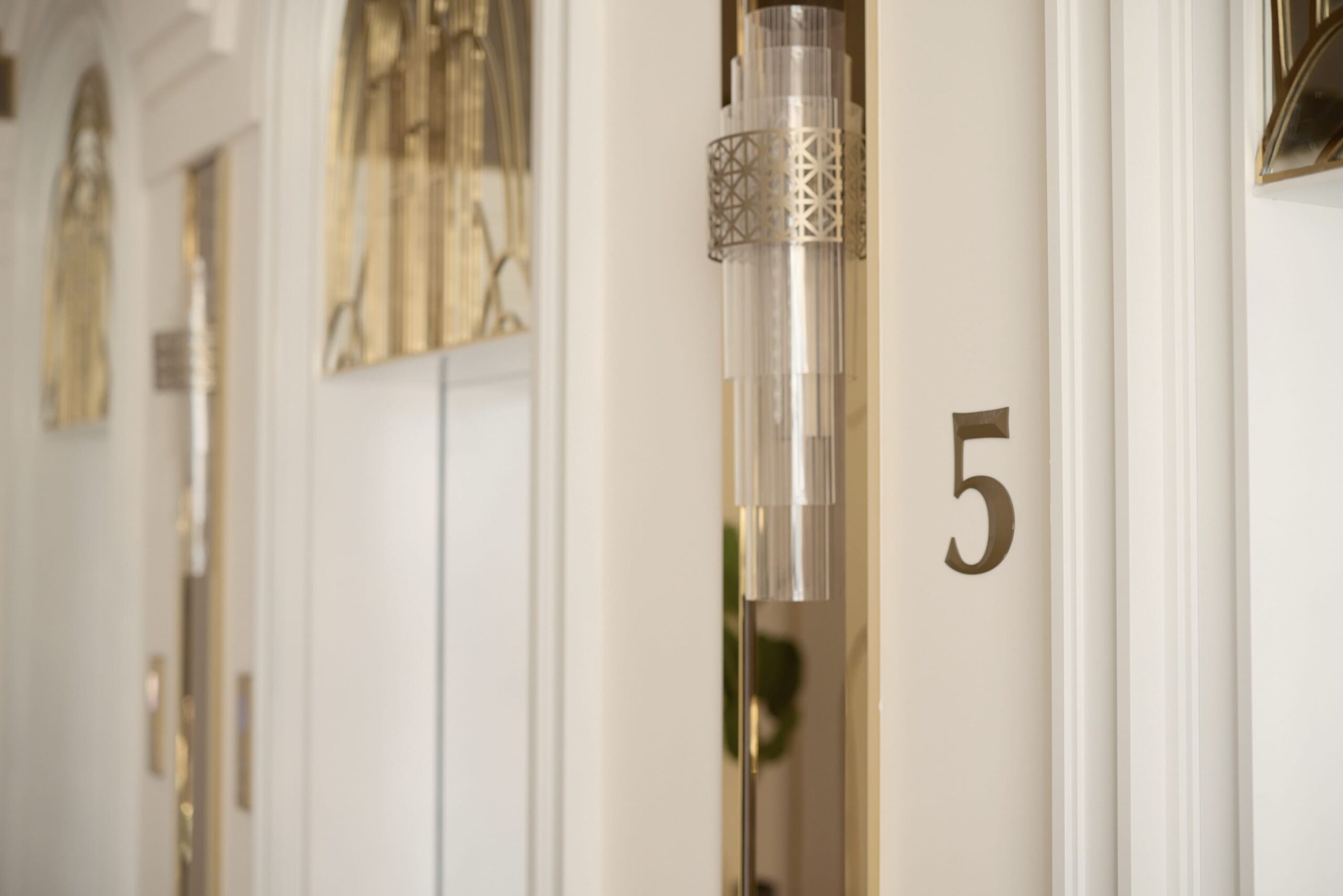
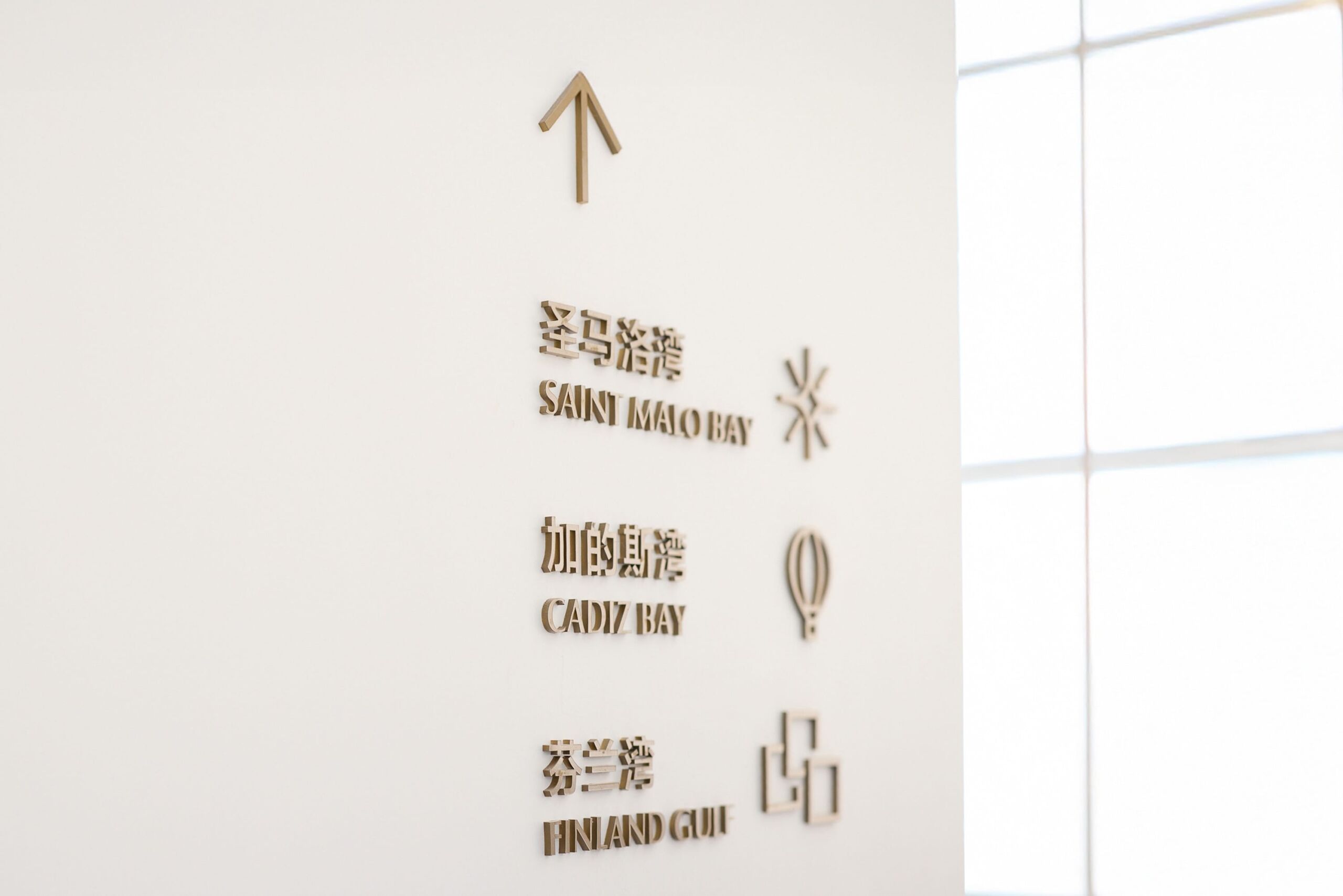
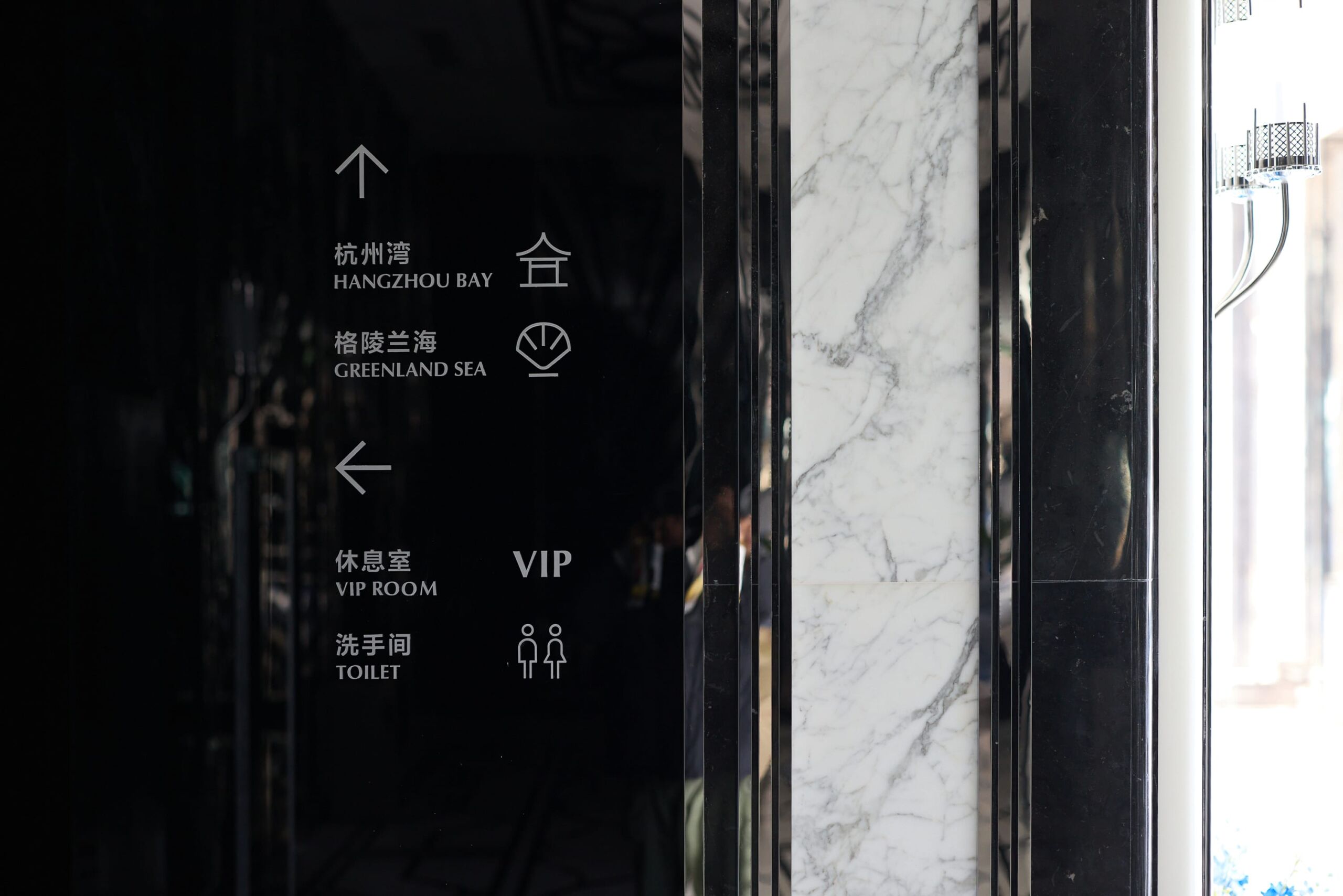
Fantora’s spatial signage system follows the established design language of Delizzo Hotels, integrating the brand identity naturally into every pathway and setting of the banquet space through a clear and consistent visual language.Taasdesign also developed a dedicated set of icons tailored to the character of the banquet halls. With a simple and elegant graphic language, the icons reinforce wayfinding while echoing the brand’s romantic and artistic atmosphere. In this way, signage goes beyond its functional role to become an integral part of the spatial experience.
Against the growing homogenization of banquet spaces, Delizzo Hotels introduced Fantora 馥朵芮 as a new hotel banquet sub-brand, responding to consumers’ rising expectations for emotional experiences and ceremonial occasions.
Starting from the brand architecture, Taasdesign established a clear positioning and systematic identity for Fantora as a hotel banquet sub-brand. While extending the visual language of the parent brand, the new brand creates a distinctive identity for the banquet space and strengthens its differentiation.
This strategy expands Delizzo Hotels’ banquet offering while enabling the hotel to address diverse needs across weddings and business events. It also transforms the banquet business from a single-space offering into a one-stop, full-service brand experience.
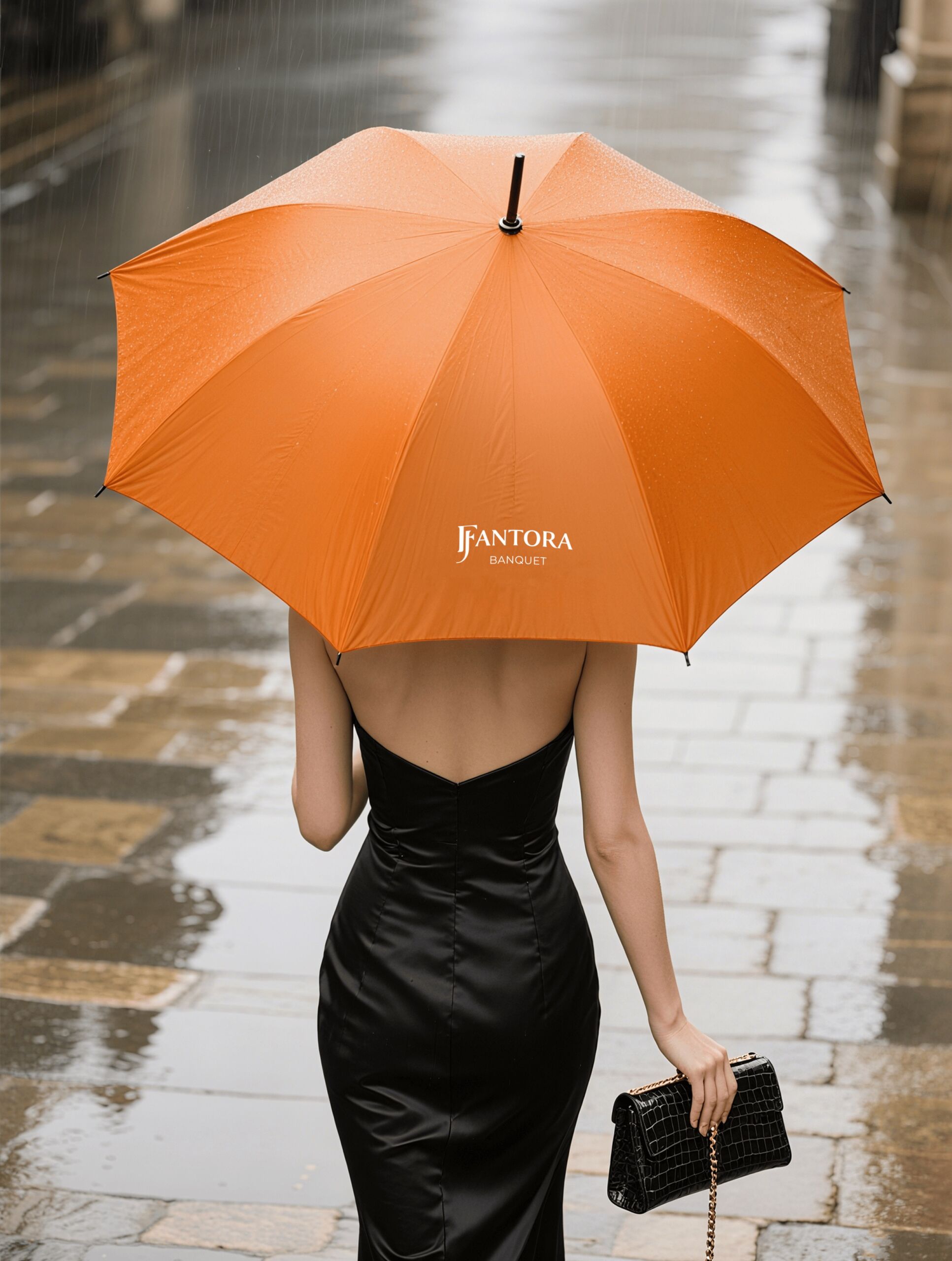
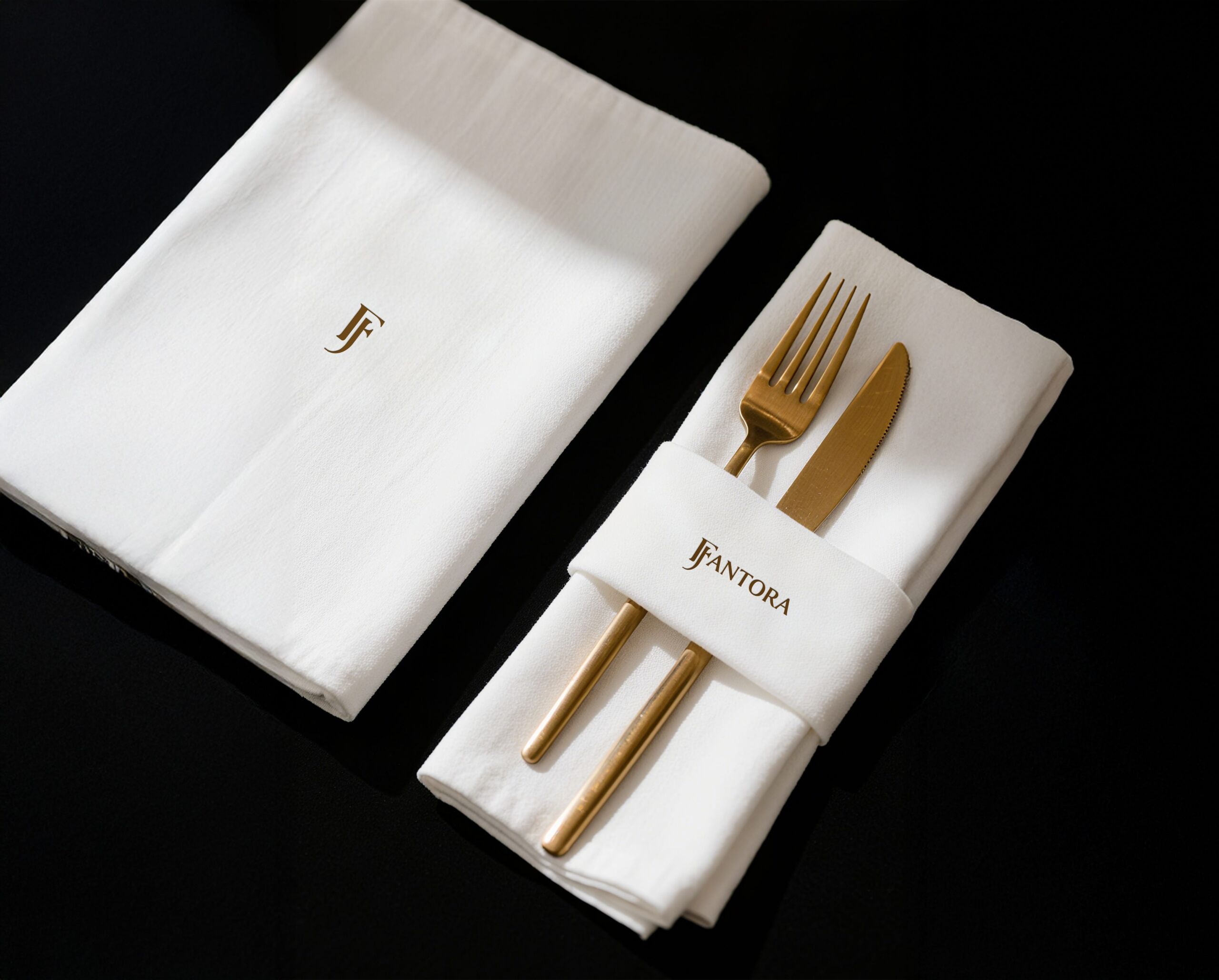
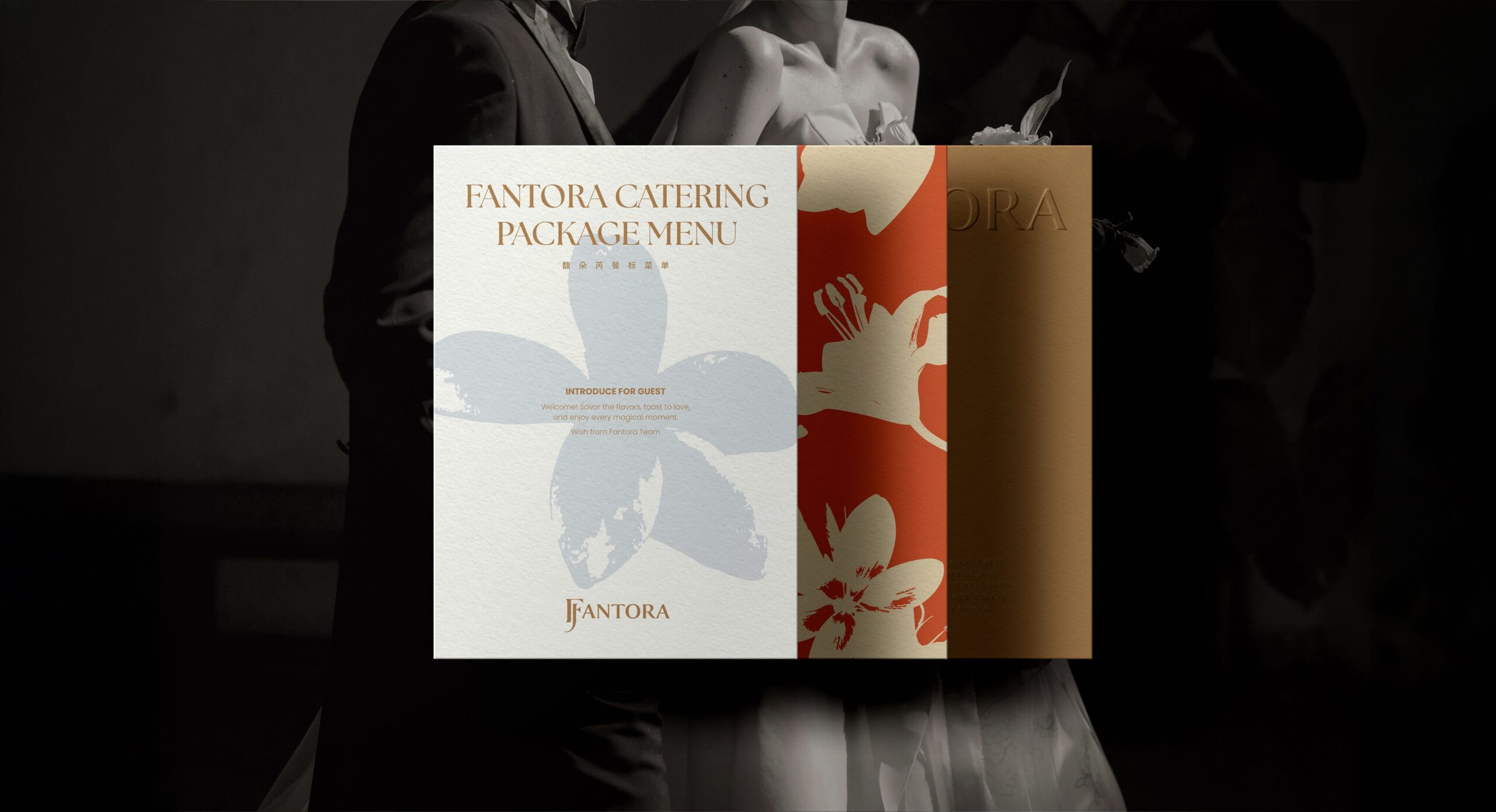
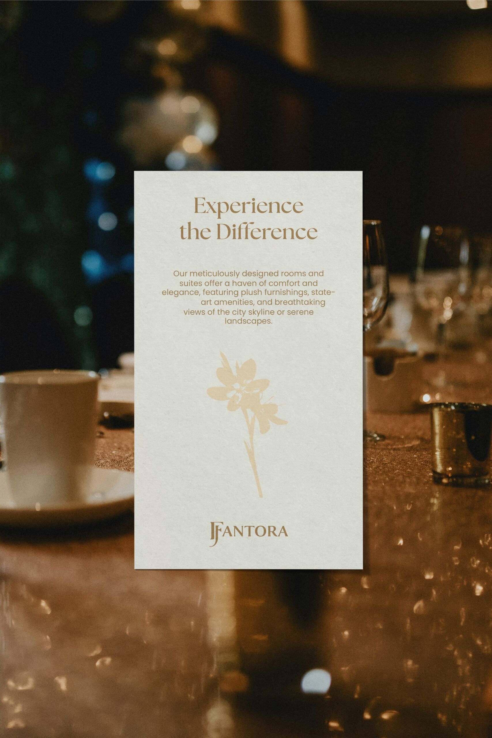
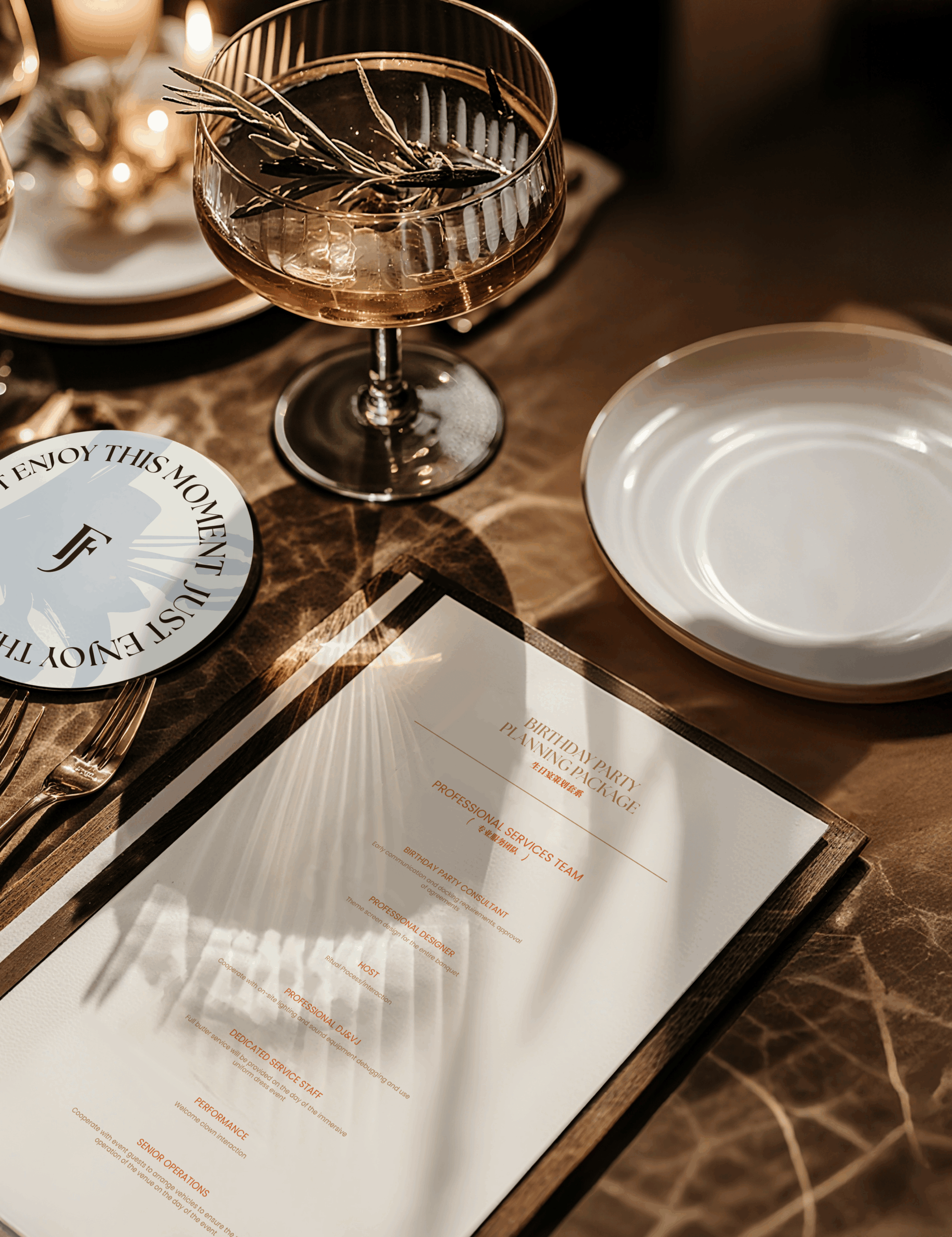
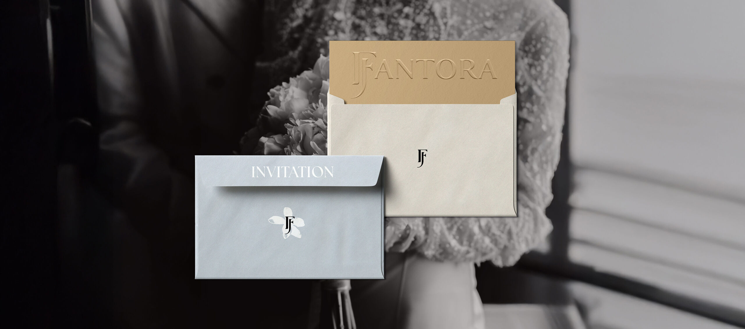
As a hotel banquet sub-brand, Fantora’s identity system extends across invitations, packaging, and wayfinding signage. From naming and visual identity to spatial signage, it carries a consistent design language across every physical touchpoint.
The engagement covers brand strategy, full brand identity, brand imagery, and a brand film, developed jointly by taasdesign and the Delizzo Hotels team.
We will help you to ideate, design and implement
Brand Visual & Naming
Consistent Branding, from Naming to Visual Identity
The brand’s visual extension covers the coordinated application of the logo, graphic language, and color system across print materials, digital presentation, and spatial signage. Guided by a systematic set of standards, the design team maintains consistency and professionalism in every application, so the brand image stays recognizable across media.
The naming considered the tone of both Chinese and English and the communication needs of international markets, balancing local cultural resonance with recognition across language contexts. The visual expression builds on the overall design language and is refined for each application, keeping unity while fitting each setting. The project was delivered jointly by the strategy, design, and content teams, from early research and concept development through final implementation.
Aligned Strategy, Design, and Content
Throughout the project, strategic research, design execution, and copywriting stayed closely connected, so the final visual and written expression reads as one. Brand assets follow a single set of standards across materials and channels, which makes them easier to maintain and extend. The case documents the full path from concept to implementation and offers a practical reference for similar projects.
A Unified Brand Logic
From naming strategy to spatial signage, design decisions at every stage follow a single brand logic, which avoids gaps in expression between touchpoints. The case is compiled from actual project outcomes and aims to reflect how the work was carried out and what it achieved, showing how a brand methodology applies in specific settings.
Reviewed Materials, Consistent Messaging
Project communication materials span print output, digital presentation, and on-site items. Each was reviewed internally before production to keep the information accurate and the style consistent. The case text draws on records and team documentation kept during the project and will be updated to reflect later developments.
Results and Reusable Methods
The change the brand collaboration brought shows in the visual refresh, and also in better internal communication efficiency and more consistent external perception. A clear brand architecture gave cross-department teams a shared reference and reduced differences in how each team expressed the brand. The process has also built up reusable methods and experience for similar hotel sub-brand projects.