Delizzo Hotels
In China’s standardized hotel market, A New Brand, Delizzo faced standing out and building a scalable brand for multi-city expansion. This project crafted an experience-driven framework, ensuring consistent recognition across locations and supporting diverse growth.
From “Stay” to “Experience”
Client
-
Delizzo
Industry
-
Hospitality
Our work
-
Branding, Strategy, Naming, Signage, Video, Photo Imagery
A Brand System Built for Cross-Market Expansion
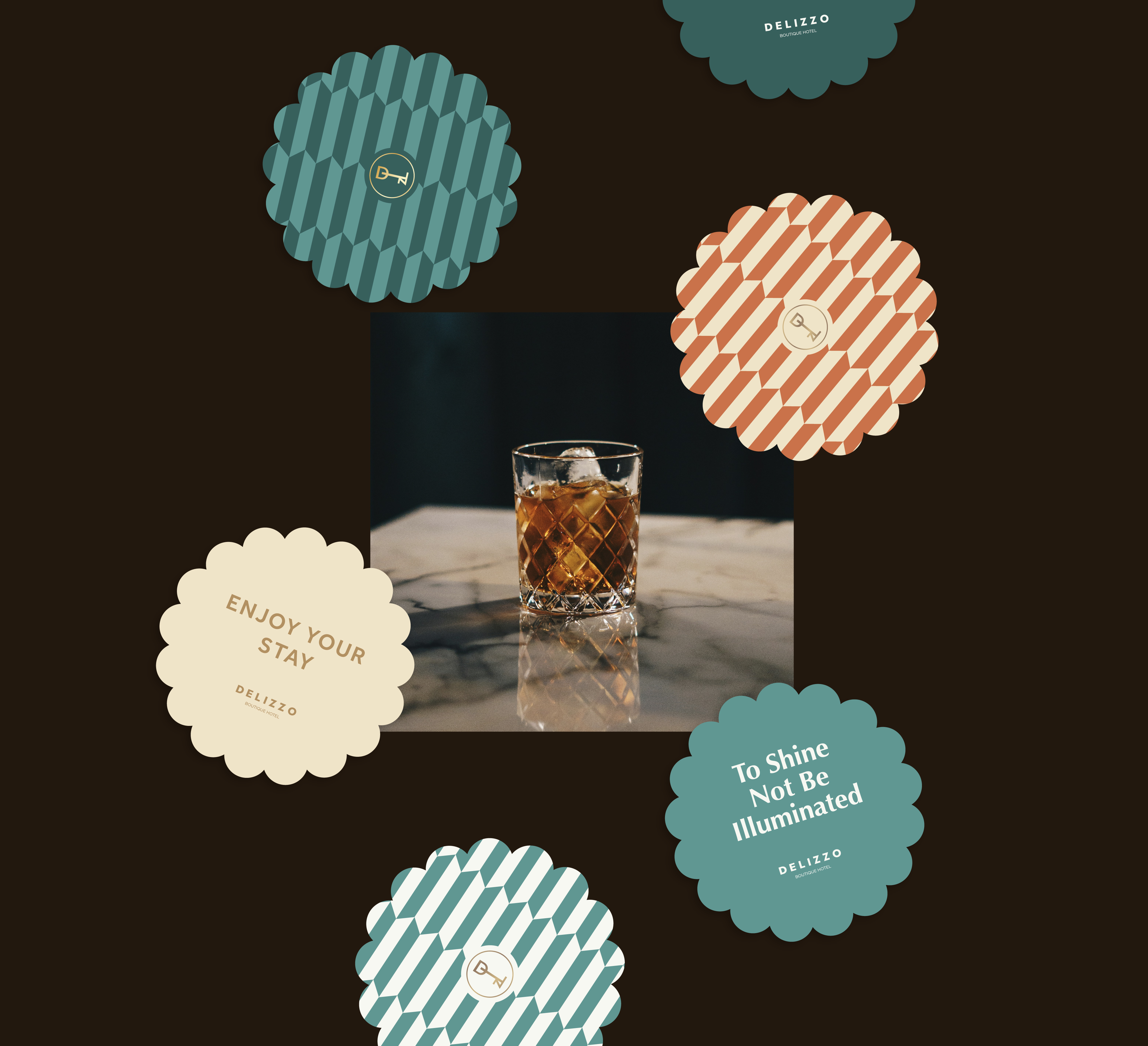
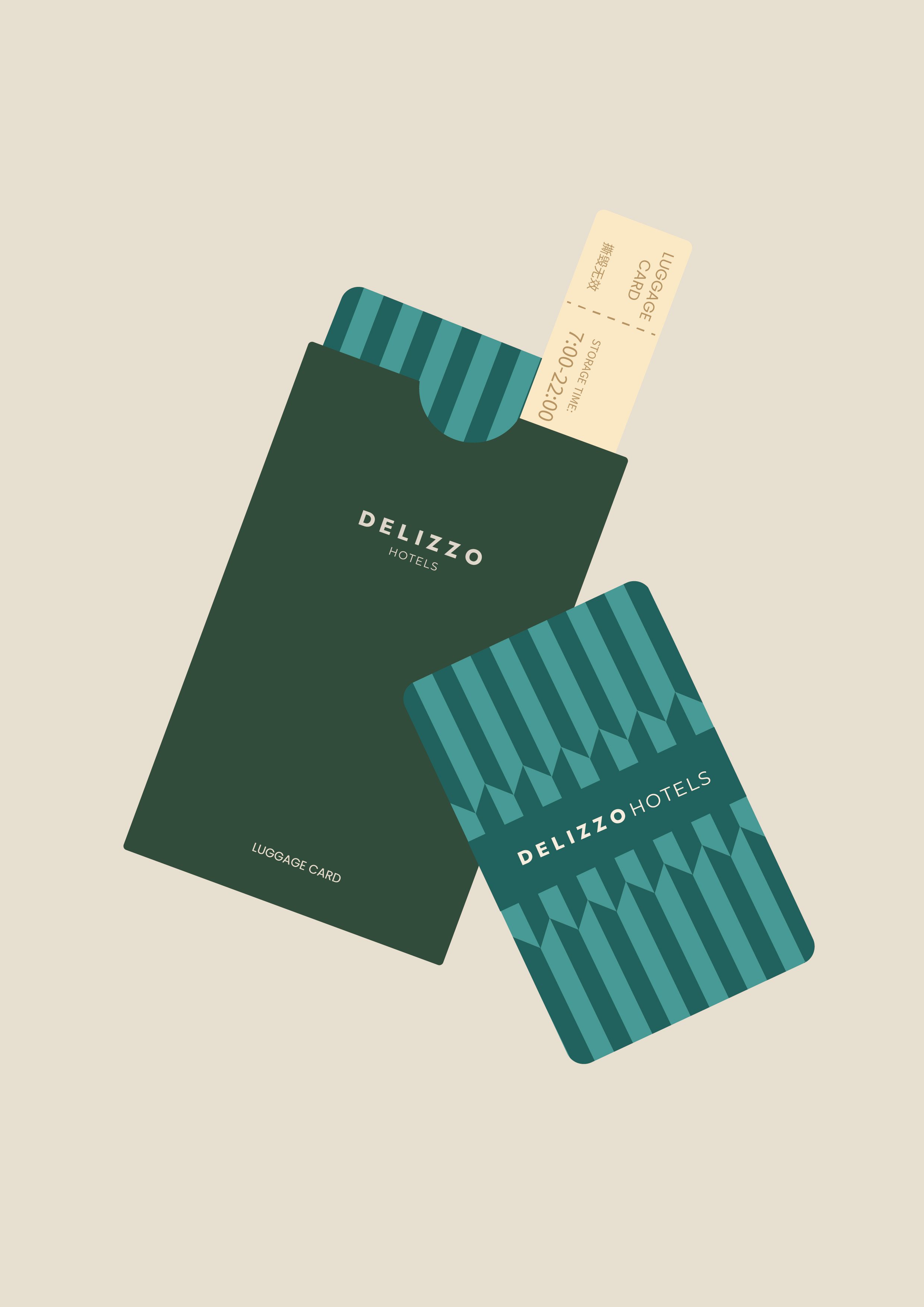
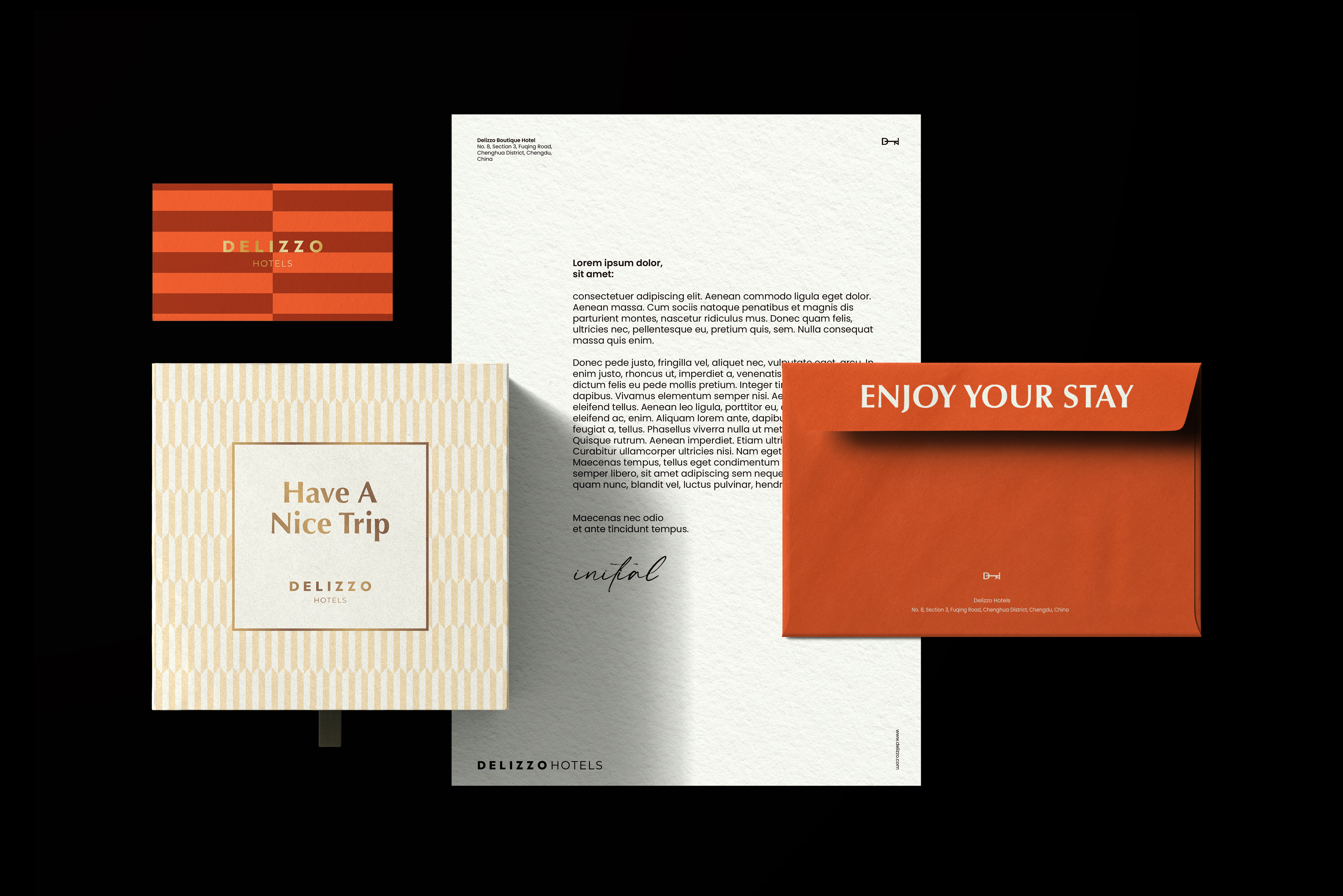
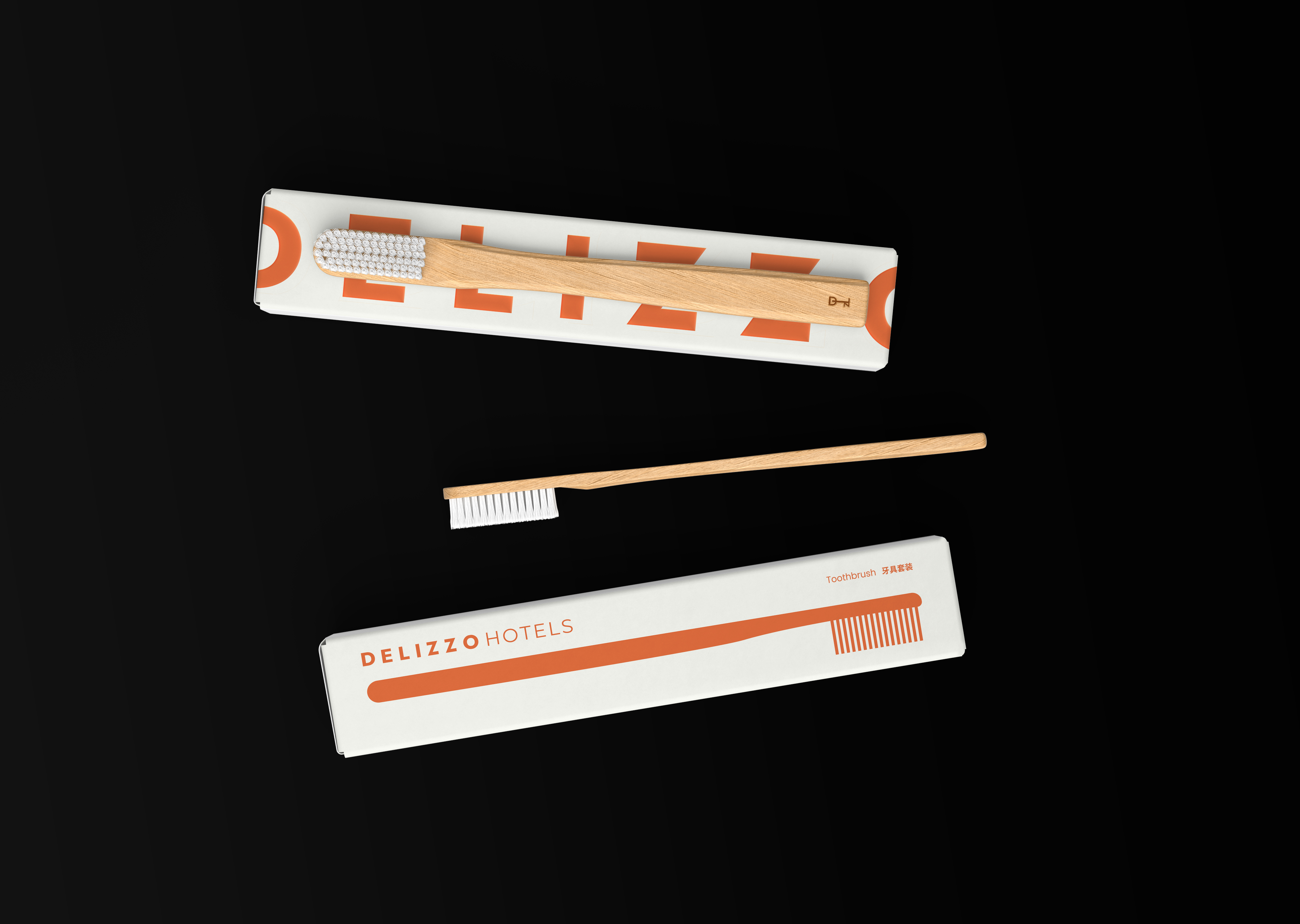
Delizzo draws inspiration from the Orient Express, reimagining the romance of travel through a contemporary lens. Blending the timeless elegance of old-world wealth with Gatsby-era flair, the project focused on building a brand system that is both cohesive and adaptable, giving Delizzo a clear, consistent identity across all touchpoints.
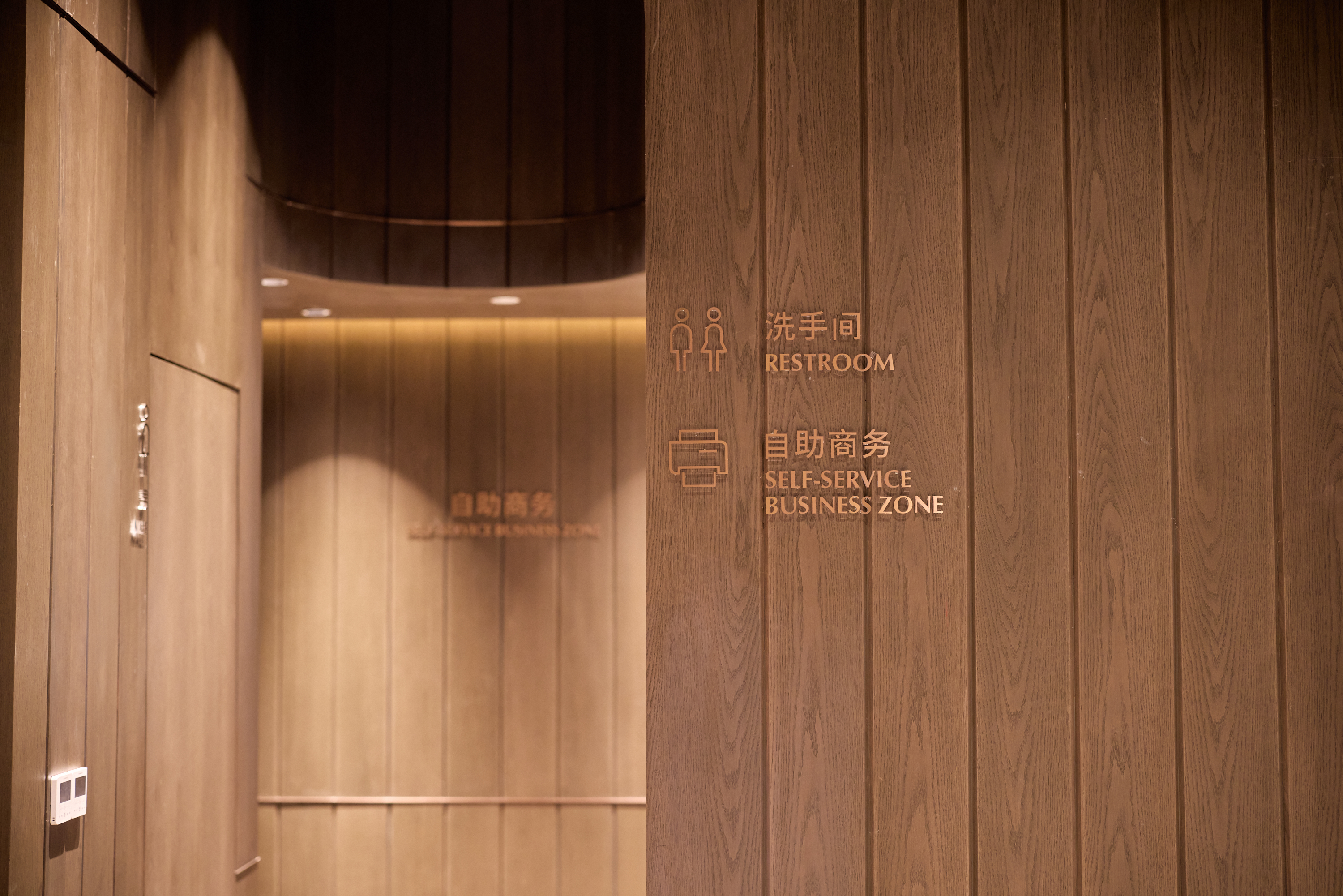
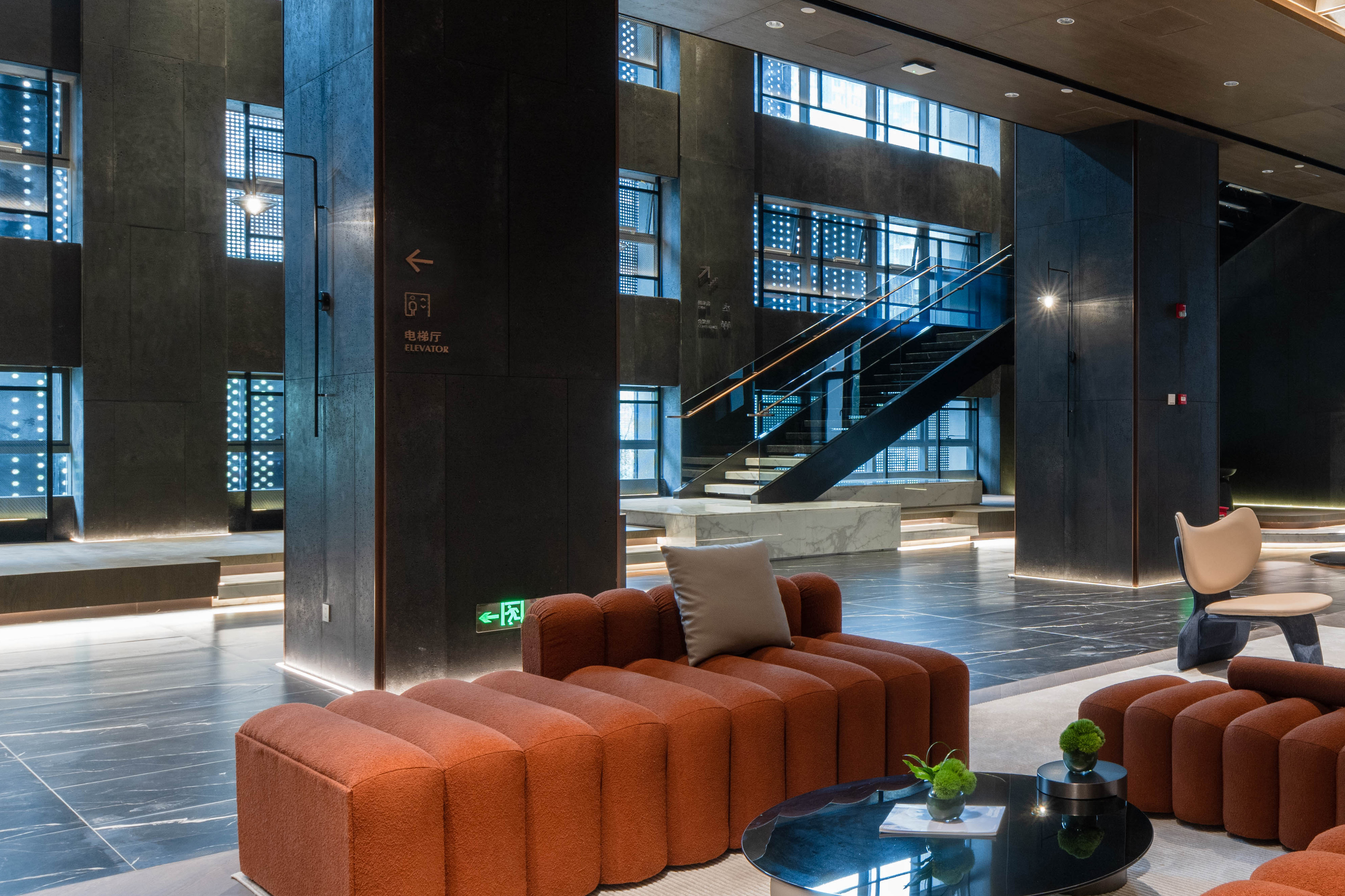
From naming and identity design to rollout and application, the system establishes a structured framework for expression. Unified visual logic, tone of voice, and modular design ensure that every interaction reflects the brand’s style, while remaining flexible enough to support multi-city expansion and diverse themes.
The result is a brand system that is distinctive, scalable, and sustainable—providing Delizzo with a foundation for long-term growth and immediate recognition in new markets, while keeping every future expression consistent, yet effortlessly adaptable.
Start with naming
The name DELIZZO was developed with international communication and brand recognition efficiency as its core priorities. It draws from the Italian word Delizia, conveying pleasure, relaxation, and a sense of high-quality experience. The “zzo” sound structure introduces an association with dazzle, adding visual appeal and refinement, while strengthening the brand’s premium positioning and memorability.
Phonetically, DELIZZO closely aligns with the Chinese name 德立庄 (De Li Zhuang), ensuring a natural and consistent brand identity across languages and markets.
Color
The brand’s core colors are Warm Wood Brown and Sunshine Orange, with the former symbolizing stability and quality, reflecting long-term care in service and spatial details, and the latter conveying warmth and joy, adding energy and vibrancy to the overall identity. Complementary colors are used across different materials and applications to enhance visual depth while ensuring a consistent and flexible brand mood.
Visual Symbol
The DLZ key icon, derived from the letters of DELIZZO, symbolizes unlocking and exploration. It serves as a flexible visual element, enhancing brand recognition across spaces and communications.
The visual system uses layered auxiliary graphics, letting each hotel adapt its design to its theme while keeping brand consistency. At DELIZZO Design Hotel Chengdu Fuqing, the “Orient Express” theme draws on Gatsby-era decorative art, with symmetrical layouts, geometric shapes, and rhythmic lines creating a timeless visual narrative. Classic motifs are abstracted and modernized, balancing decorative richness with contemporary style.
This “stable structure, flexible expression” approach gives each hotel a unique experience while maintaining visual coherence, building a strong, scalable DELIZZO Design Hotel identity.
A Wayfinding System
In its wayfinding design, DELIZZO continues to follow an experience-first principle, prioritizing clarity and usability in information delivery.
Indoor signage uses cut-out lettering combined with icons to reduce cognitive effort, allowing guests to quickly understand directions and functions at key spatial points. The cut-out approach maintains legibility while blending naturally into the environment, avoiding visual disruption to the overall experience.
Outdoor signage adopts a metal sign system with clear, direct messaging to support arrival and circulation. The solid materials and restrained visual language strengthen the visibility of entrances and key nodes, providing guests with precise and efficient guidance.
