Wisheye
In this Wisheye nonprofit branding project, the brand system was reimagined, translating its vision of education, compassion, and community into an emotionally rich visual language that amplifies its influence and social reach.
Wisheye Nonprofit Branding: Planting Roots, Cultivating the Future
Client
-
Wisheye Charity
Industry
-
Non-Profit
Scope of work
-
Branding, Strategy
Wisheye Nonprofit Branding for a Global Future
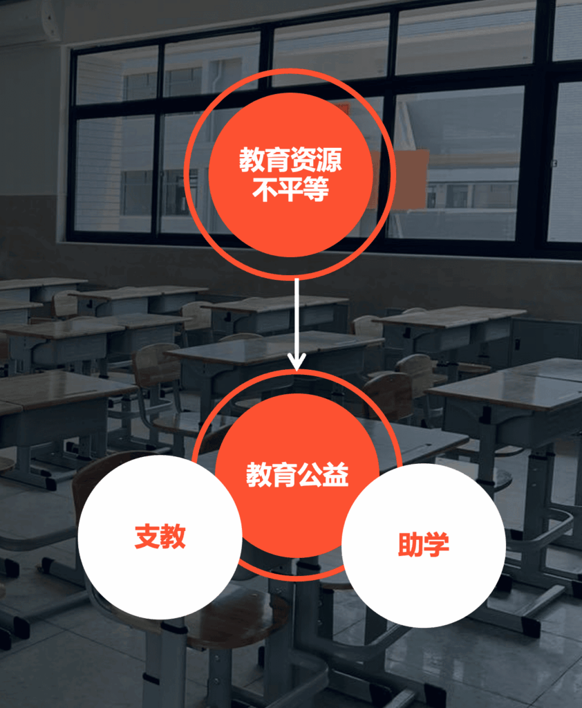
Wisheye is an innovative charitable platform aimed at promoting social good, founded out of a deep concern for educational poverty alleviation. Focusing on scholarship support and teaching assistance programs, it helps children in difficult circumstances achieve their hopes for a better life through material support and emotional companionship.
After 12 years of development, Wisheye has achieved significant results in promoting educational poverty alleviation and gradually formed a unique charitable philosophy and social influence. To further enhance its brand image and expand its social impact, a completely new brand visual system was created as part of the Wisheye nonprofit branding.
The Intersection of Hope and Insight
The name “Wisheye” is deeply meaningful: “Wish” represents hope and desire, symbolizing expectations for knowledge, growth, and goodness; “Eye” conveys insight and attention, keenly capturing societal issues while focusing on enhancing the vision of philanthropy and future development. Wisheye signifies viewing the world through the lens of hope and reflects a commitment to help people perceive their lives from new perspectives, paving the way for different futures and turning hope into reality.
The term “演心” embodies the core spirit of charity—”thoughts arise from the heart and never leave it.” Every act of kindness stems from genuine sincerity and goodness. Philanthropy extends beyond material giving to heartfelt spiritual support, demonstrating social responsibility and concern for the happiness of others. That outlook runs through the Wisheye nonprofit branding, from the name to the visual language.
From "I" to "We"
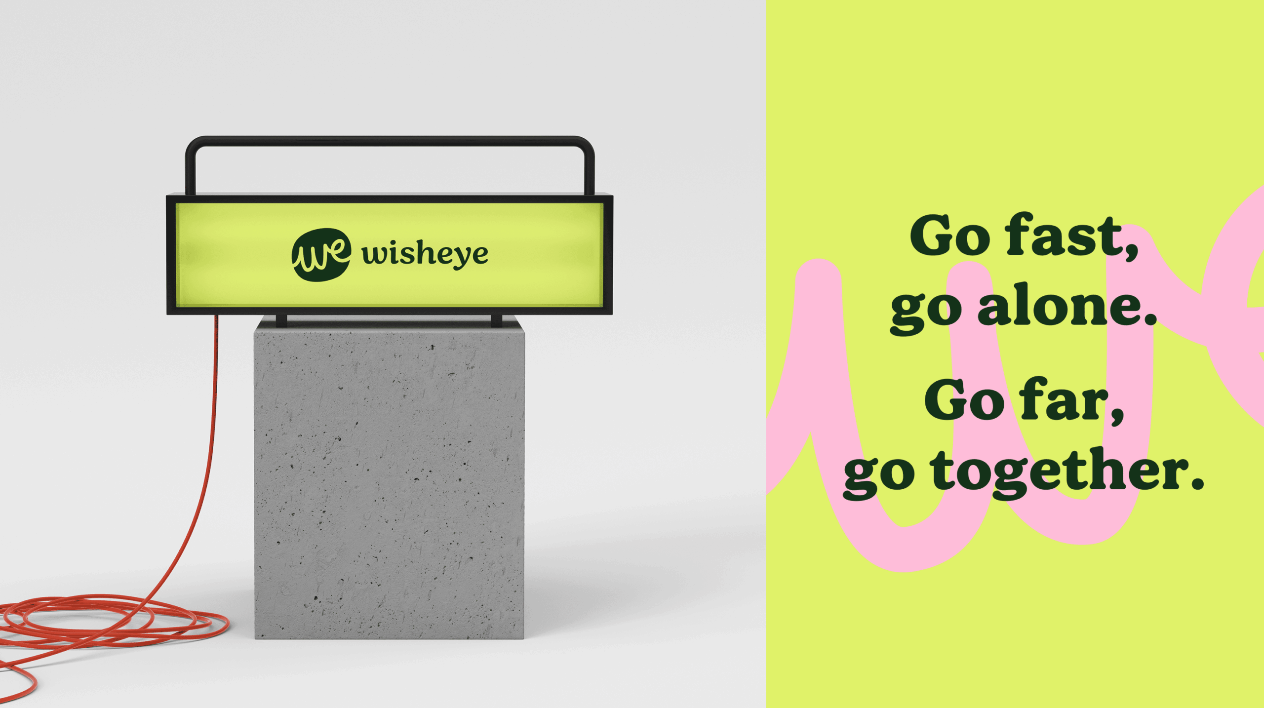
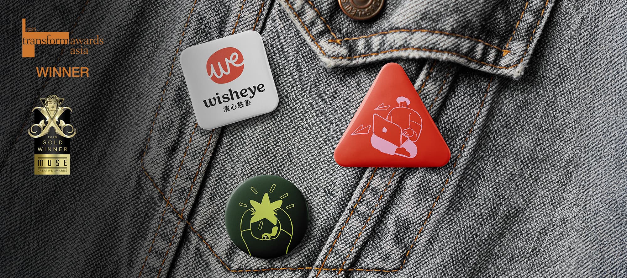
The logo features natural, flowing handwritten lines that embody the brand’s approachability and humanitarian spirit while enhancing its uniqueness and recognizability. The design of the handwritten lines conveys the brand’s core values of “authenticity” and “nature,” aligning perfectly with Wisheye’s philosophy that acts of kindness stem from the heart. This handwritten identity anchors the Wisheye nonprofit branding across every touchpoint.
The logo features natural, flowing handwritten lines that embody the brand’s approachability and humanitarian spirit while enhancing its uniqueness and recognizability. The design of the handwritten lines conveys the brand’s core values of “authenticity” and “nature,” aligning perfectly with Wisheye’s philosophy that acts of kindness stem from the heart.
Conveying Vitality and Warmth
The brand colors form a vibrant palette for Wisheye, primarily featuring warm and lively tones such as gentle orange, soft pink, and hopeful green. These colors enhance visual vitality and recognition and imbue the brand with an emotional dimension of care and love, providing a positive and uplifting warmth.
As part of Wisheye nonprofit branding, a series of playful and engaging illustrations was designed to further enhance the brand’s approachability. These illustrations help convey the brand’s core messages more effectively and add warmth and interest to the brand image, allowing people to intuitively feel the care and warmth that Wisheye provides. The illustration design complements the brand’s core philosophy, particularly enhancing its relatability when interacting with younger audiences and the broader public.
The Driving Force of Innovation and Collaboration
As Wisheye continues to grow, the brand’s mission evolves, moving beyond traditional scholarship support to embrace a more open and inclusive model of philanthropy. Wisheye actively seeks out socially innovative projects, particularly those that can bring tangible help and change to impoverished areas. These projects carry a unified nonprofit branding, enhancing their recognizability and communication potential to support the ongoing development of philanthropic innovation.
Wisheye firmly believes that every small philanthropic innovation carries immense power to change the world. This power transcends mere material assistance; it is also a source of spiritual encouragement that can inspire various sectors of society to engage in charitable efforts. With a new brand visual identity, Wisheye will more effectively convey this spirit of philanthropy, motivating more people to get involved and collectively weave a warmer, kinder world.
In the Wisheye nonprofit branding project, the powerful spirit of its philanthropy came through in fresh visual symbols, a vibrant color palette, and warm, engaging illustrations, and Wisheye has radiated new vitality. Public awareness has grown, and its future philanthropic projects now have greater communicative strength and appeal. Wisheye will continue to collaborate with more social forces to advance the beautiful vision of promoting goodness through kindness and action.
Frequently asked questions
Wisheye is a charity founded out of deep concern for educational poverty alleviation. It focuses on scholarship support and teaching assistance programs, helping children in difficult circumstances pursue a better life through material support and emotional companionship.
After 12 years of development, Wisheye needed a stronger brand image to expand its social impact. The project created a completely new brand visual system, covering the name's meaning, a handwritten logo, a warm color palette and a series of illustrations.
"Wish" represents hope and desire, and "Eye" conveys insight and attention. Together they describe viewing the world through the lens of hope. The Chinese name 演心 reflects the spirit that kindness arises from the heart and never leaves it.
Flowing handwritten lines in the logo express authenticity and a natural, approachable spirit. Gentle orange, soft pink and hopeful green bring warmth, and playful illustrations make the brand easier to relate to for younger audiences and the broader public.
Its mission is moving beyond traditional scholarship support toward a more open and inclusive model of philanthropy. Wisheye seeks out socially innovative projects, especially those that can bring tangible change to impoverished areas, and gives them a unified brand identity.