Shinybrands Group
Integrating and Extending Group Value
Client
-
Shinybrands Group
Industry
-
Beauty & Wellness
Services
-
Brand Architecture Strategy
Brand Strategy
End-to-End Brand Development
Brand Identity System
Recognition
Giving a Multi-Brand Group a Clearer Identity
Shinybrands is a listed beauty and wellness group with businesses spanning beauty and personal care, health and nutrition, and e-commerce. Over time, it has built a broad set of integrated capabilities that run from consumer insight to product development and market operations.
As its portfolio grew, a new question took shape. How could the market come to know Shinybrands itself? And how could the group build a recognizable identity of its own, one that conveys its core values and long-term direction, while each brand keeps growing in its own way?
Today a group’s competitive edge comes from the whole system. Brand development, R&D, supply chain and commercial operations have to work in step, and the performance of each brand is one part of that picture.
Redefining the Group’s Role from the Portfolio Up
A group brand is worth more than the sum of its brands. It connects resources and creates growth. Until now, consumers and the market have mostly focused on individual brands, while the group’s strengths in brand development, R&D, supply chain and commercialization have been far less visible. So the rebrand began with group strategy. Shinybrands’ positioning, mission and value proposition were revisited to define the role the group plays in helping its brands grow.
Management workshops, employee research and cross-functional discussions surfaced the core capabilities that run through every business in the group and shaped a single strategic foundation. That foundation ties the group’s business logic, organizational philosophy and brand expression together. The group brand becomes an asset in its own right. It speaks for the group’s value, aligns how people inside the company see it, and builds lasting recognition among investors, partners and employees.
Shine On and the Shinybrands Brand Identity
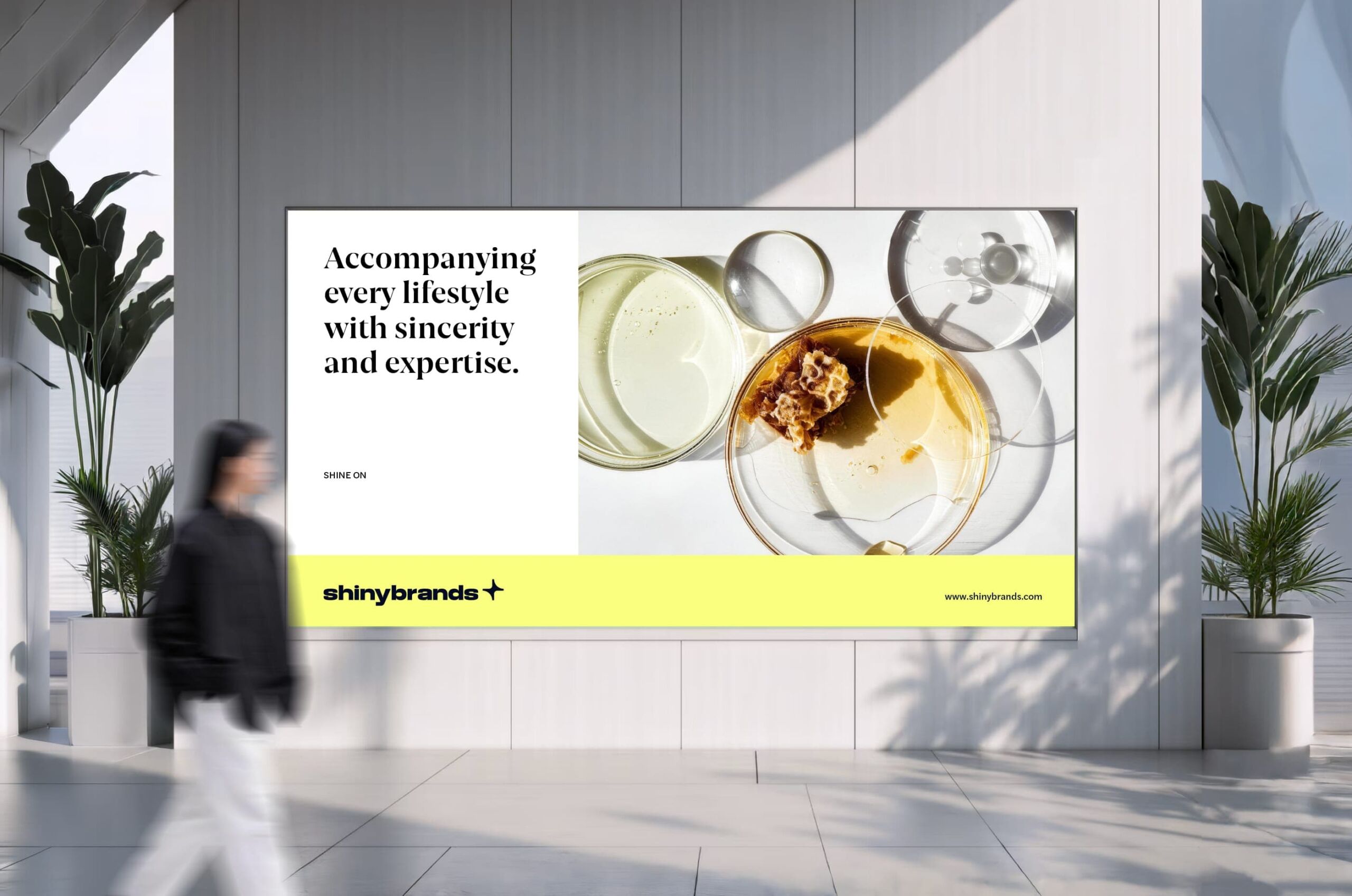
Keep growing, and let every possibility shine with ease. Building on the strategy work, “Shine On” became the core idea behind the new Shinybrands brand identity. It echoes the Shinybrands name and links the group’s vision of continuous growth with care for people.
For the group, Shine On stands for exploration, shared resources and innovation, the drive that keeps its brands moving. For the people inside it, the phrase invites confident self-expression, room to play to their strengths, and a sense of their own value as everyone grows together.
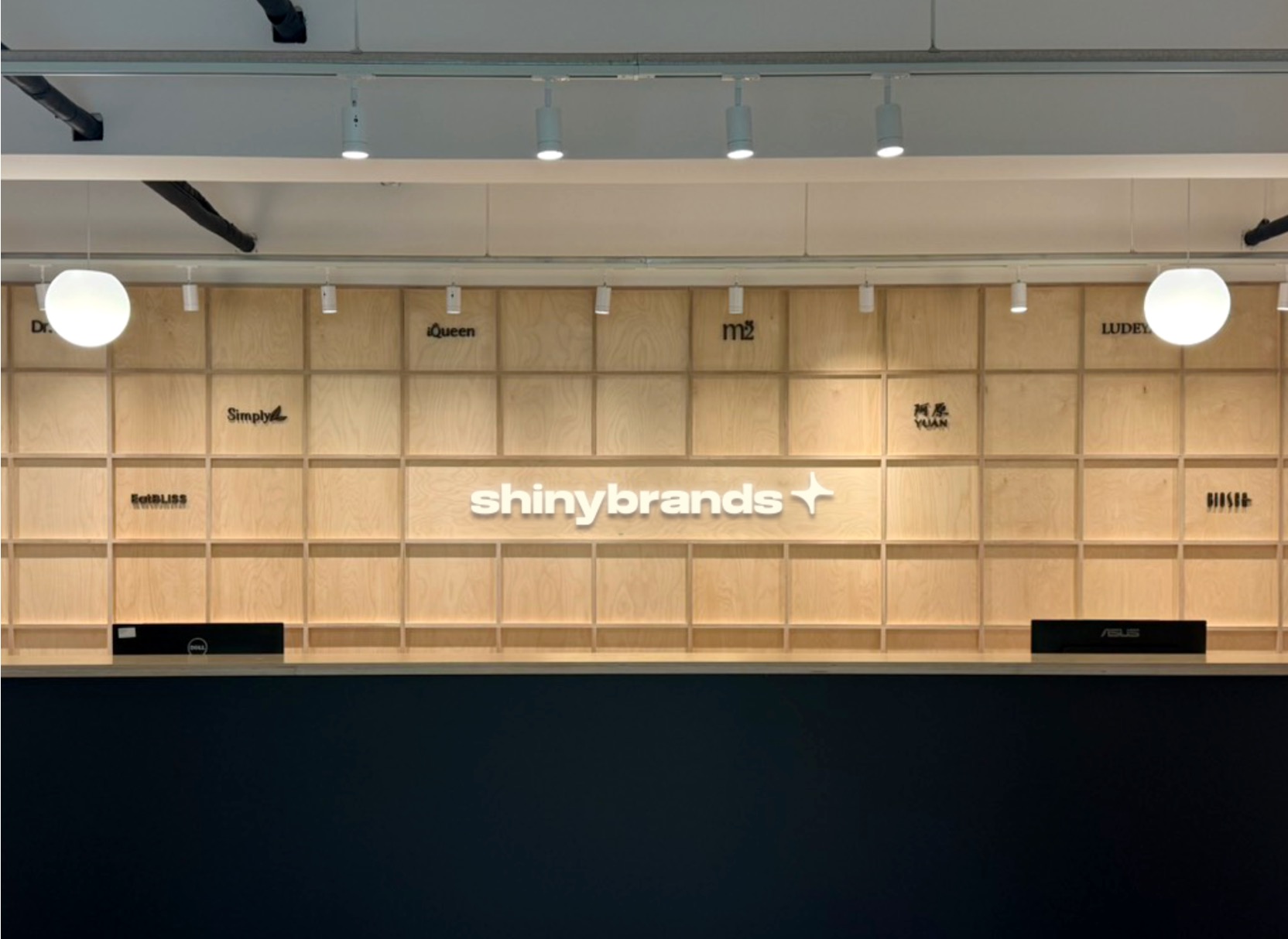
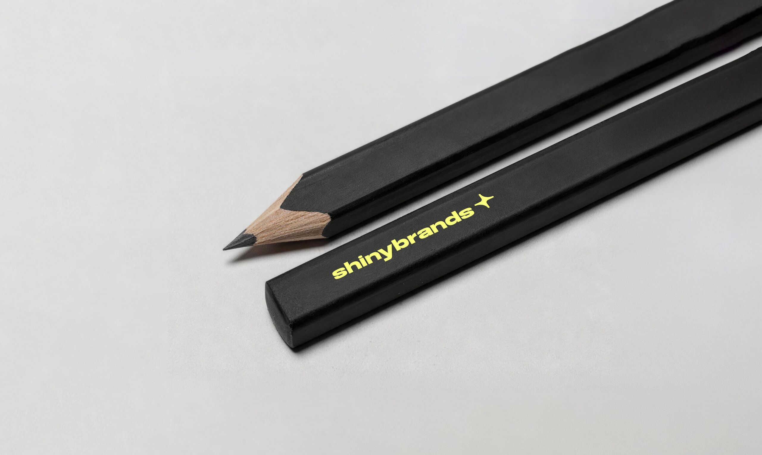
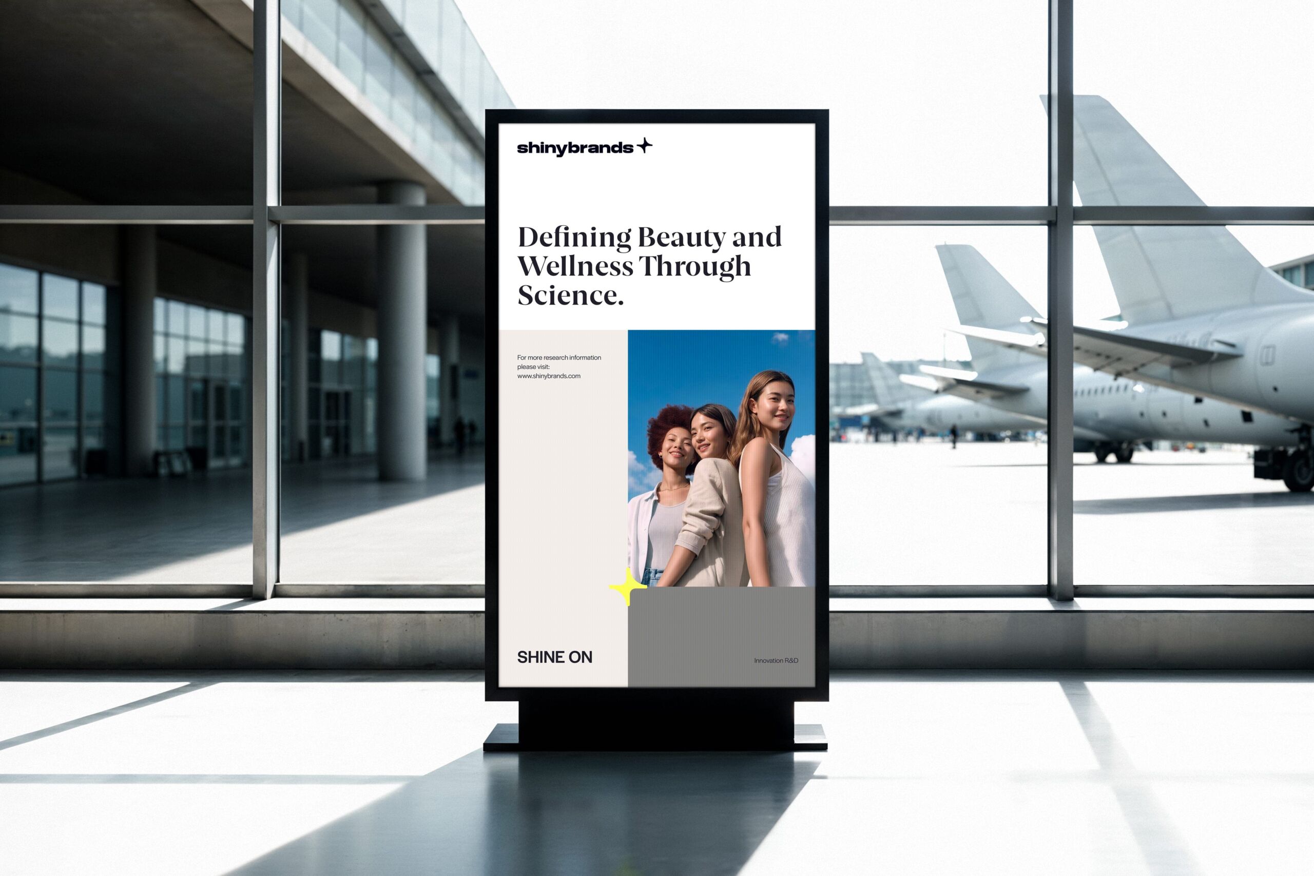
To give the idea a form people can recognize, the North Star became the central symbol. A star suggests direction, guidance and forward motion, and it picks up the “Shiny” in Shinybrands. It serves as the group’s visual mark and the starting point for the entire system, turning an abstract idea into a clear, consistent look.
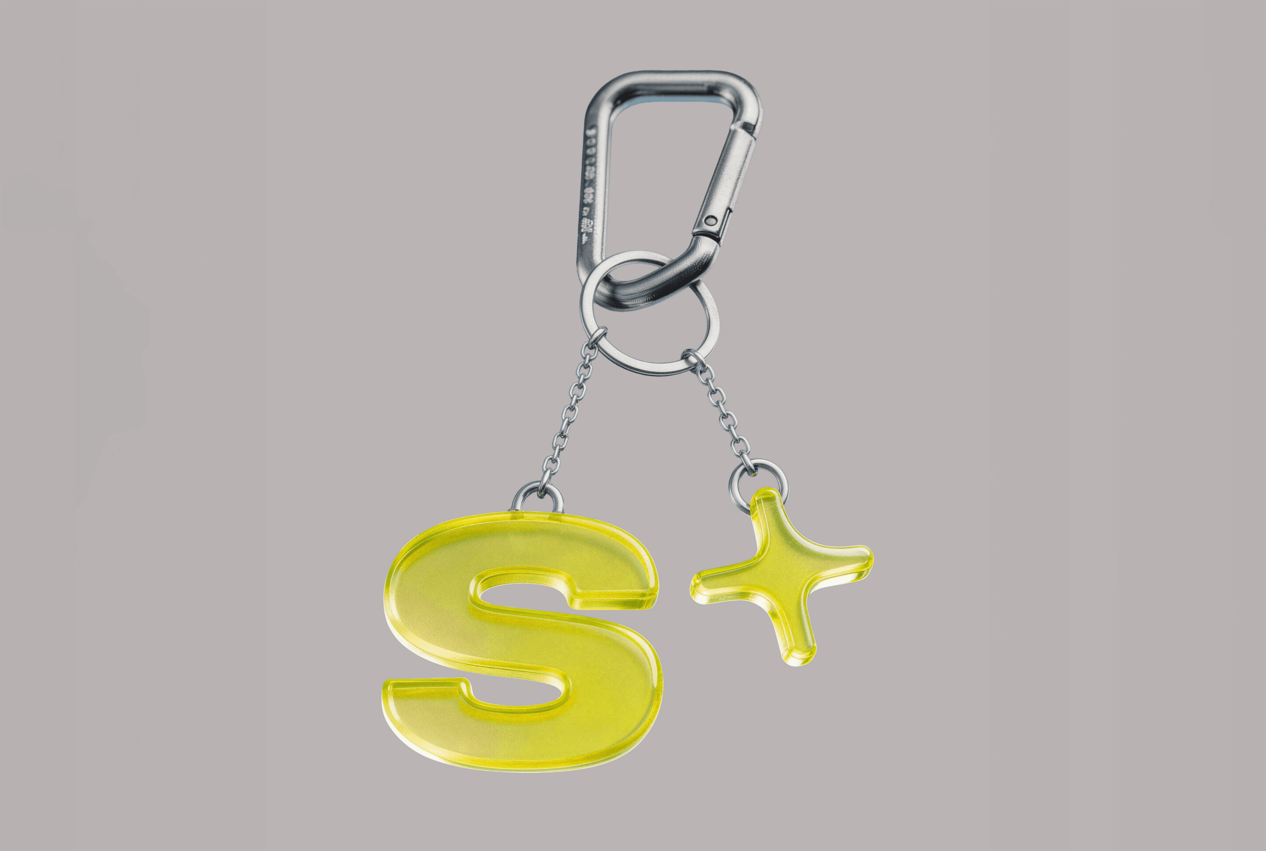
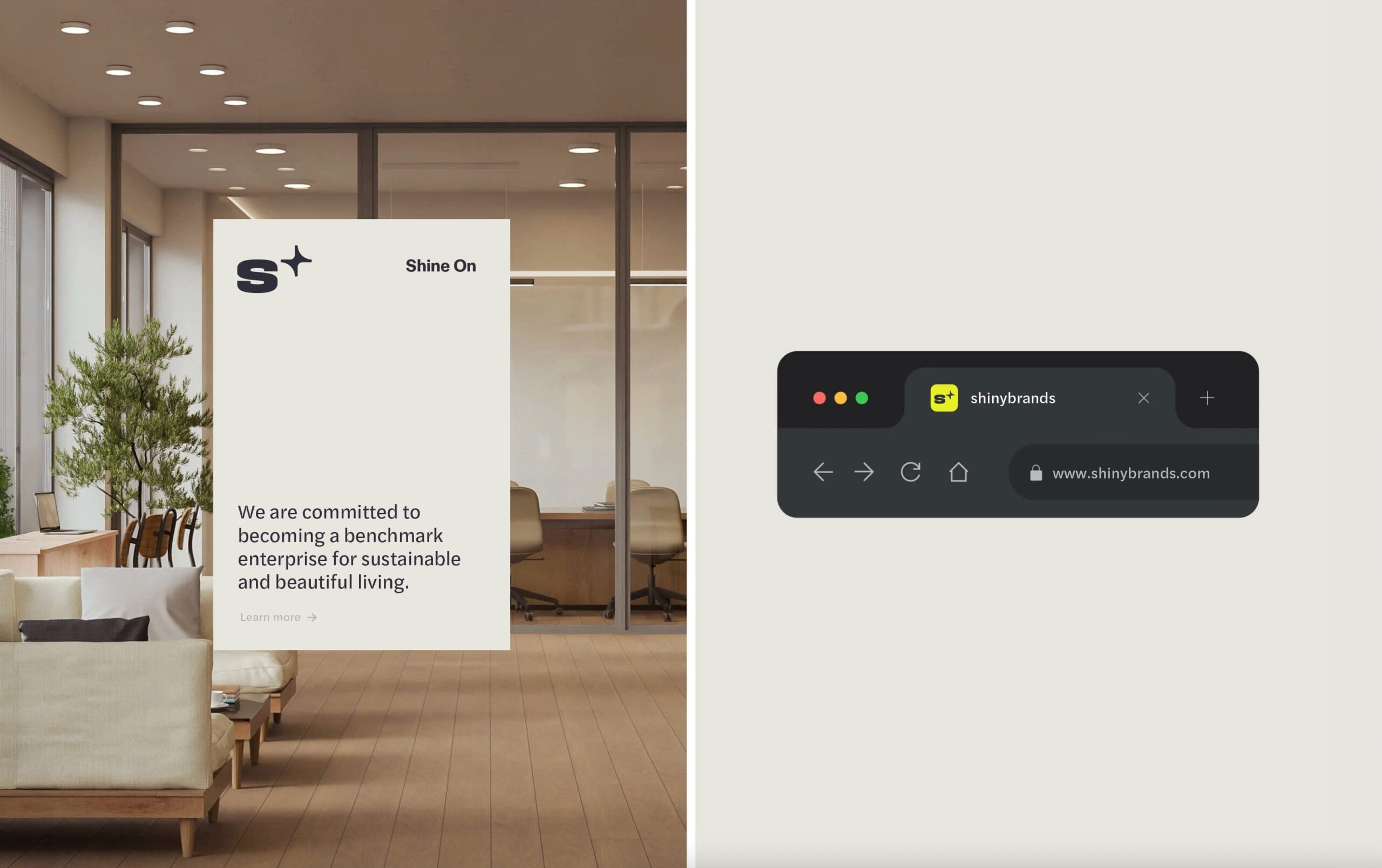
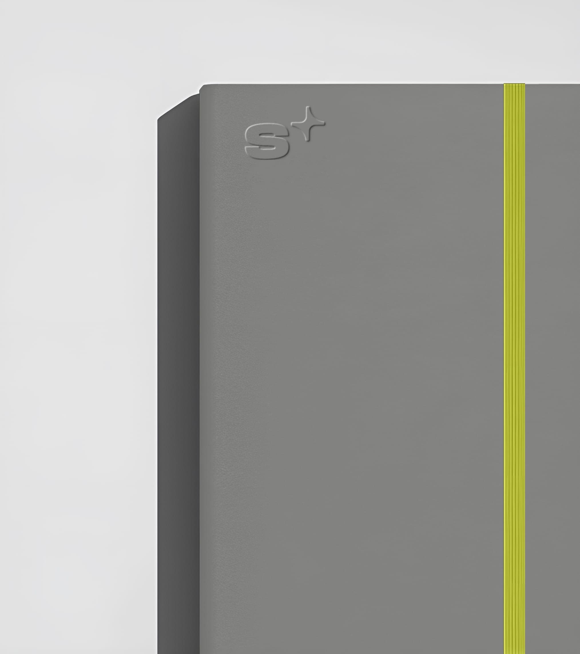
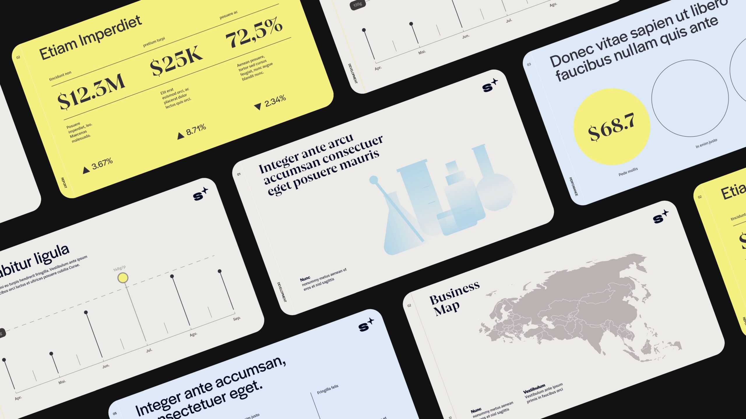
Alongside the main logo, the Shinybrands brand identity includes the S+ symbol, which pairs the S in Shinybrands with a star. It carries the core identity in a simpler, more compact form, keeps the link between the name and the North Star, and gives the system a lighter, more adaptable way to show up.
From the full logo to the compact S+, the identity scales to suit different sizes, layouts and applications. S+ can stand alone as a focal point or combine with star patterns, type and other graphic elements for different levels of expression. Moving from a primary mark to a supporting symbol gives the brand more room to work across settings while keeping a clear connection to the main identity.
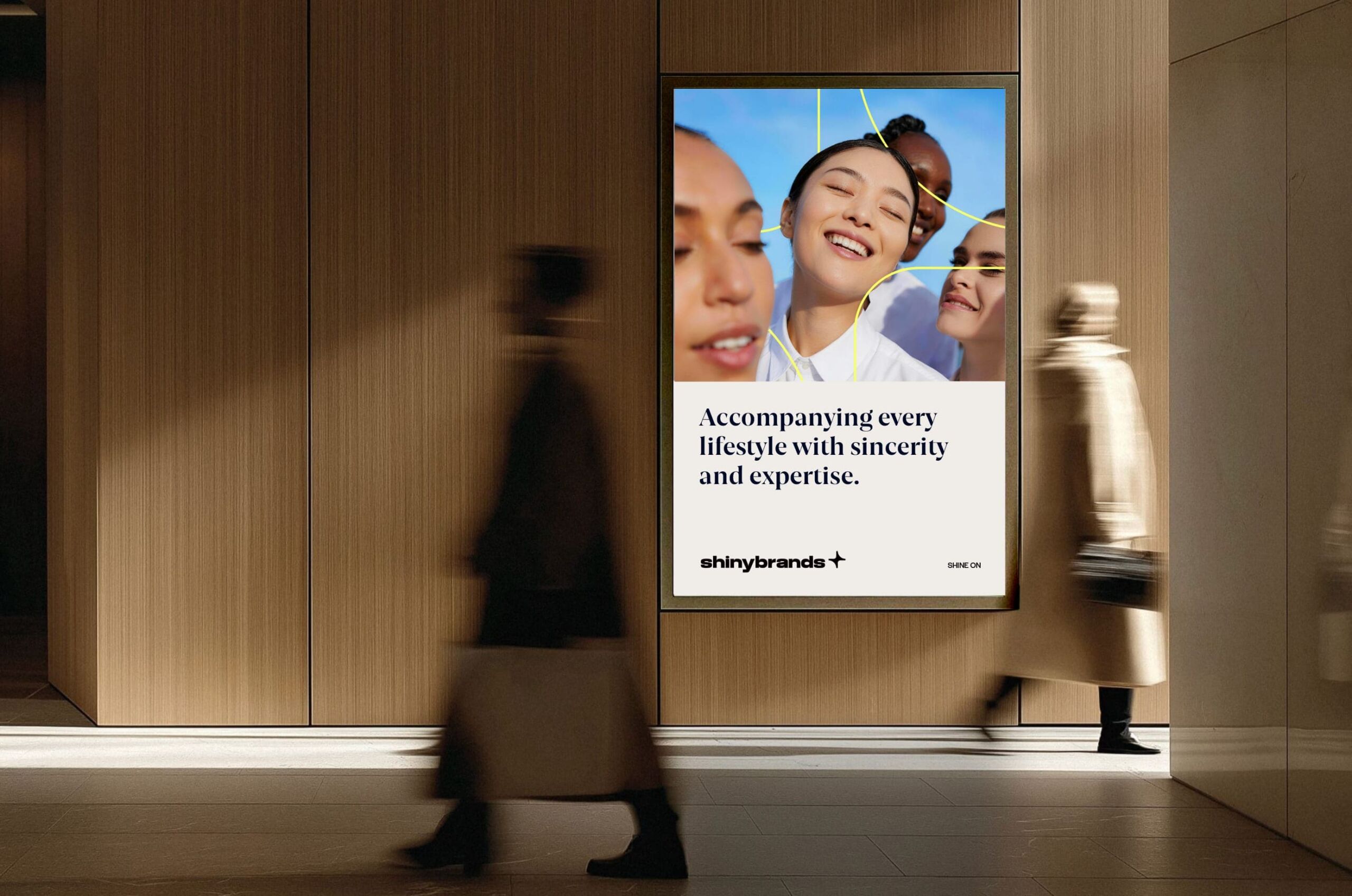
The overall design balances structure with expression. Clean typography, layout and information design convey the professionalism of a listed group, while flexible graphics and compositions add the energy, approachability and sense of innovation that beauty and wellness call for.
A Consistent Group Image
That Helps Every Brand Keep Growing
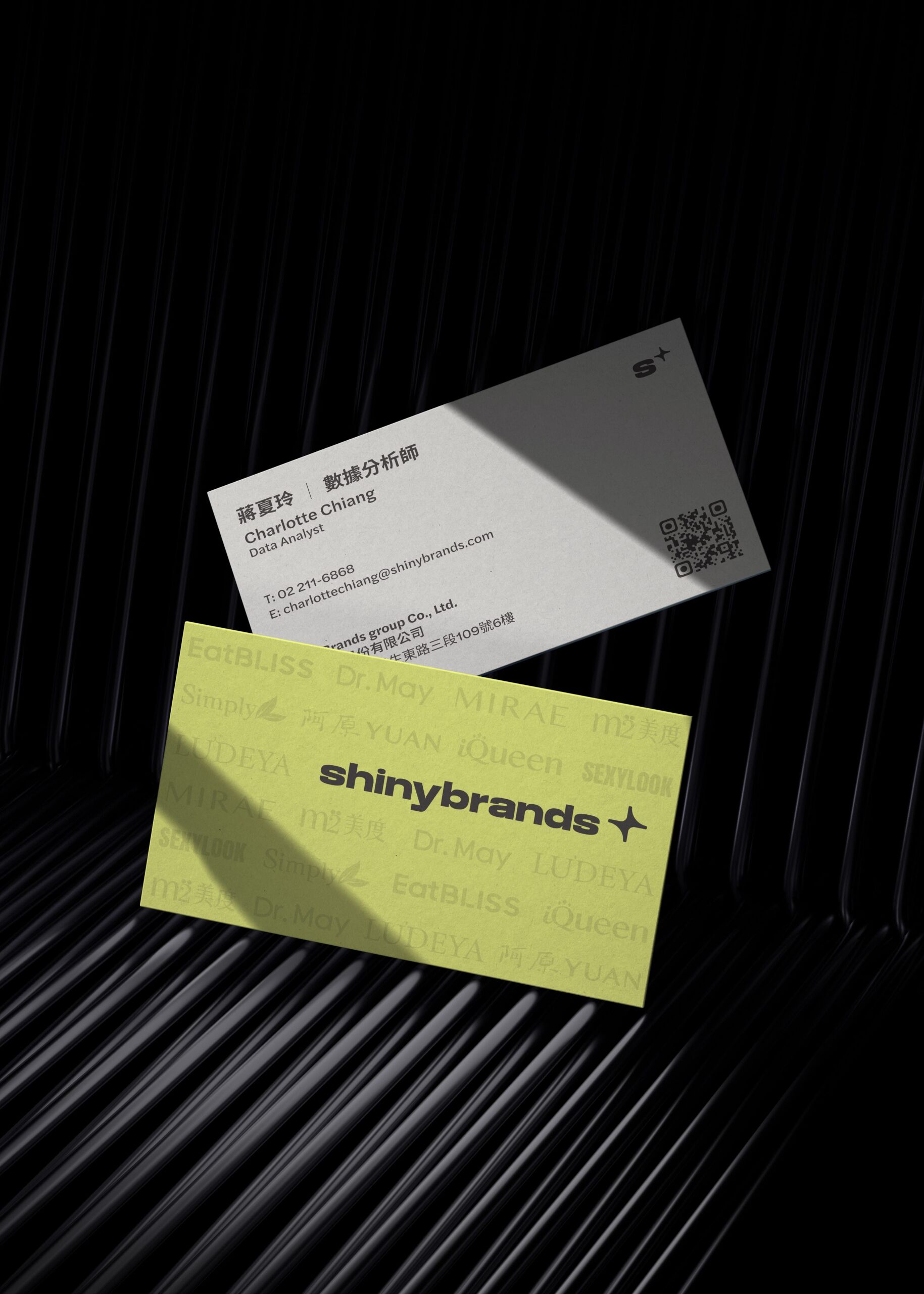
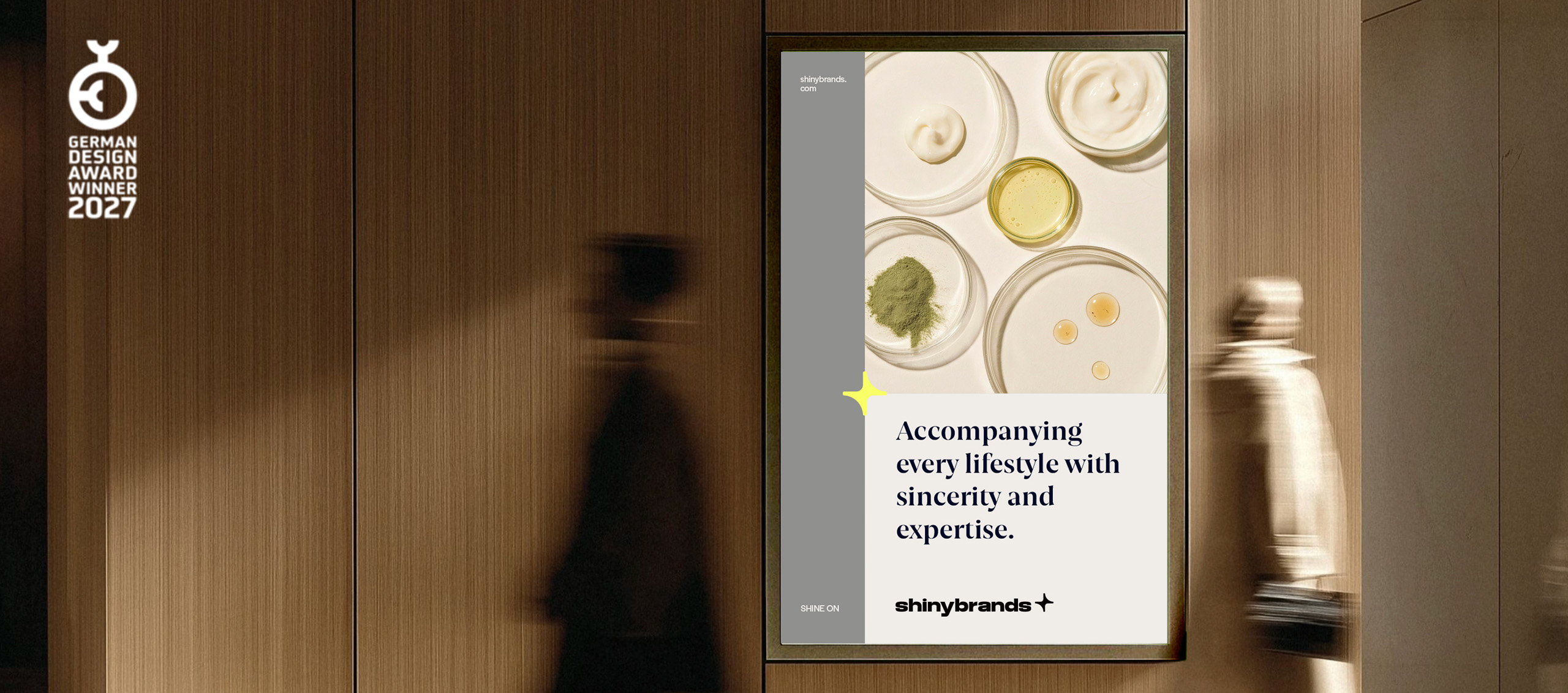
The identity gives the group a common foundation while letting each brand keep its own personality. The refresh produced a complete set of guidelines covering typography, color, layout, imagery and use of the group logo, and it spells out how the group brand and its individual brands appear alongside each other.
At the group level, a consistent visual language makes Shinybrands easier to recognize across corporate communications, investor relations, digital channels and internal communication. At the brand level, the system leaves each consumer brand room for its own positioning and voice, so every business can keep serving its own market and audience on top of a shared strategic foundation.
The modular design also leaves space for new brands, shifts in the business and use in new contexts, so the identity can keep evolving with the group instead of being rebuilt each time.
Turning Group Strategy into a Lasting Brand Asset
A rebrand pays off most when it gives a company a clear, steady foundation to build on for years, and a fresh look is only part of that. Through this collaboration, the Shinybrands brand identity brings the group’s capabilities, organizational philosophy and vision together in a more complete expression. Strategic positioning, core concept, visual identity and application guidelines all point the same way, toward a clearer group story, clearer relationships among its brands and a shared base for future growth. Related capabilities are described under Services.